Identity, Print
Sanders\Wingo
Identity, Print
Sanders\Wingo
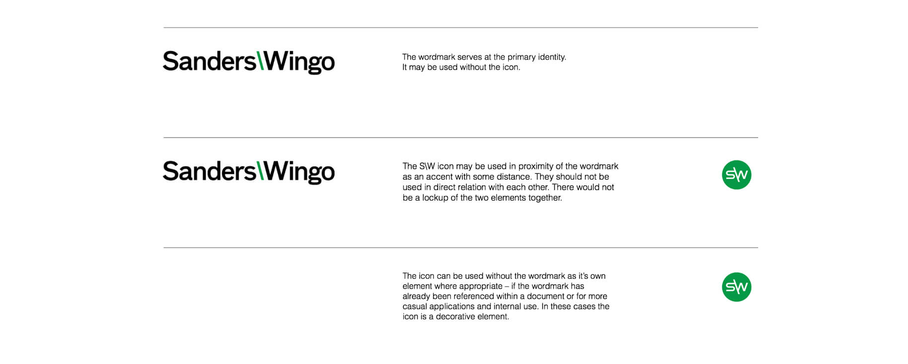
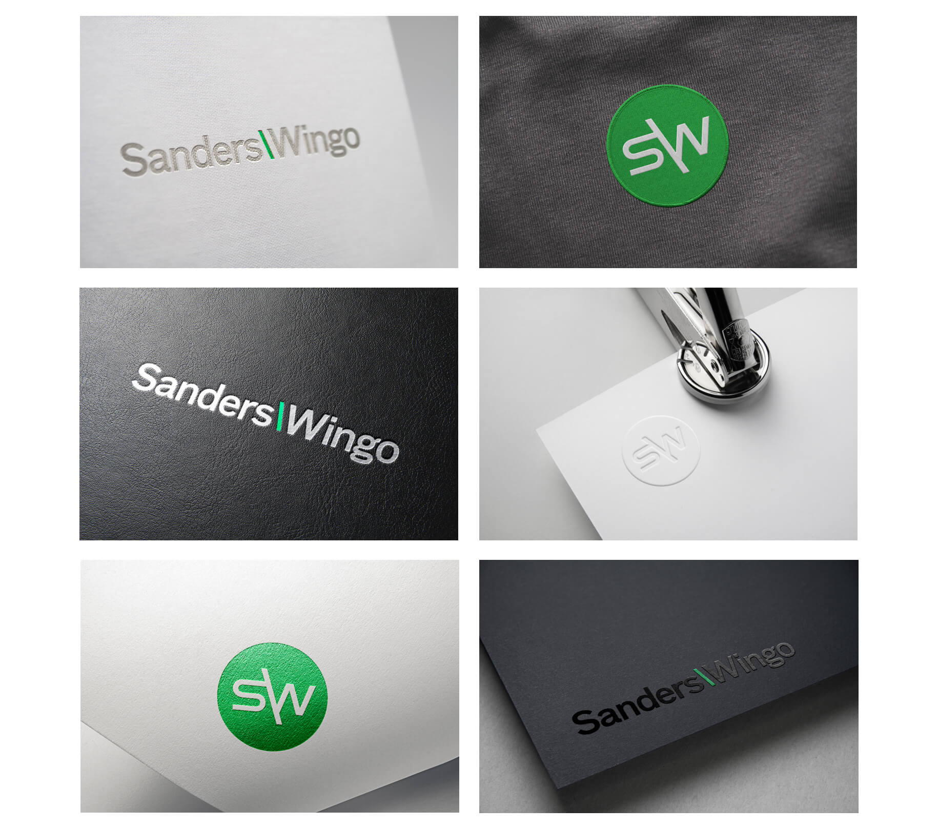
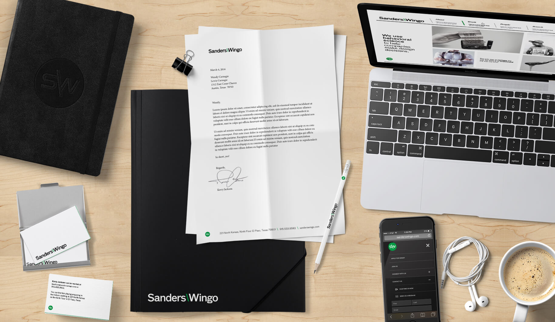
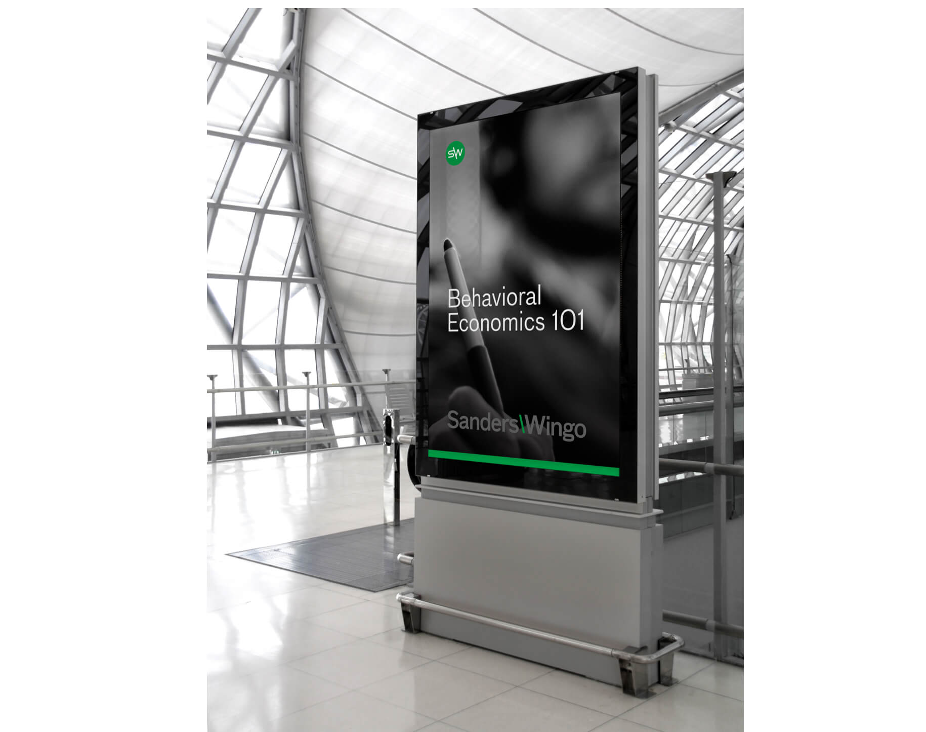
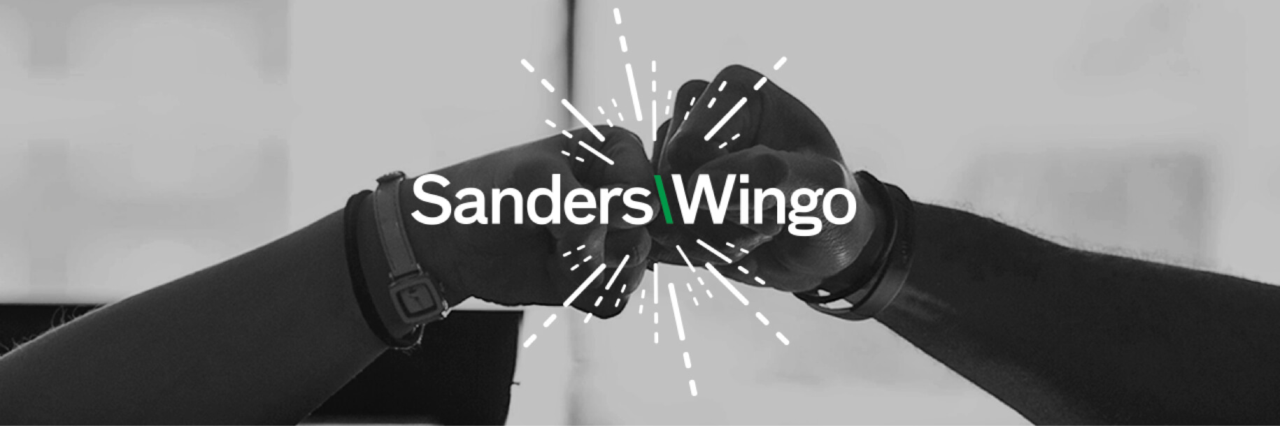
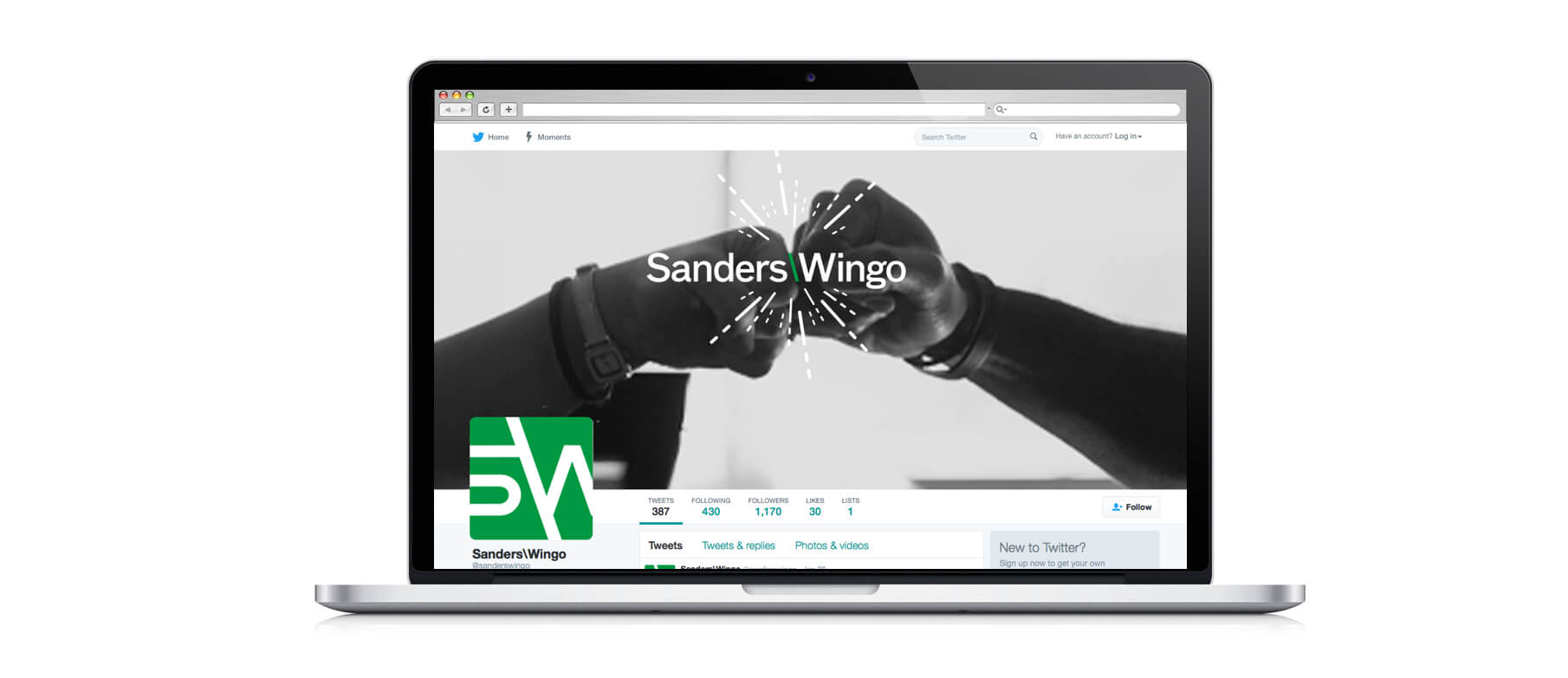
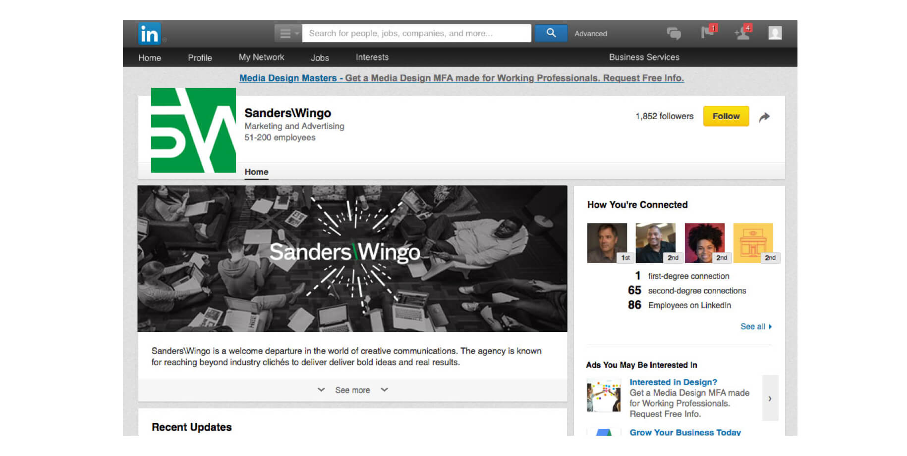
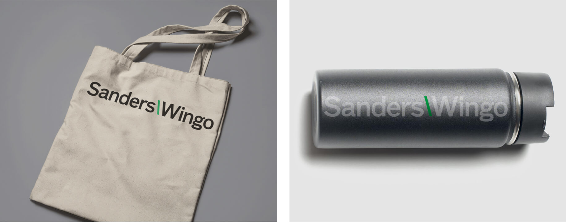
The agency Sanders\Wingo made groundbreaking changes in advertising by incorporating human behavior into the formula. While internal efforts focused on the new process, LewisCarnegie worked on a new identity to include a custom typographic word mark, fresh S\W icon and expanded graphic guidelines. A simplified color palette includes black and bright green – symbolizing growth, renewal, wealth, and the obvious “go” in their name.
Web Design
Lyndon B. Johnson School of Public Affairs
Web Design
Lyndon B. Johnson School of Public Affairs
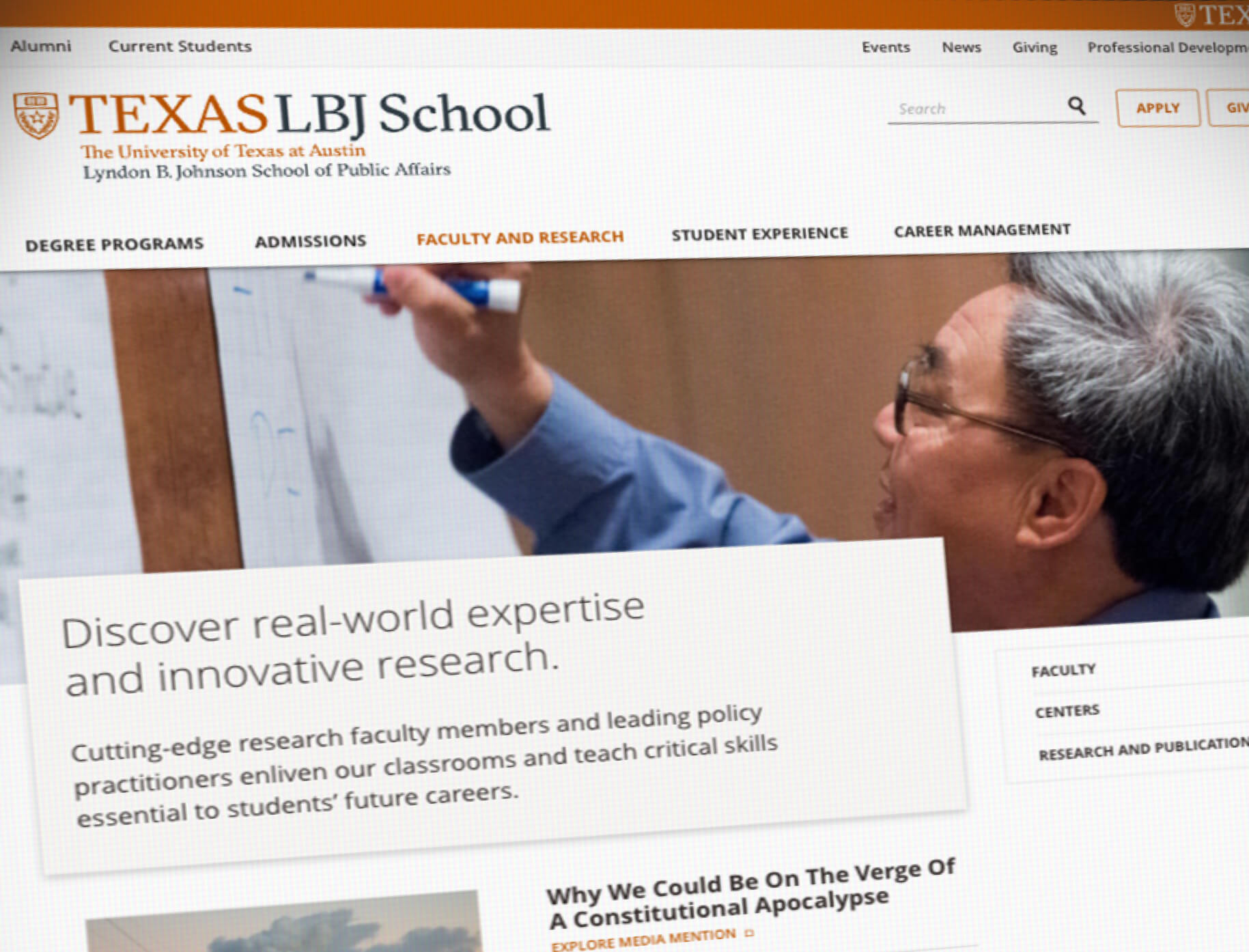
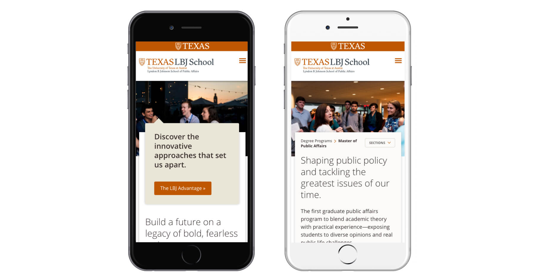
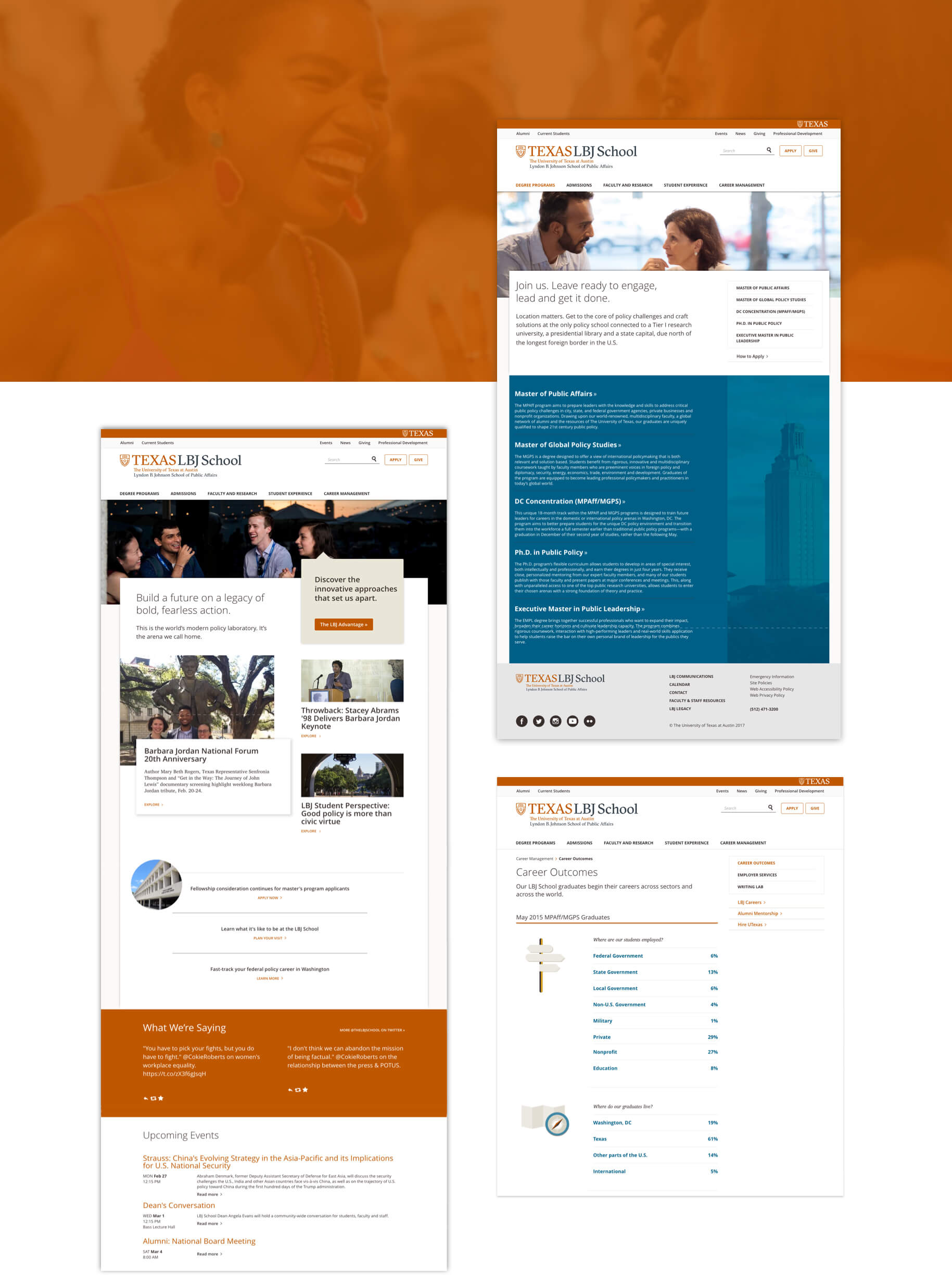
The LBJ School of Public Affairs is one of the best graduate public affairs schools in the nation and it's tied to a top-tier research university – the University of Texas at Austin. LBJ needed a site to match their prestigious reputation; a site that would garner quality applicants with easy-to-understand navigation. Furthermore, it needed to be sustainable for their internal team. To re-organize their navigation to meet their goals, we met with LBJ’s leaders, directors and managers to better understand their content and audience. The results of their input culminated into a click-able, detailed wireframe prototype, and soon after, a design prototype. We then worked with Sundaram to develop a custom drupal theme based on the University’s requirements as well as incorporate a streamlined web-publishing workflow for LBJ’s team. https://www.lbj.utexas.edu

Environmental, Identity, Packaging
Good Company
Environmental, Identity, Packaging
Good Company
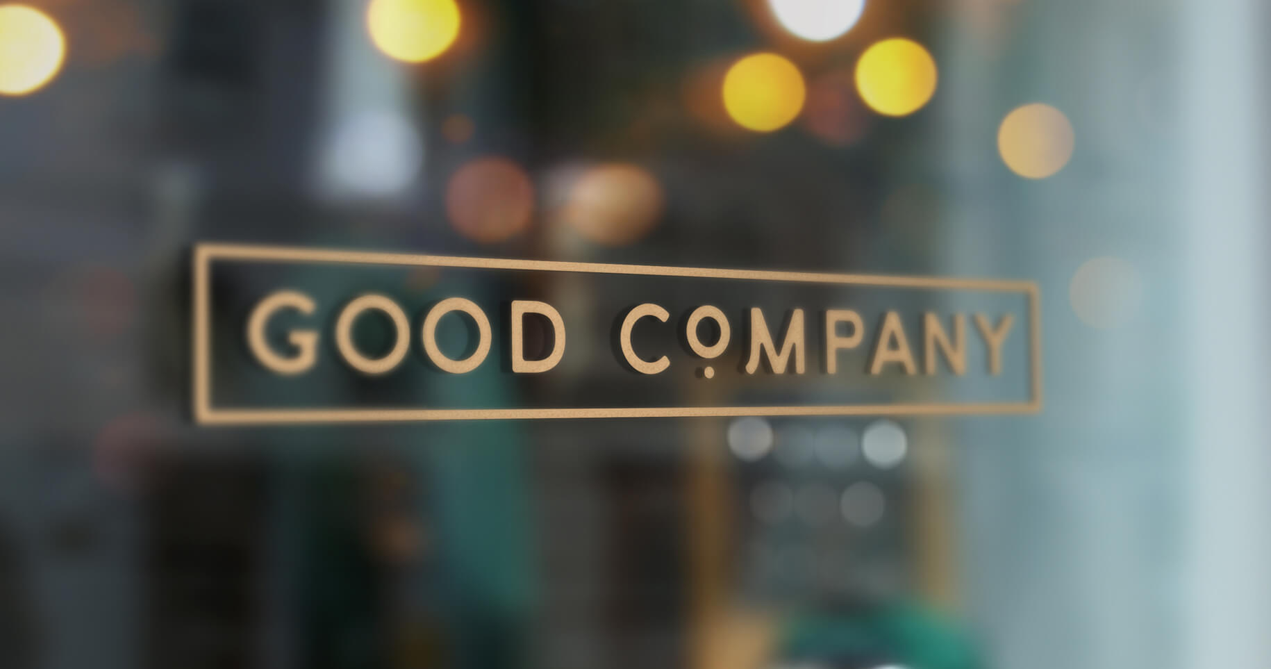
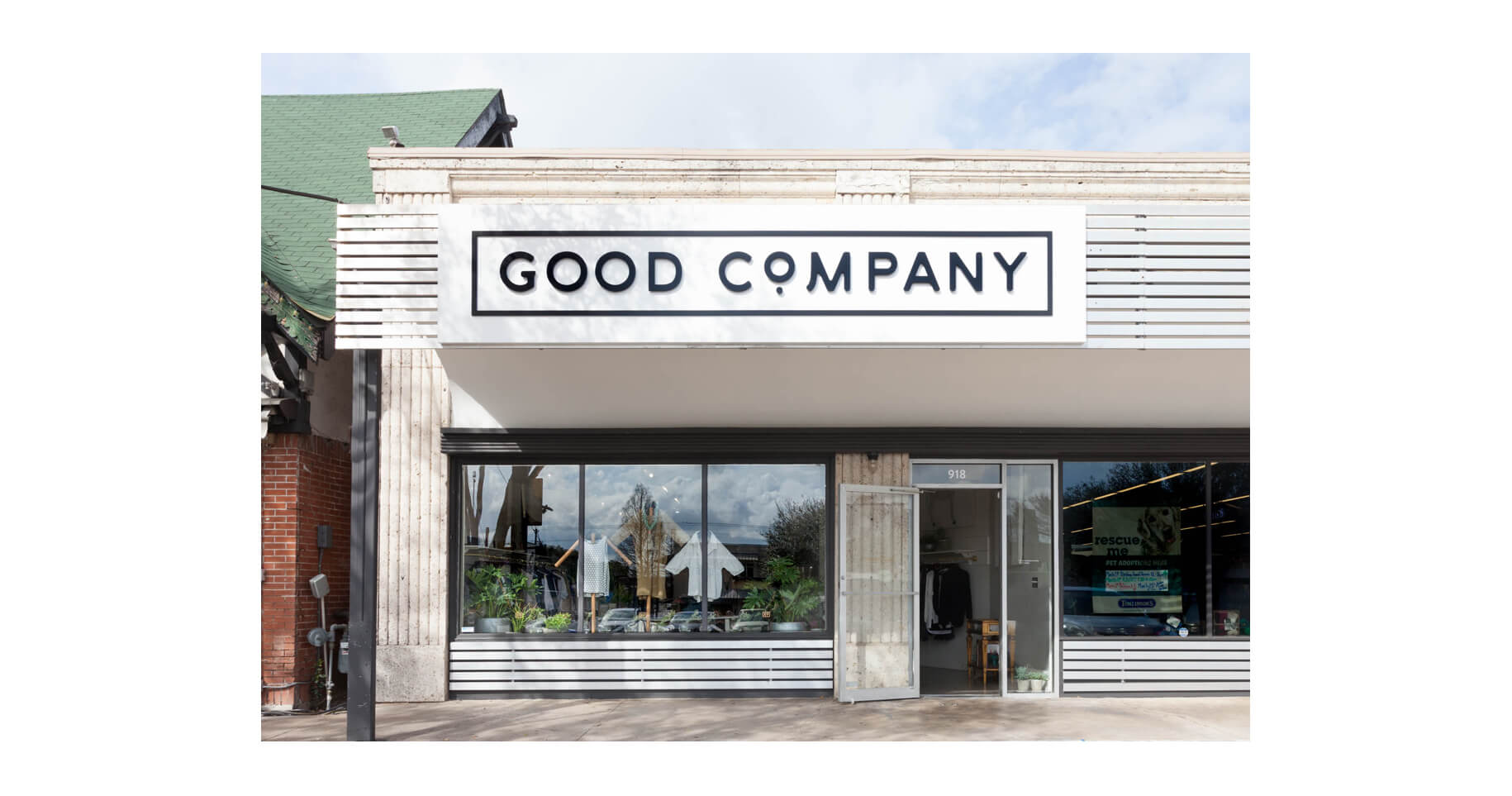
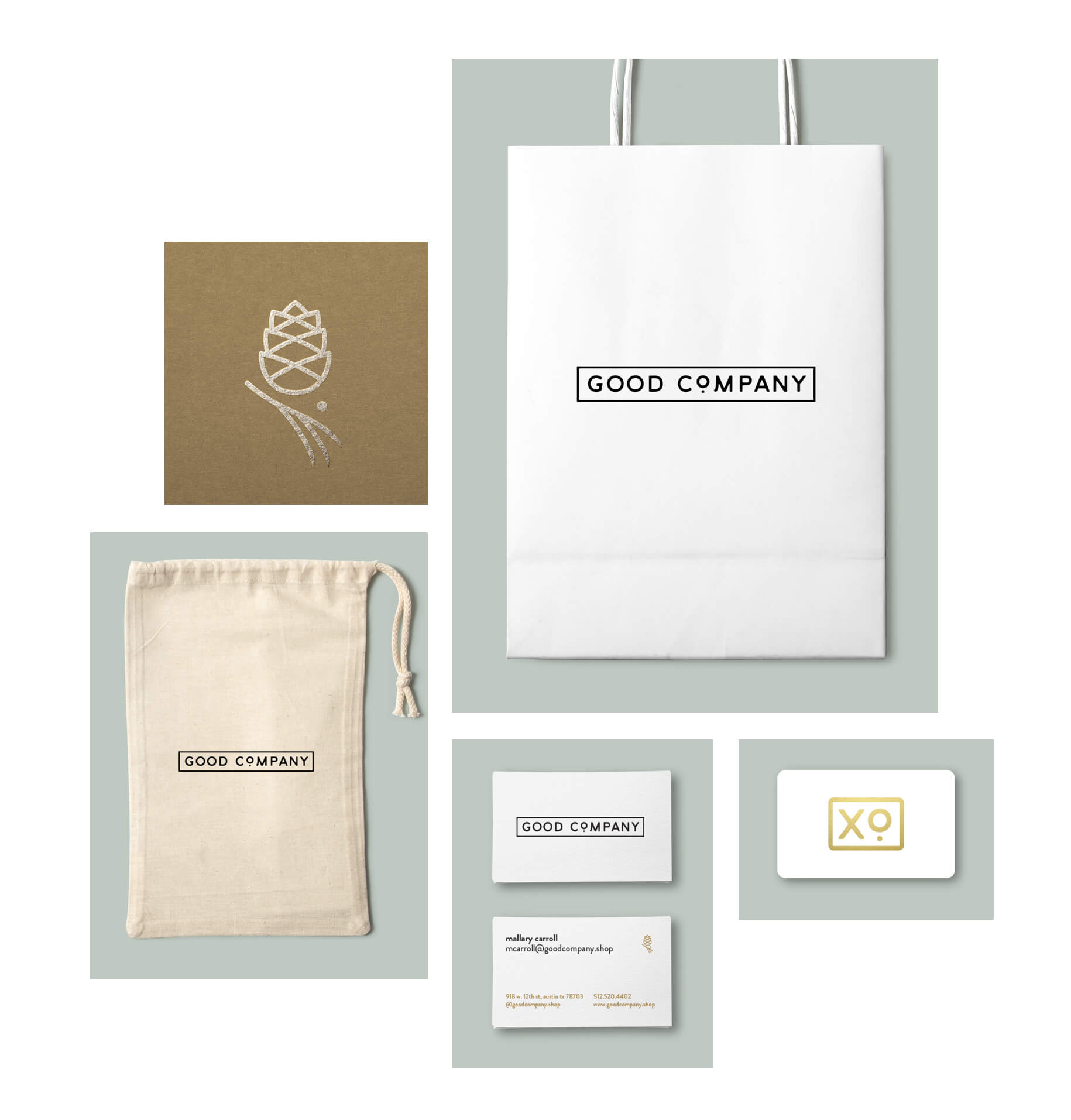
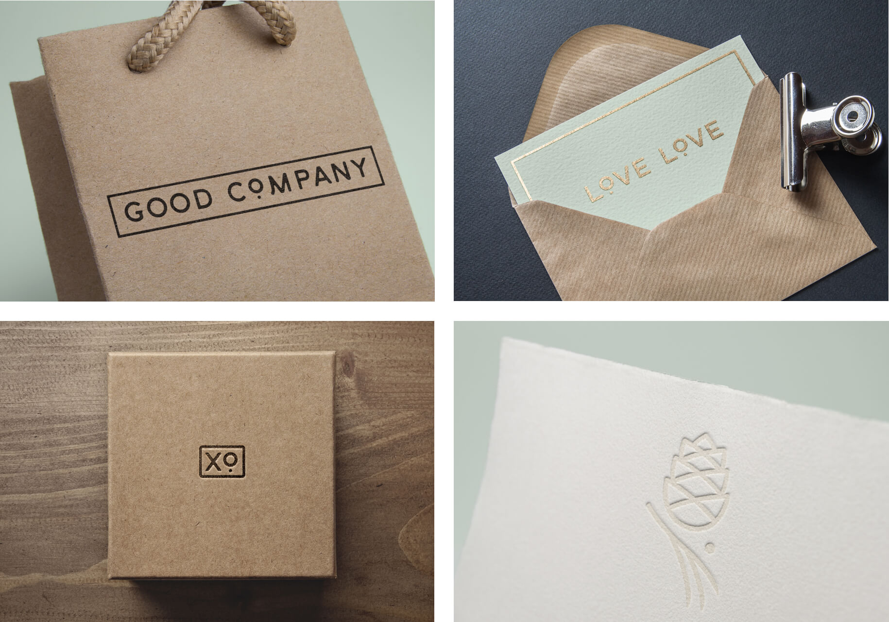
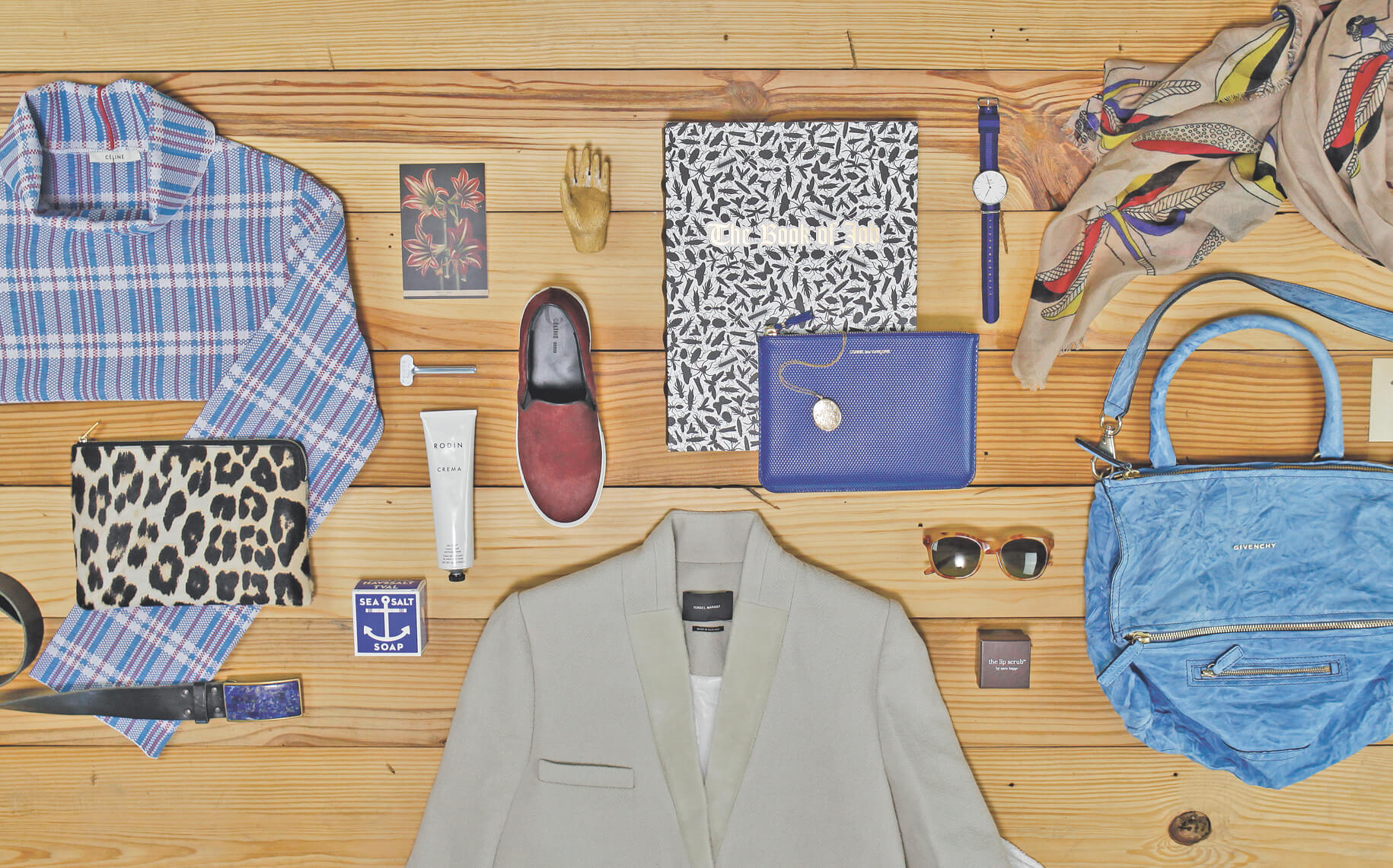
It feels great to be in Good Company. This Austin boutique carries everything to make fashion effortless – from clothes and jewelry to furniture and home accessories. LewisCarnegie worked with owner Mallary Carroll to quickly roll out a visual strategy around her warm and vibrant personal style. A black and white palette with accents of pale green, kraft and gold accents give space for artisan and designers to come to life. Supporting icons carry subtle meaning to the store and brand messaging: simple, cool, clean and comfortable. All in good company.



Environmental, Identity, Web Design, Print, Packaging, Illustration
Home Slice Pizza
Environmental, Identity, Web Design, Print, Packaging, Illustration
Home Slice Pizza
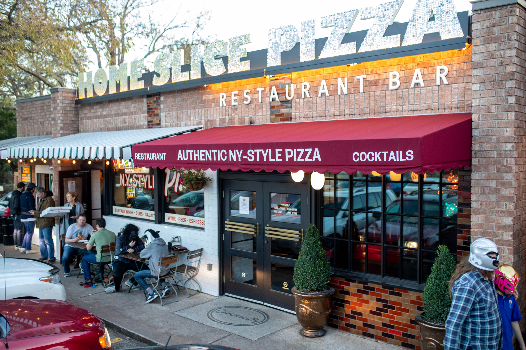
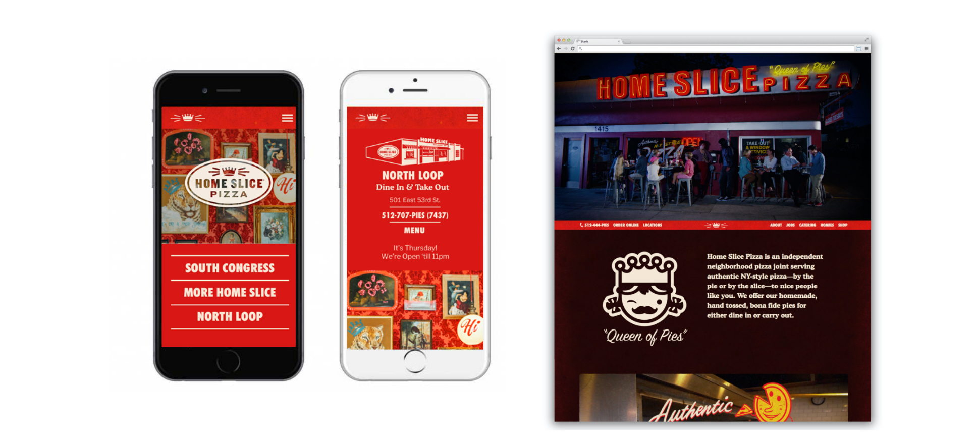
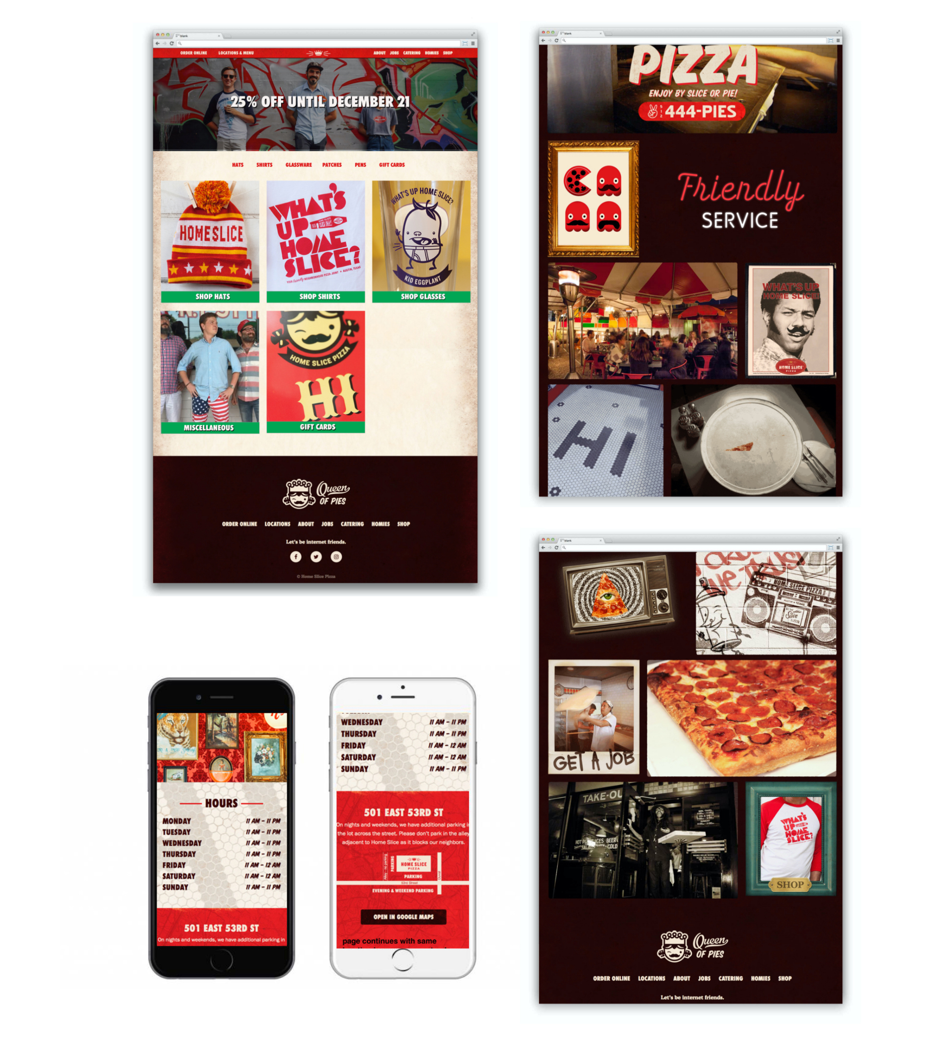
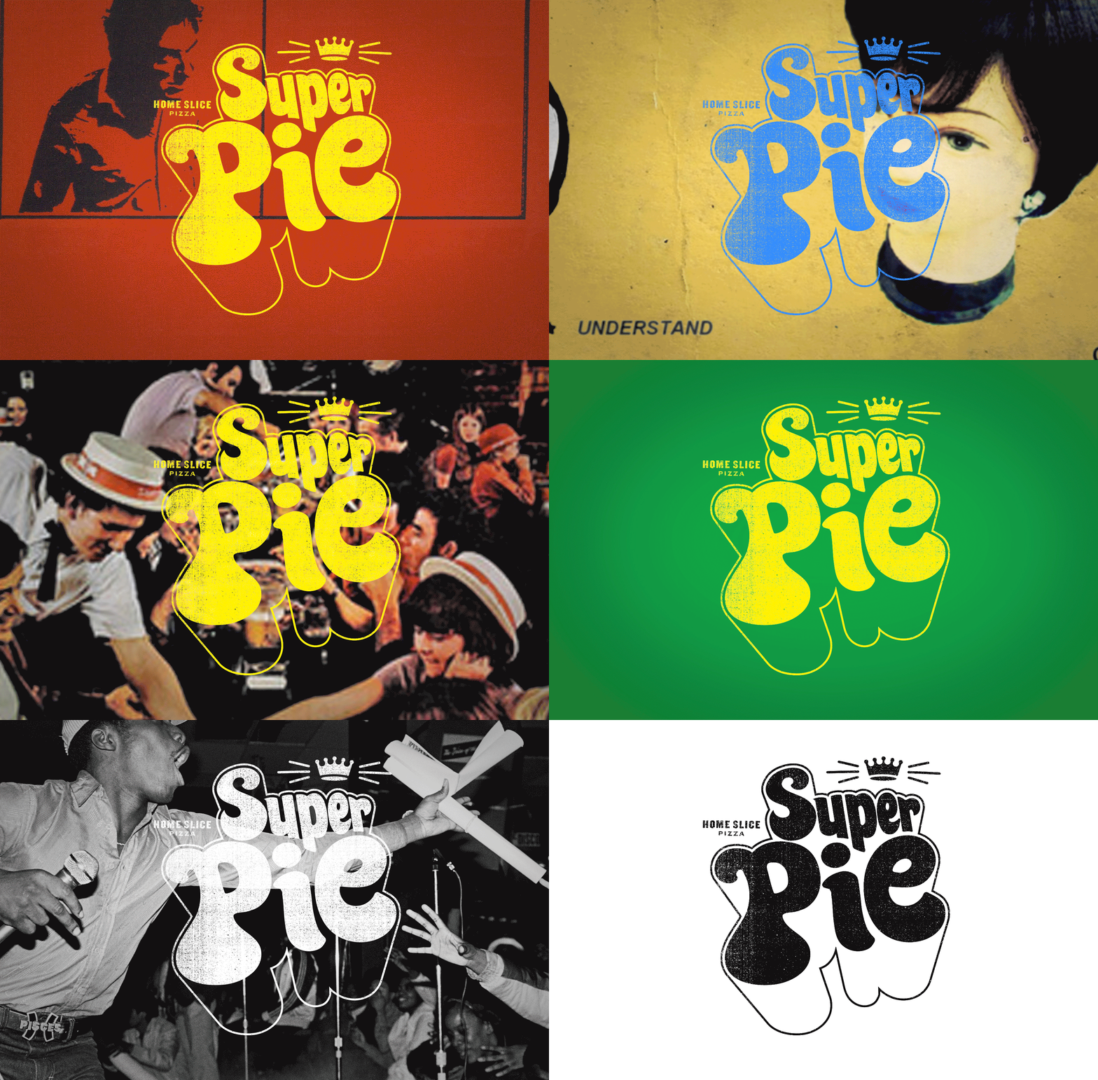
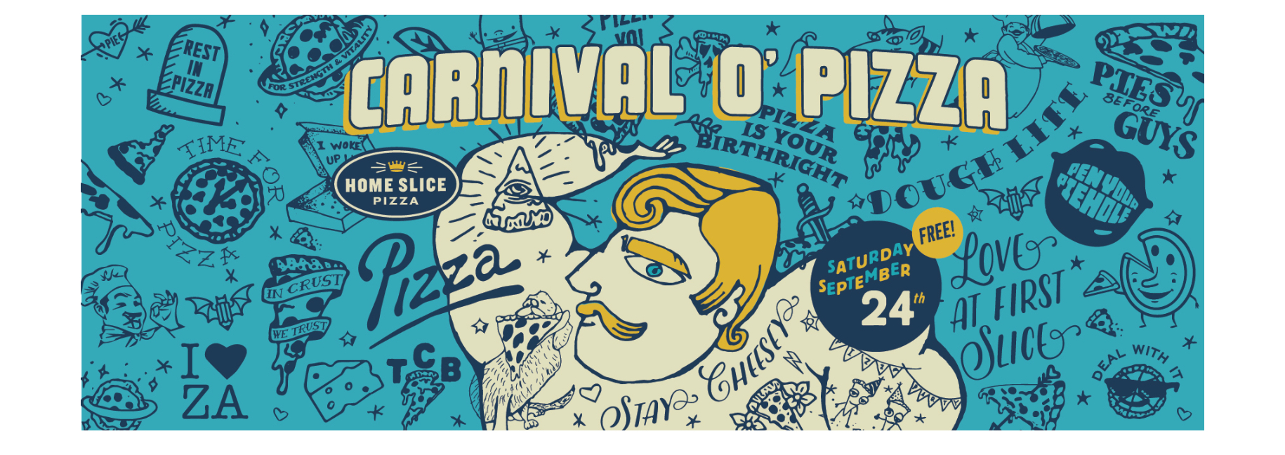
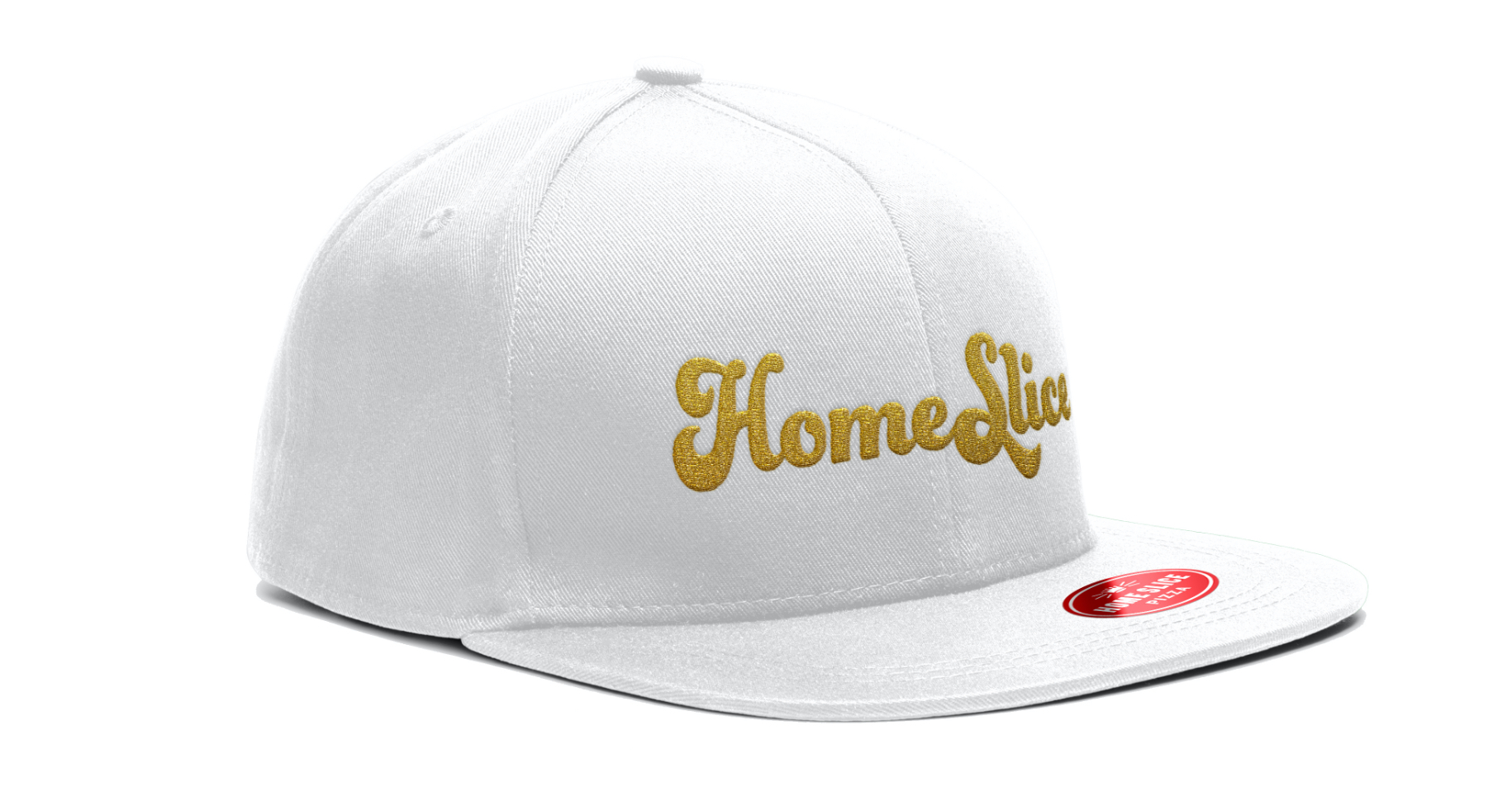
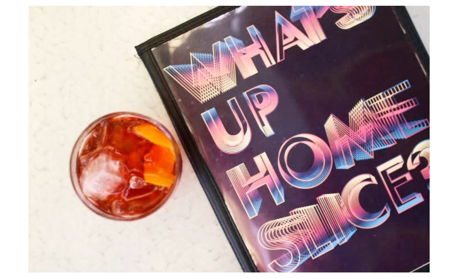
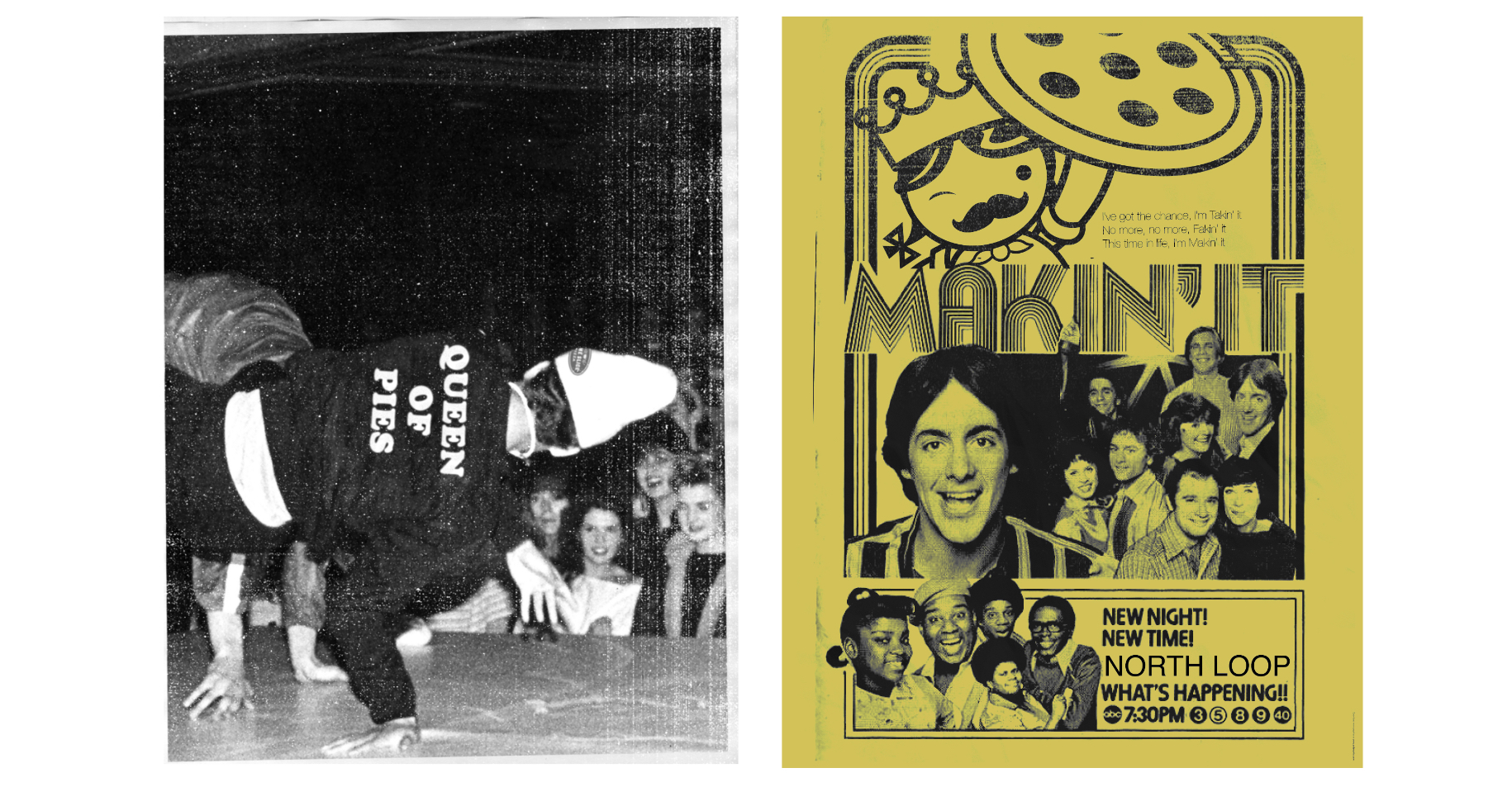
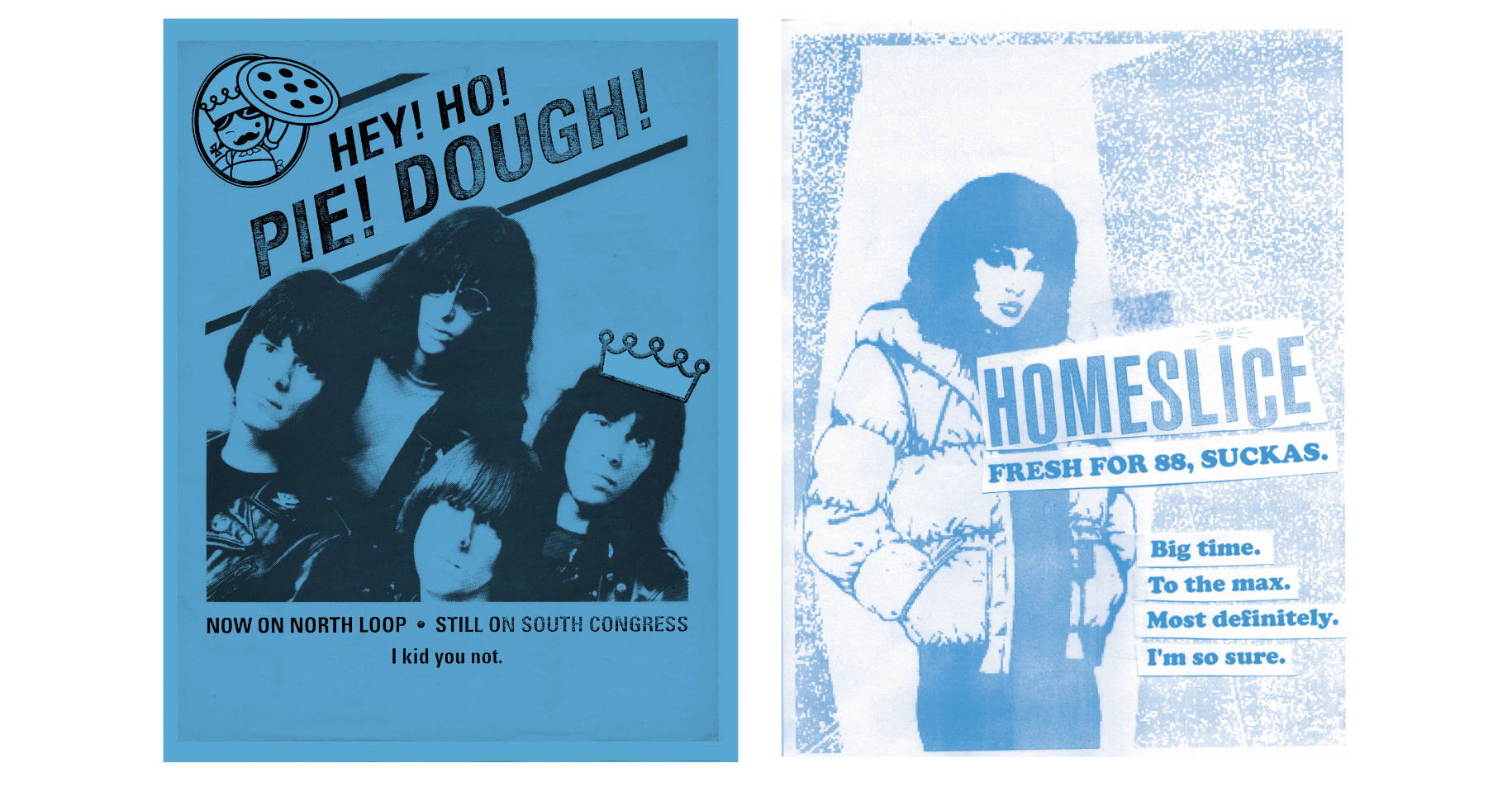
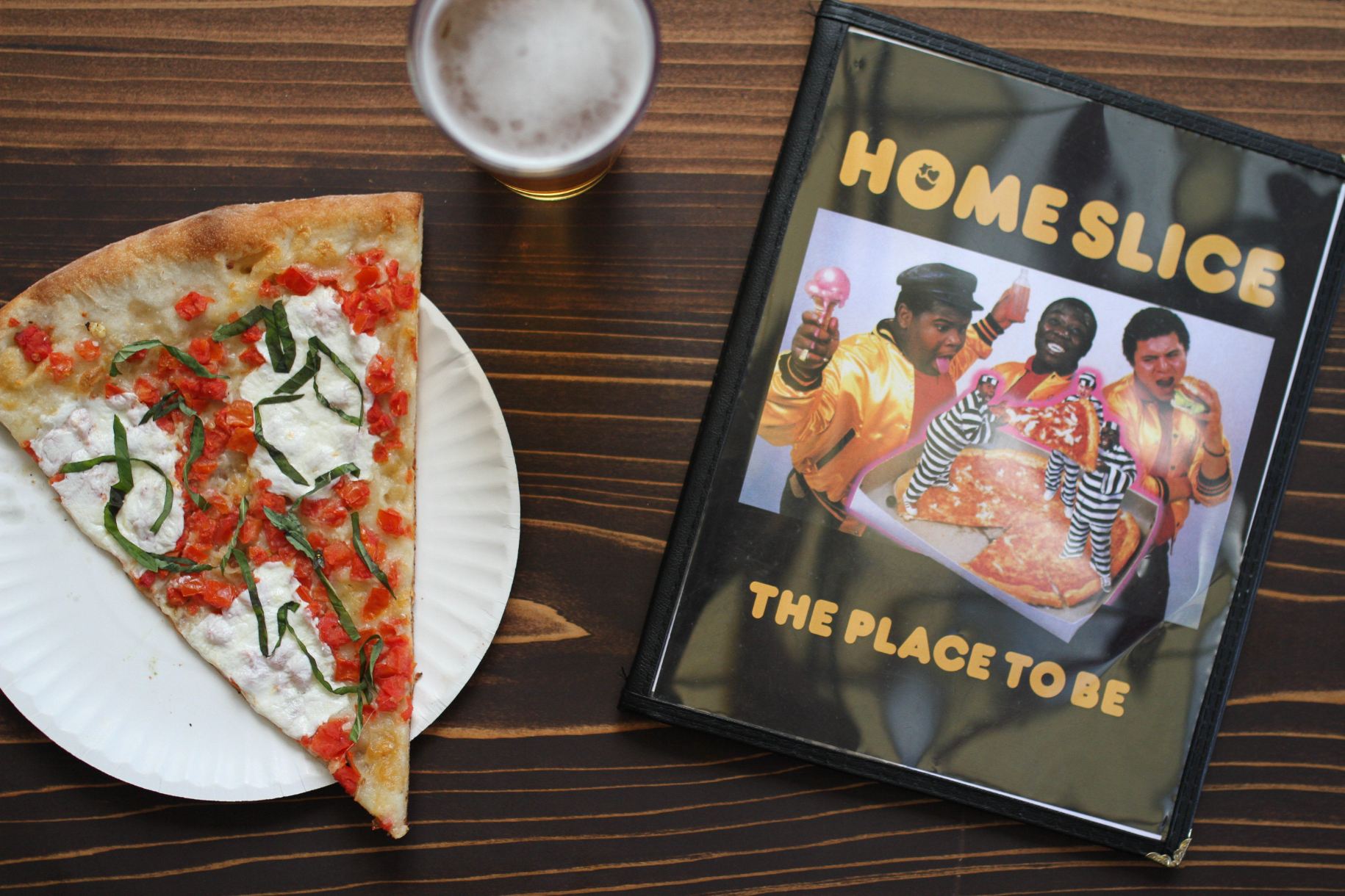
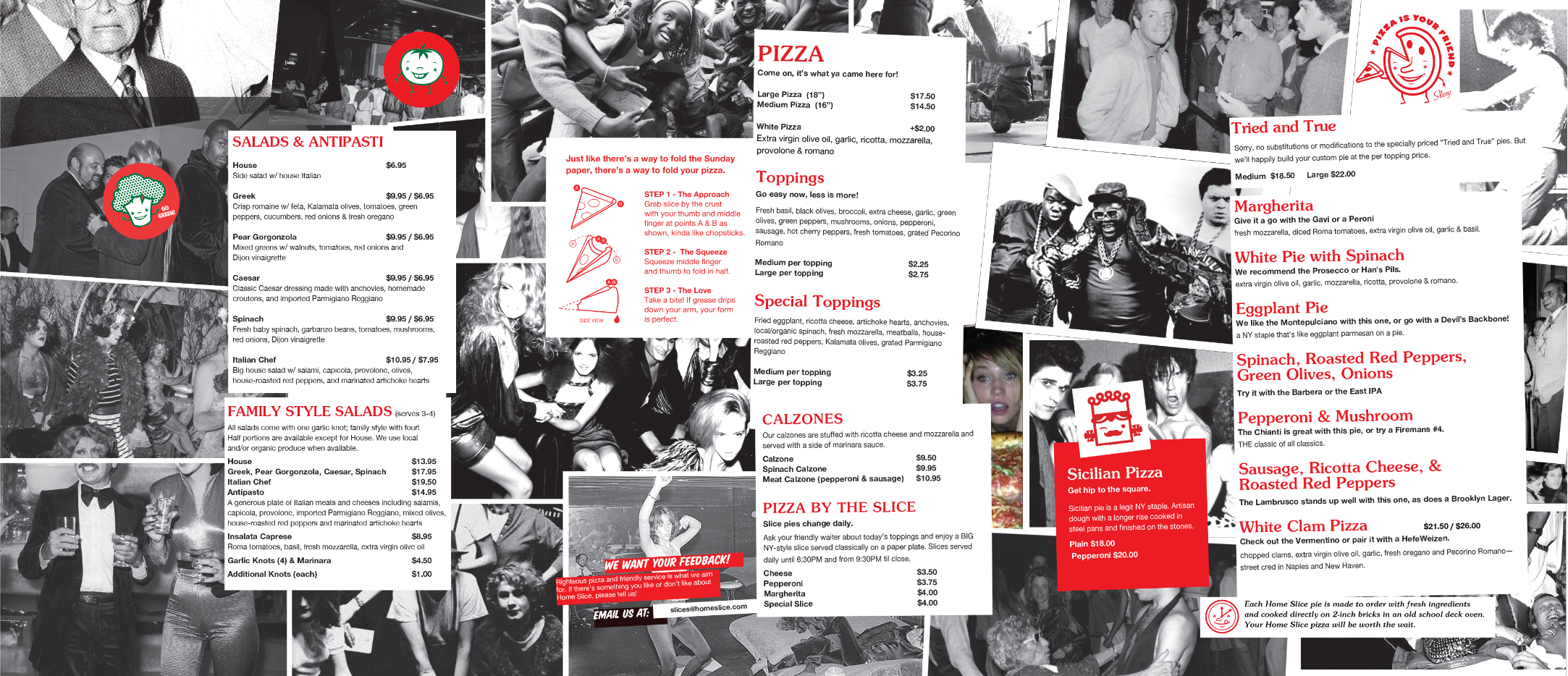
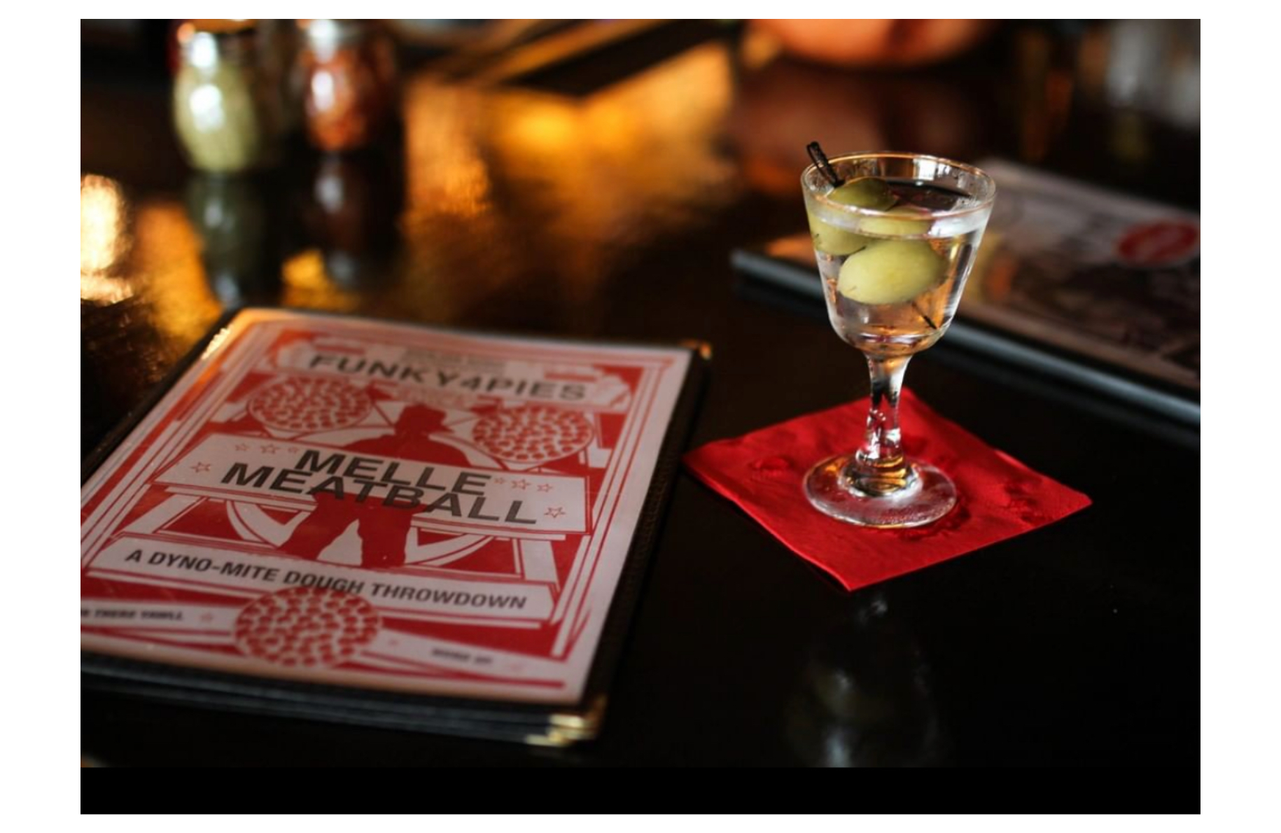
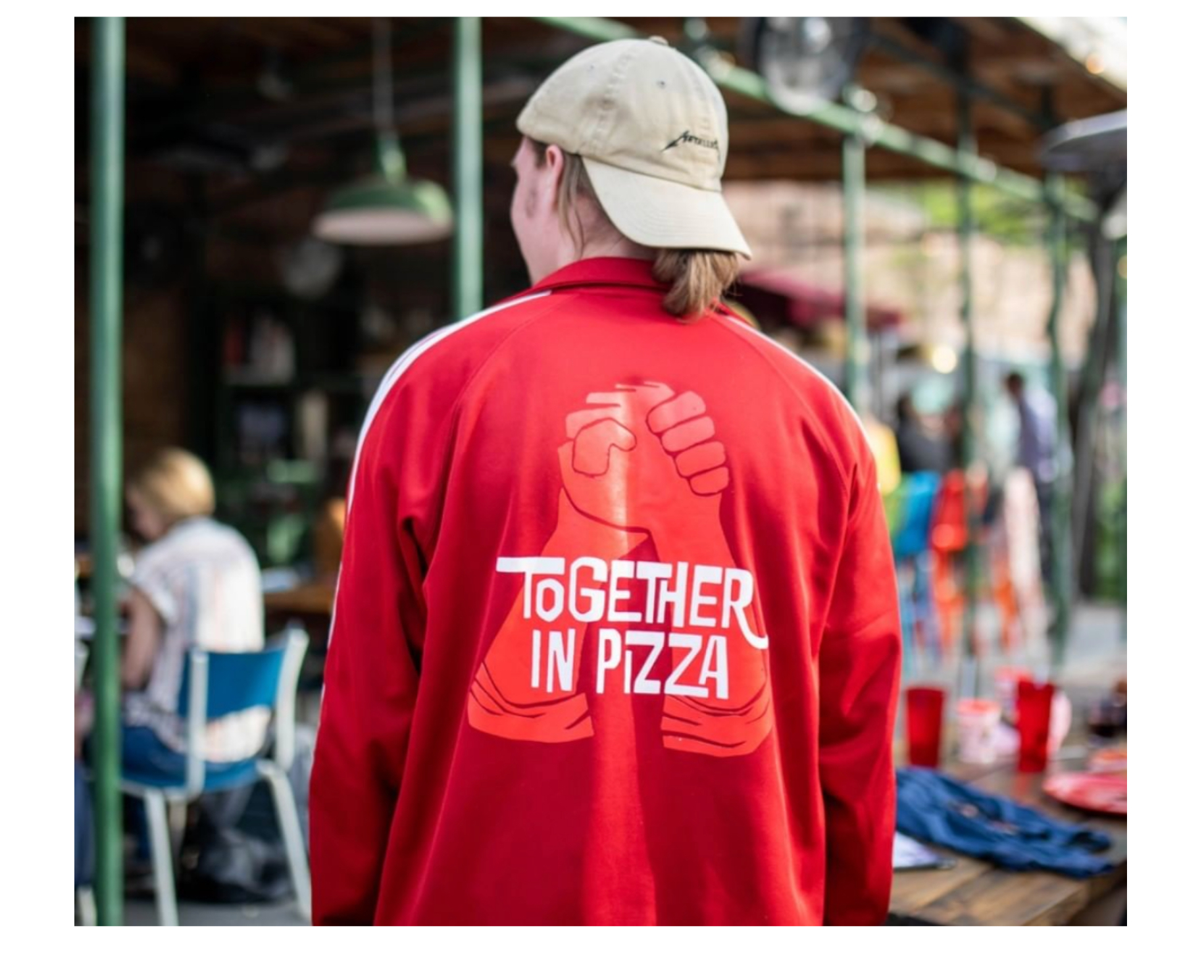
Pizza is universal. Home Slice is home town. Lewis Carnegie was asked to assist in expanding the iconic Home Slice brand for the first time outside of the legendary South Congress location. A salute to the decade when New York City went financially bankrupt and introduced the world to new thoughts on music, art and community. Disco, hip hop, punk ruled the land using simple techniques, rough materials and a work ethic indicative of the gritty 70s & 80s; wheat paste, xerox, stickers, silkscreens, stencils and spray paint, we kept the ideas hungry, fun and unforgettable.




Environmental, Identity, Web Design, Print, Packaging, Illustration
Bee Weaver Apiaries
Environmental, Identity, Web Design, Print, Packaging, Illustration
Bee Weaver Apiaries
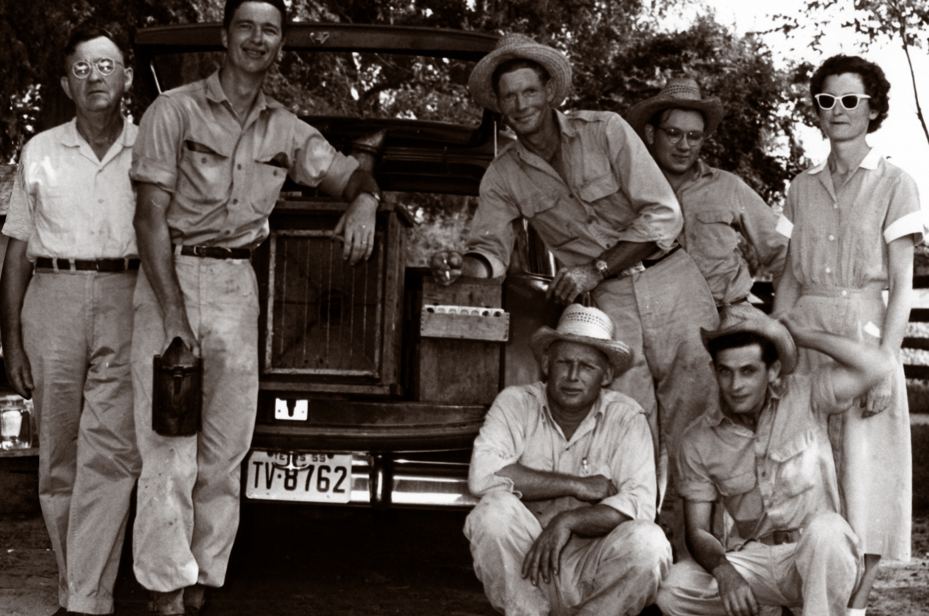
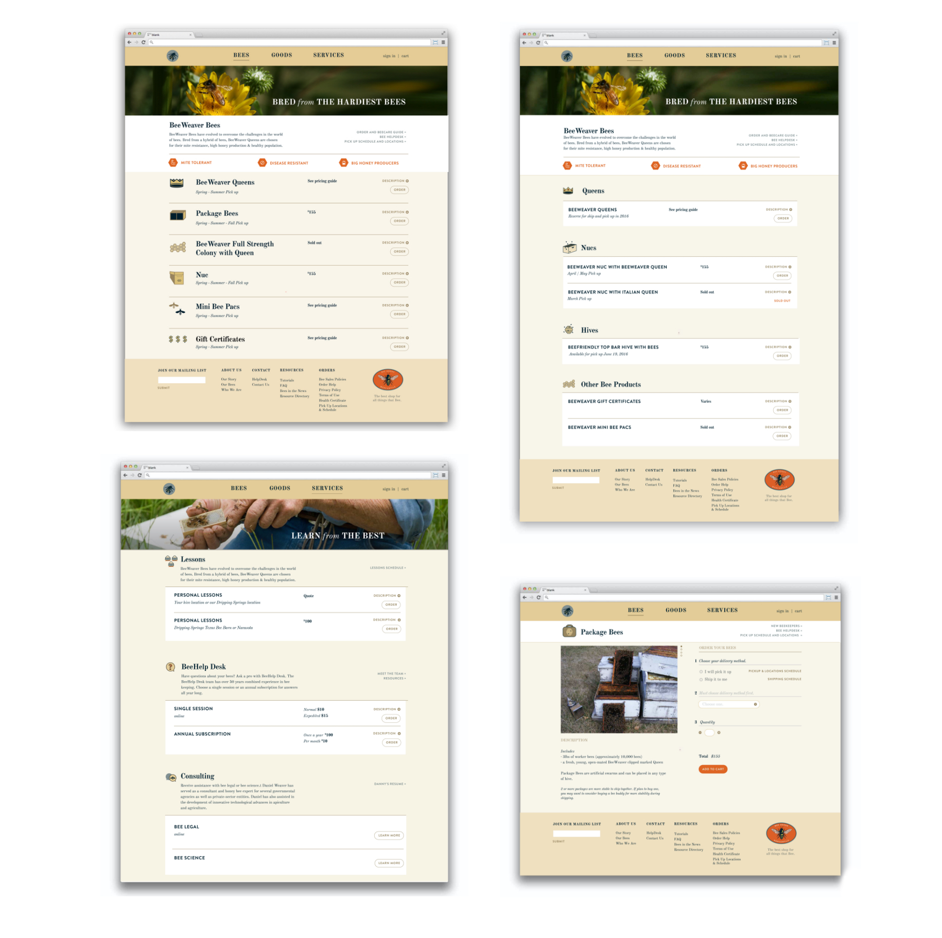
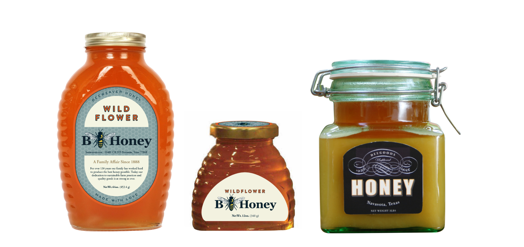
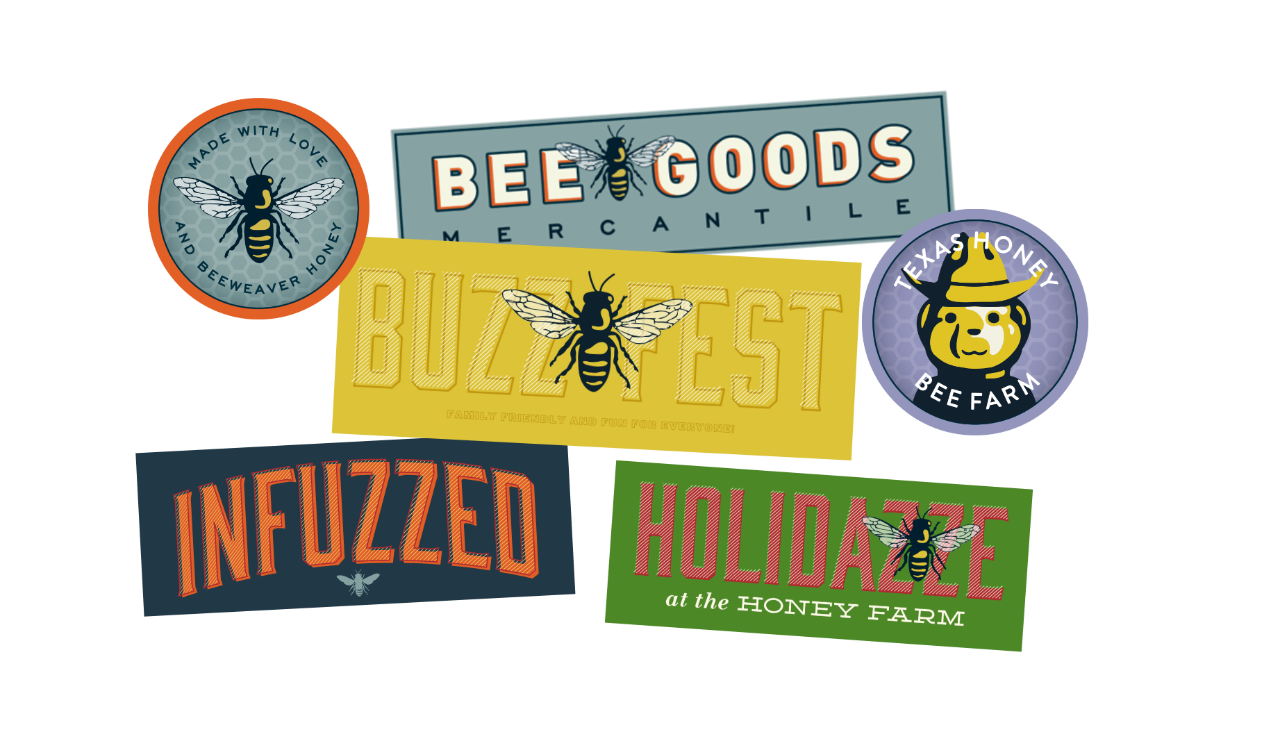
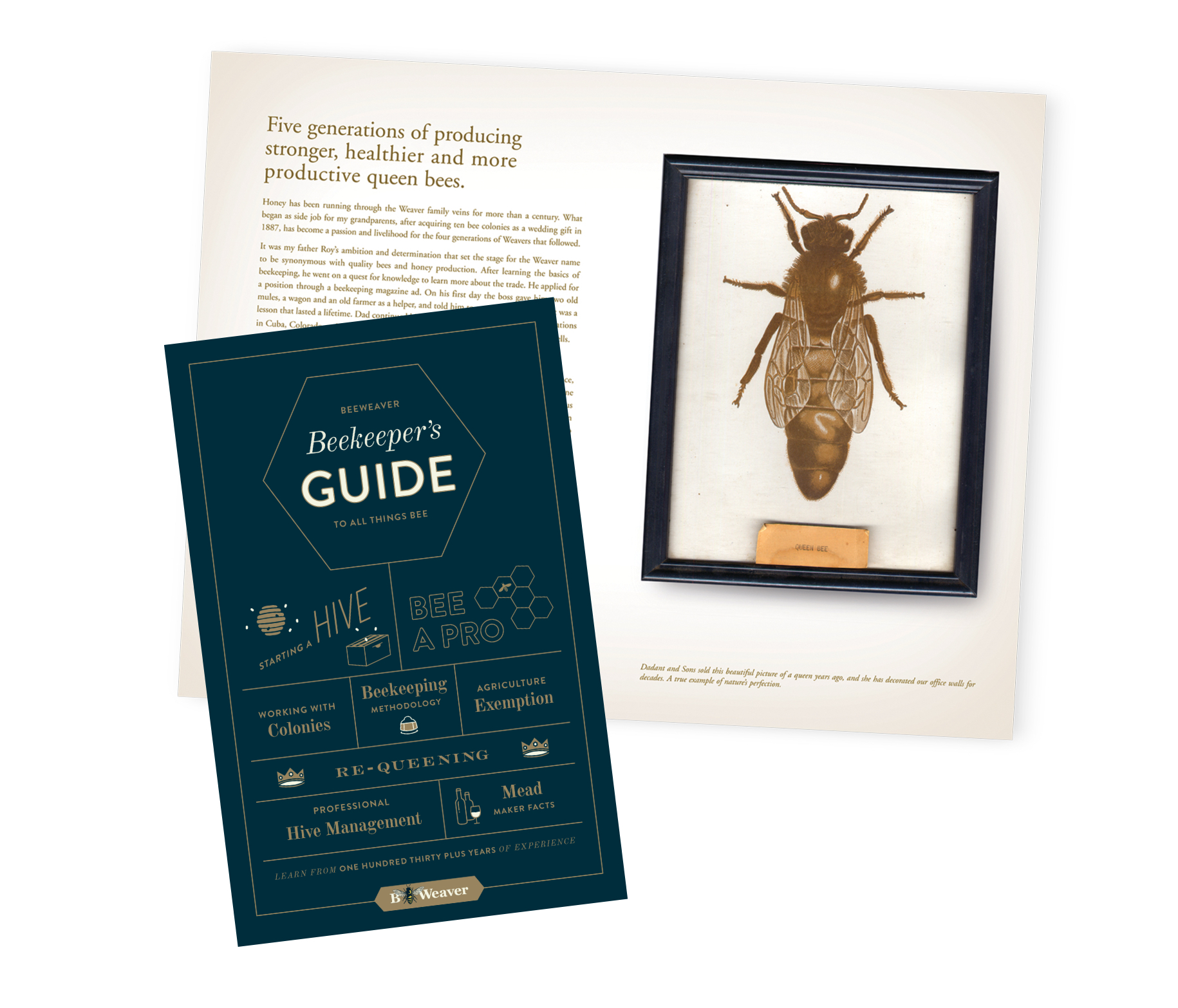
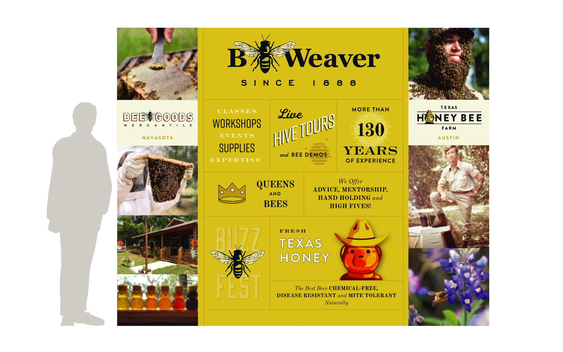
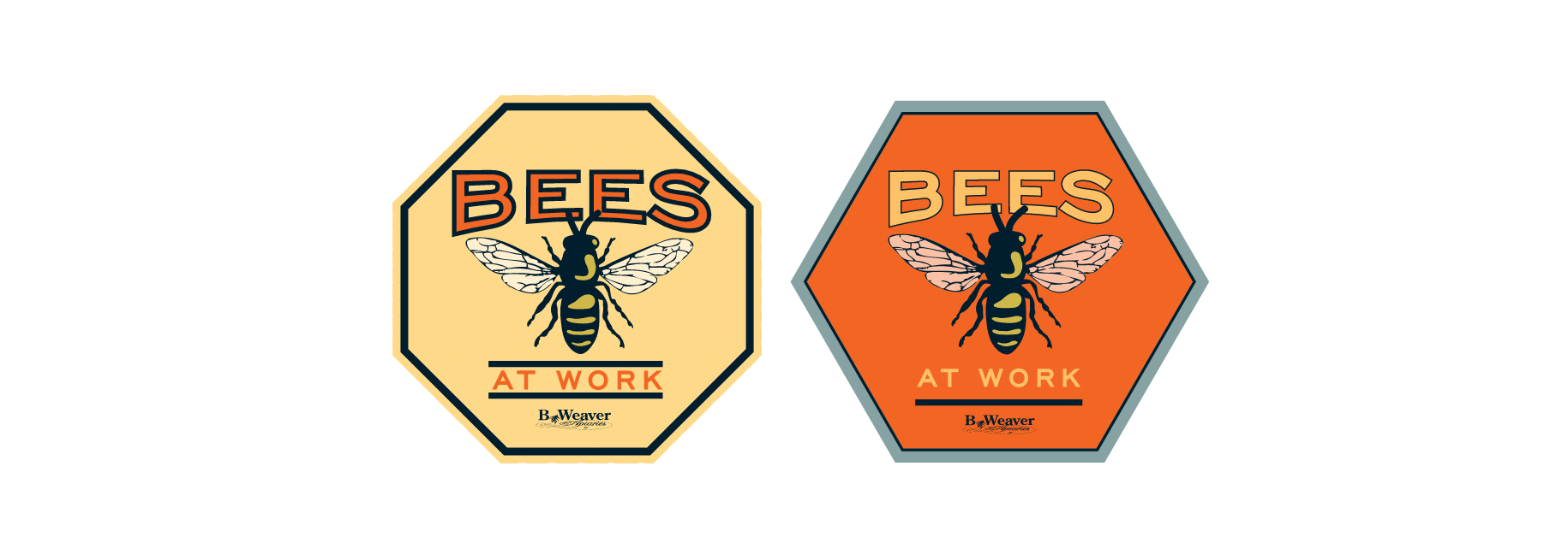
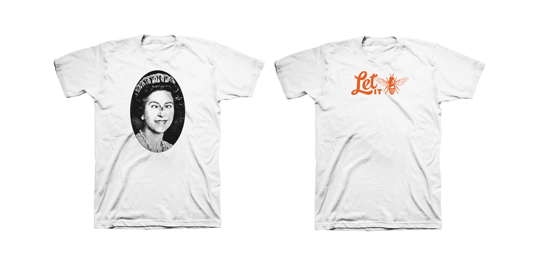
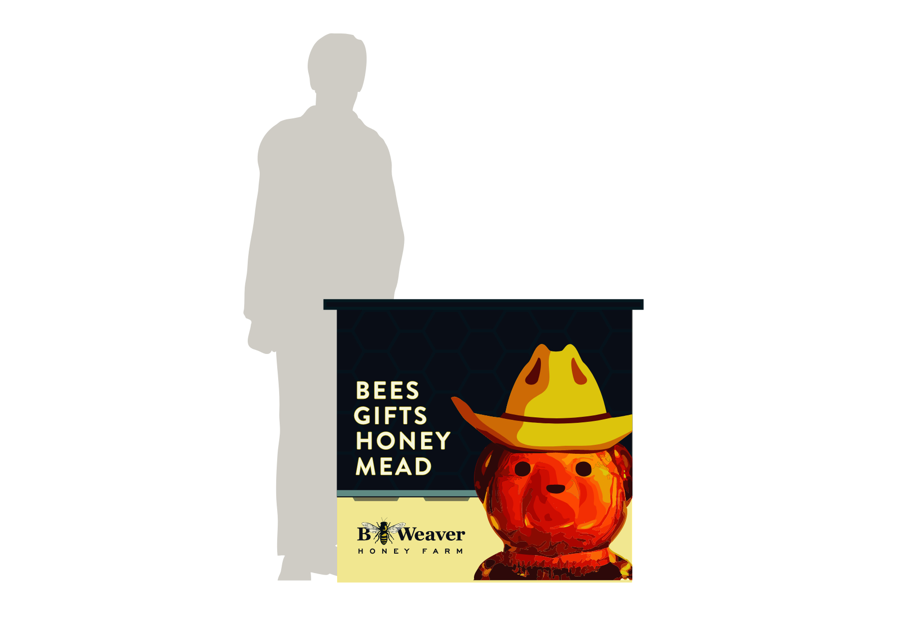
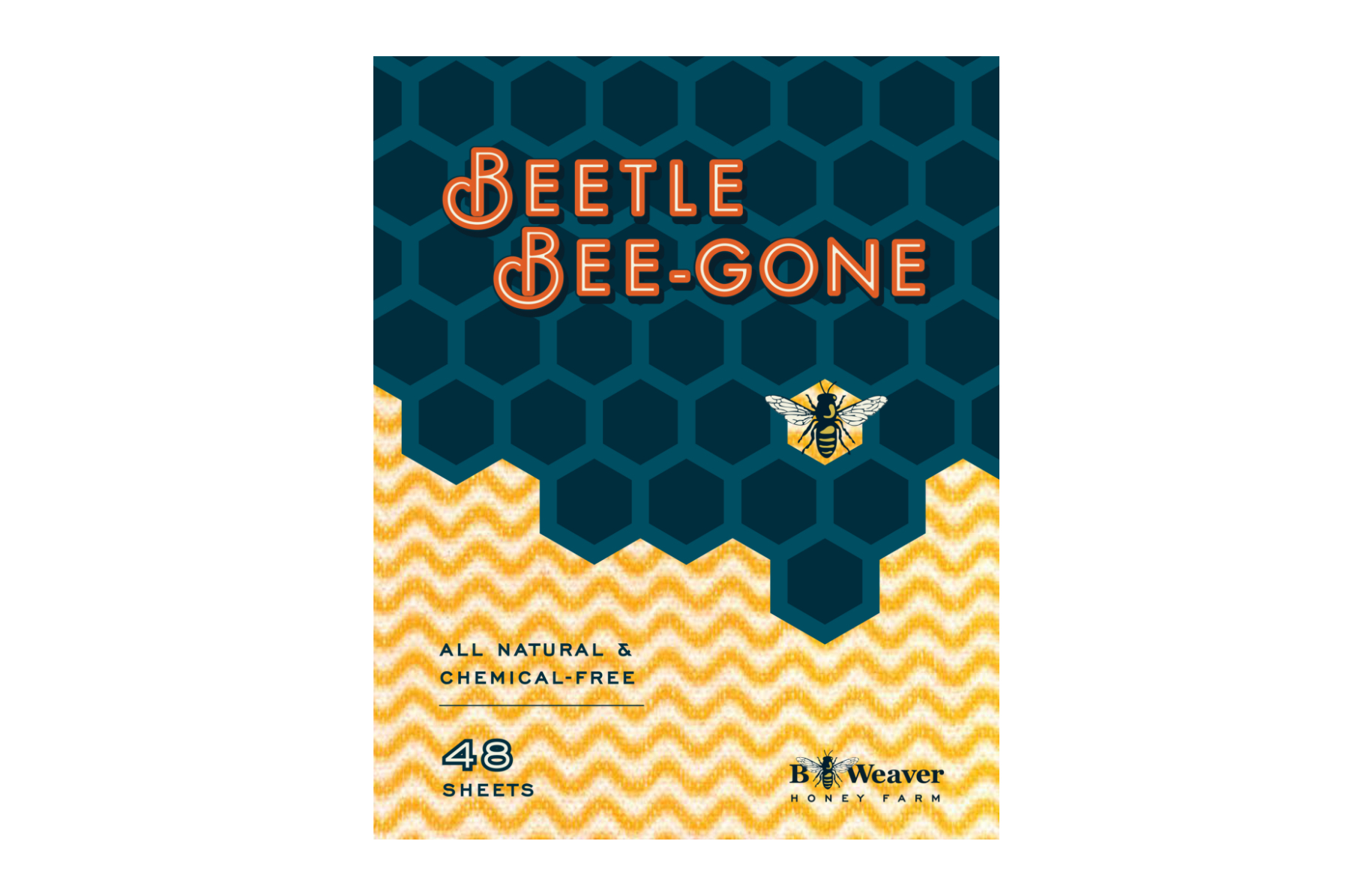
For more than five generations and 135 years, honey has been the life that has run swiftly through the Weaver family veins. Finding that voice to speak to the history, innovation, ingenuity and humanity, LewisCarnegie is always expanding and adapting upon the Weaver brand. A cross section of media was utilized: print, illustration, way finding, packaging, point of purchase, development, merchandising, handshakes and high fives. Bee Good Y'all!




Environmental, Identity, Web Design, Print, Packaging, Illustration
By George
Environmental, Identity, Web Design, Print, Packaging, Illustration
By George
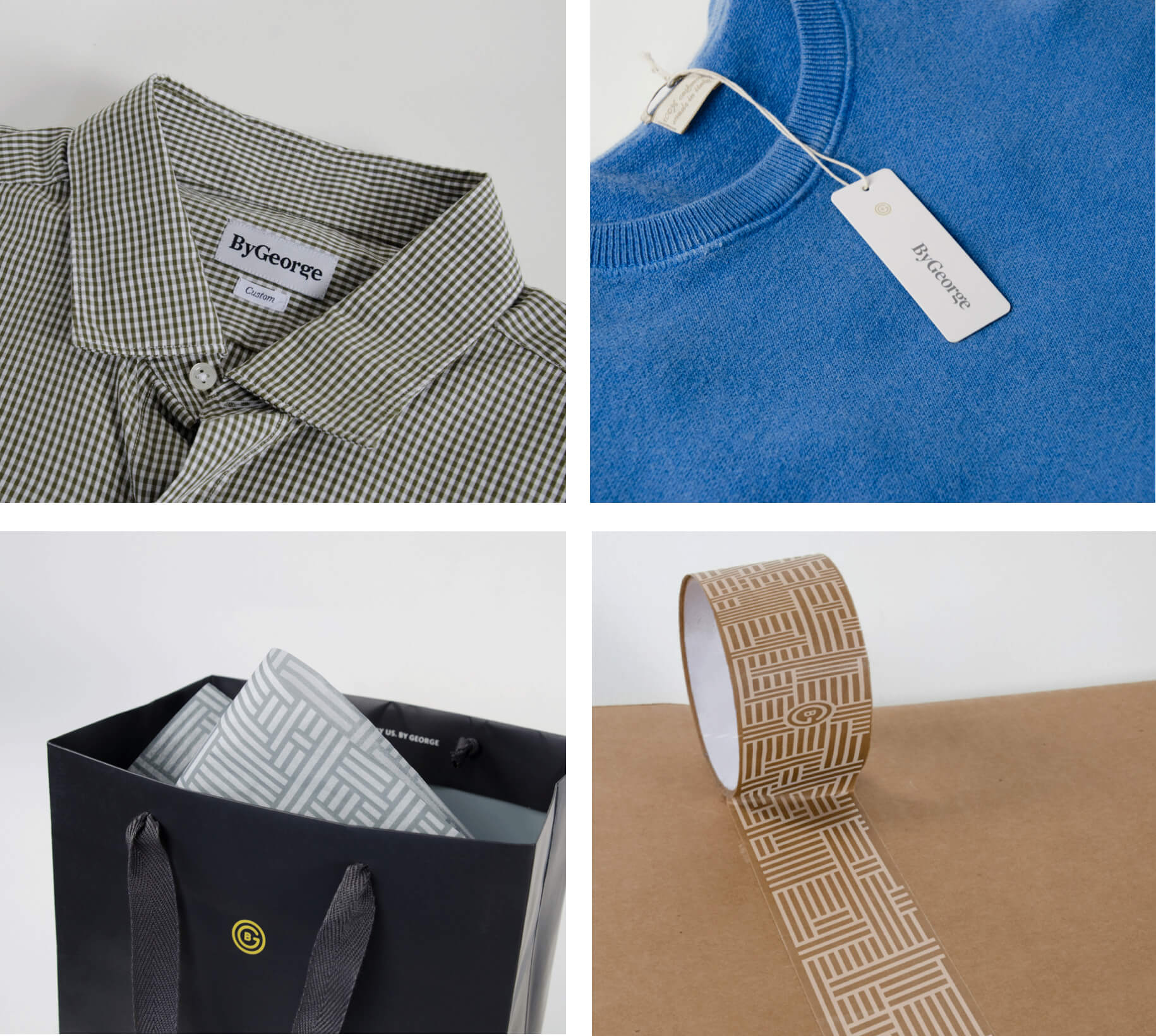
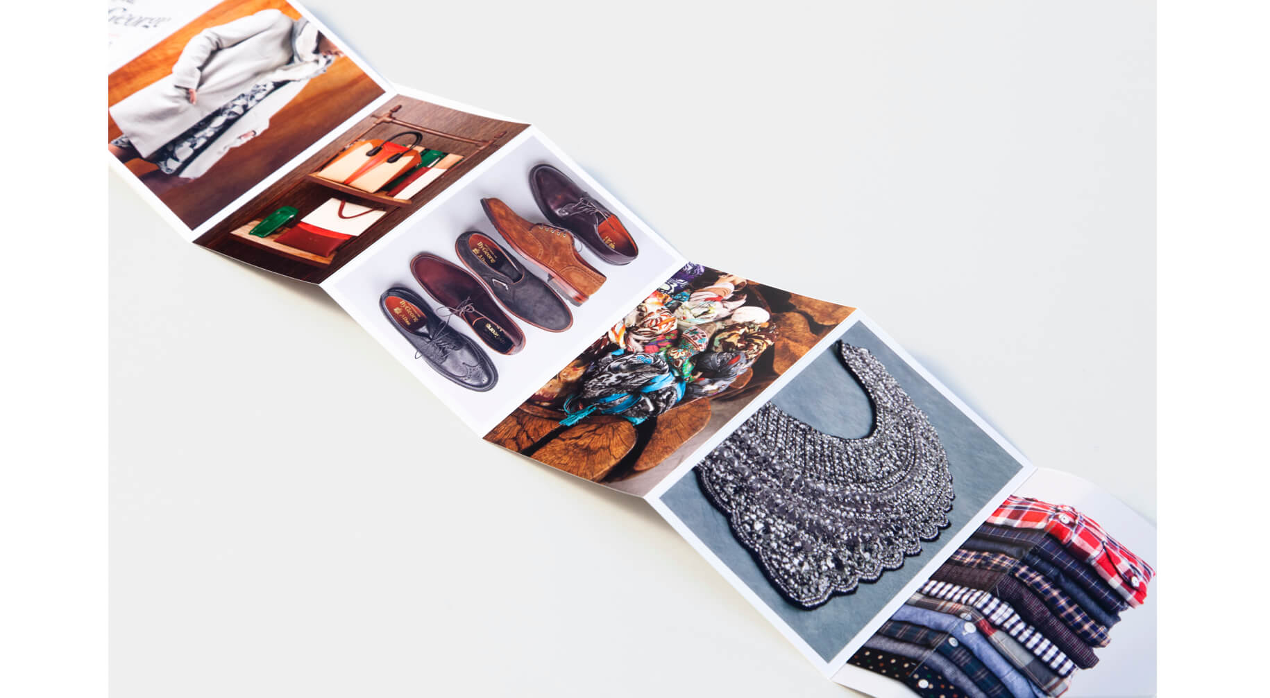
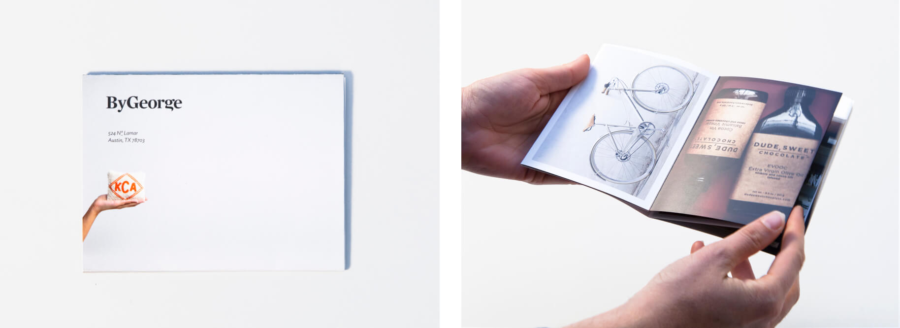
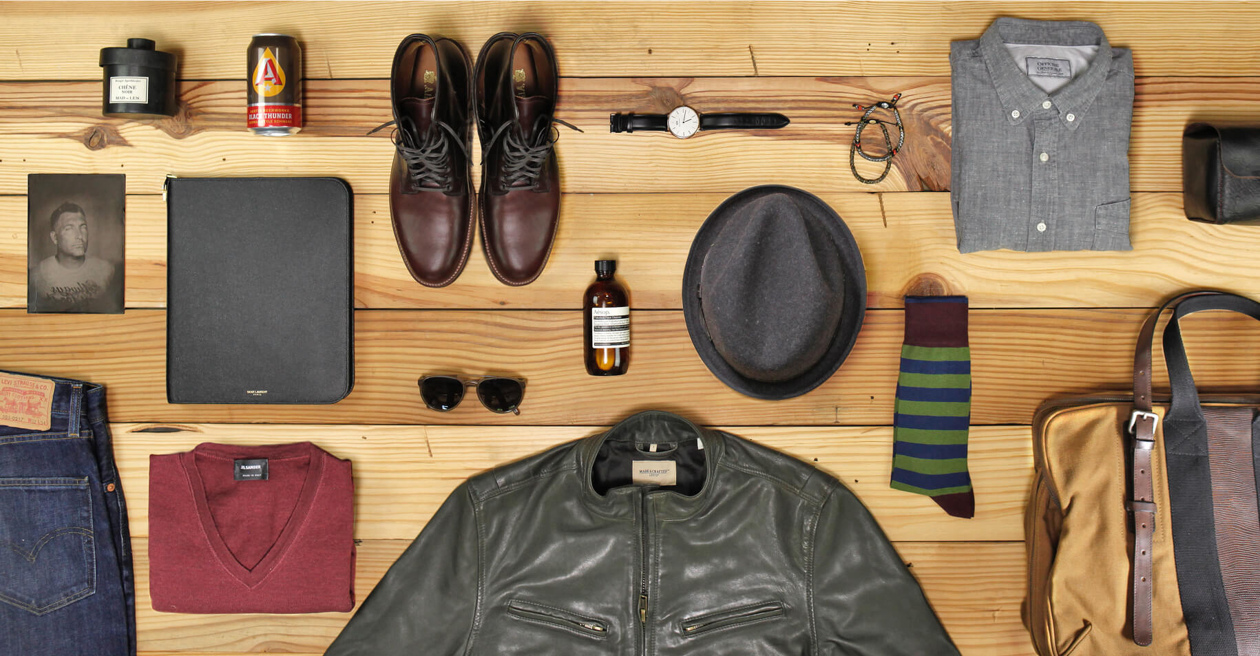
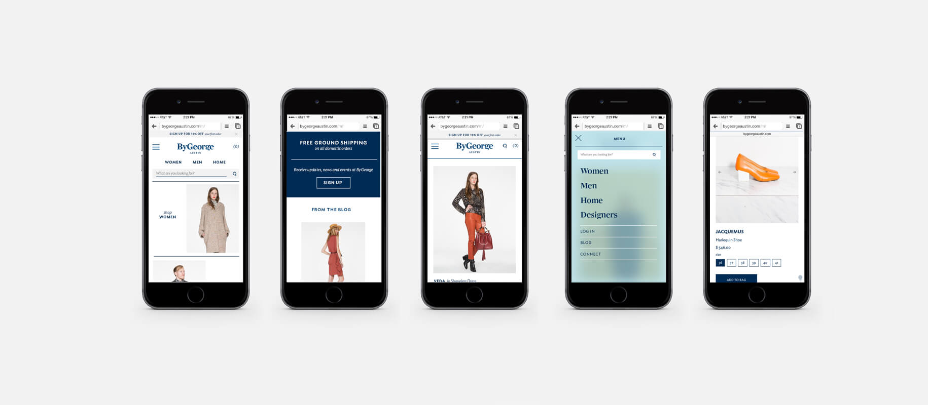
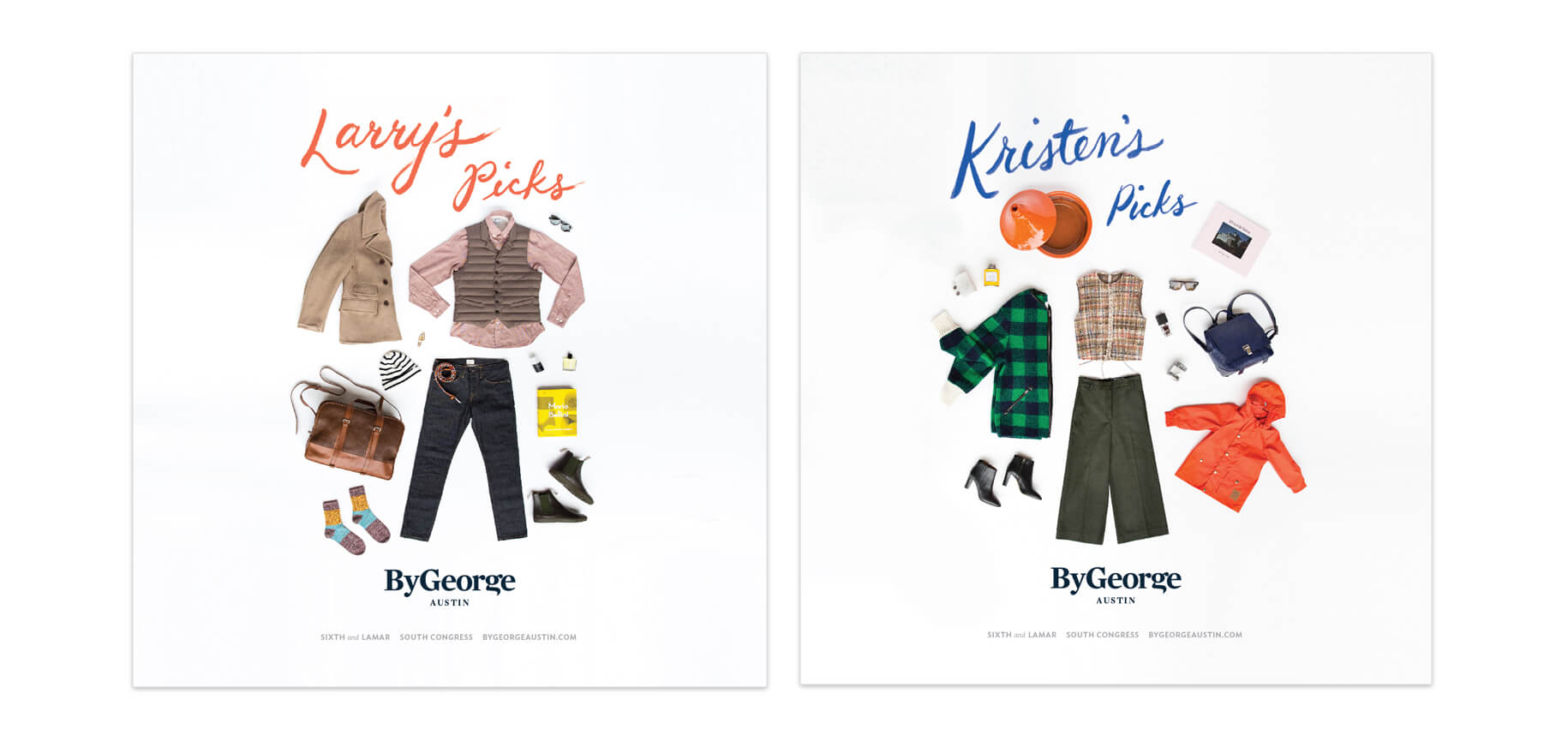
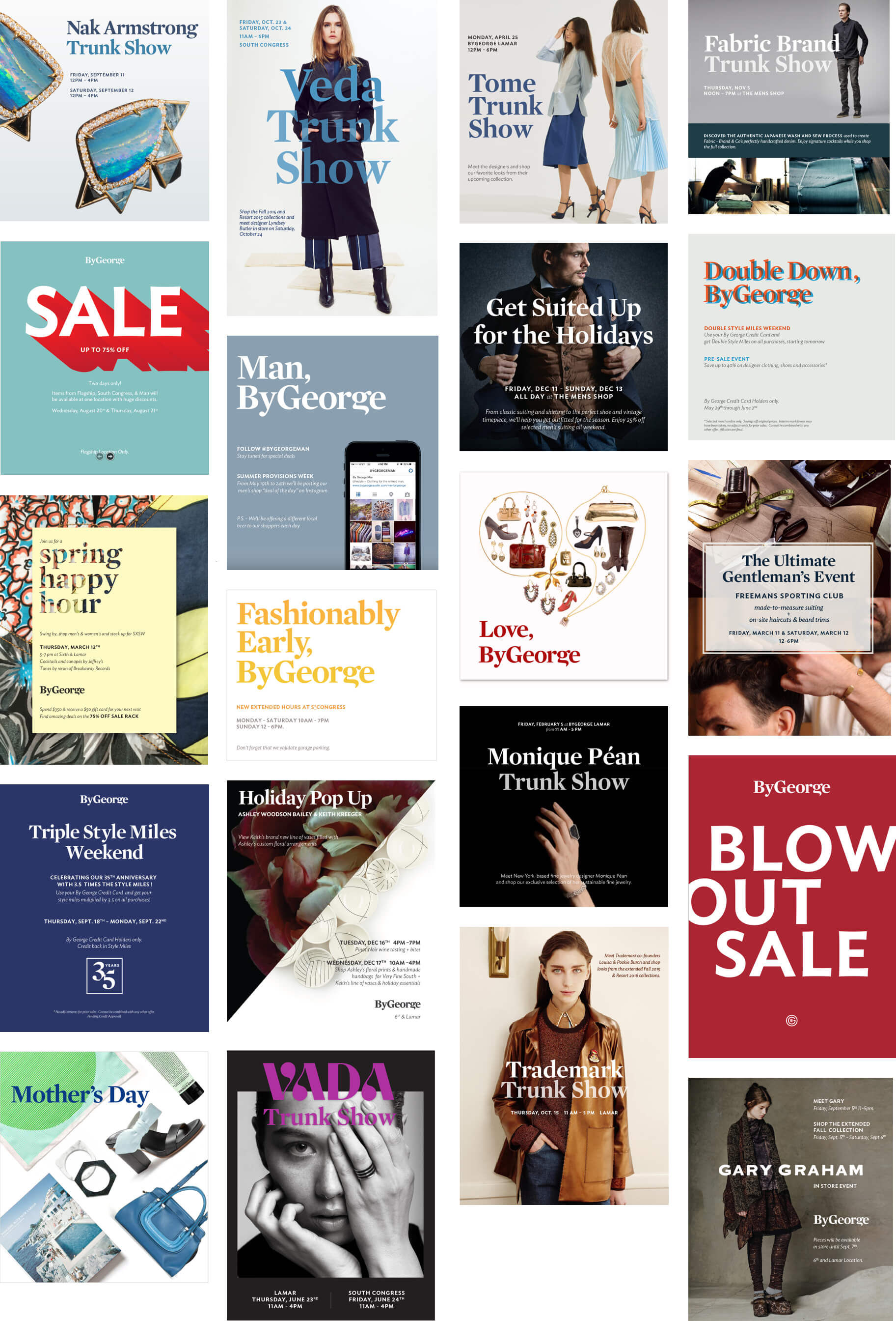
ByGeorge is an Austin-based, nationally recognized fashion and lifestyle store known for their carefully curated style. We worked with longtime owners Matt and Katy Culmo through multiple stages of growth – from their small boutique on Guadalupe to their flagship and South Congress store, brief mistrials with other designers and finally through their purchase by new owner Larry McGuire of McGuire Moorman Hospitality. We’ve touched every aspect of their marketing and design; including rebranding, their first e-commerce, responsive desktop and mobile websites, packaging, promotional collateral, windows and signage, e-mail campaigns and advertising.
Identity, Print, Illustration, Outreach
Austin Bat Cave
Identity, Print, Illustration, Outreach
Austin Bat Cave
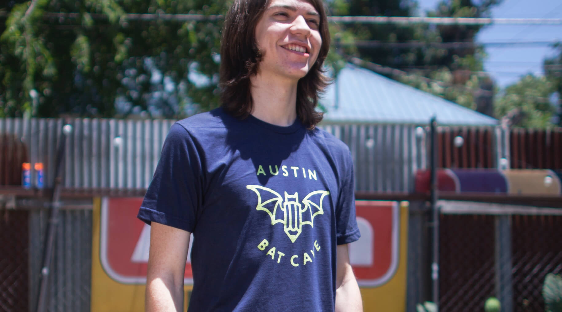
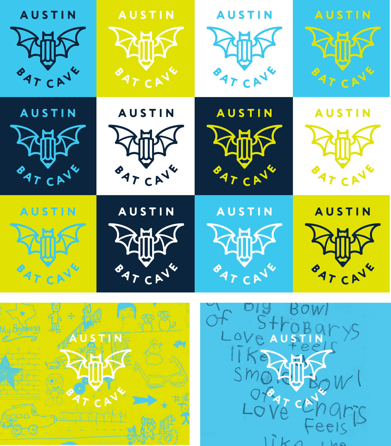
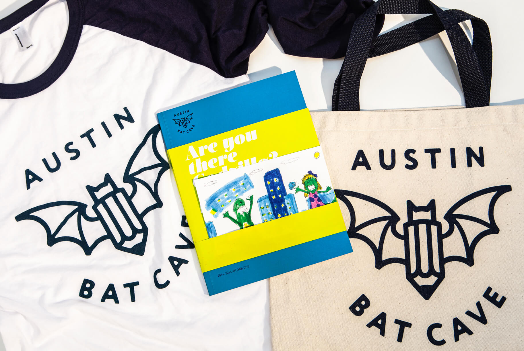
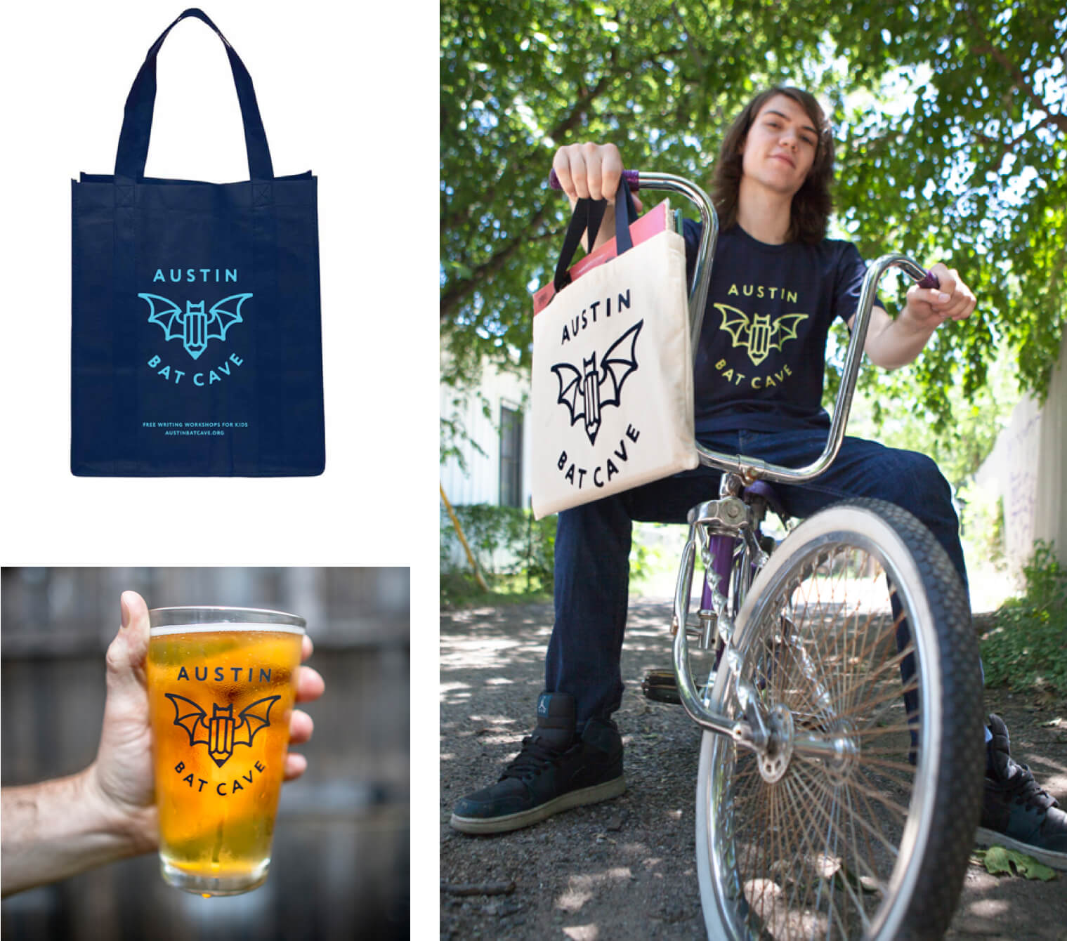
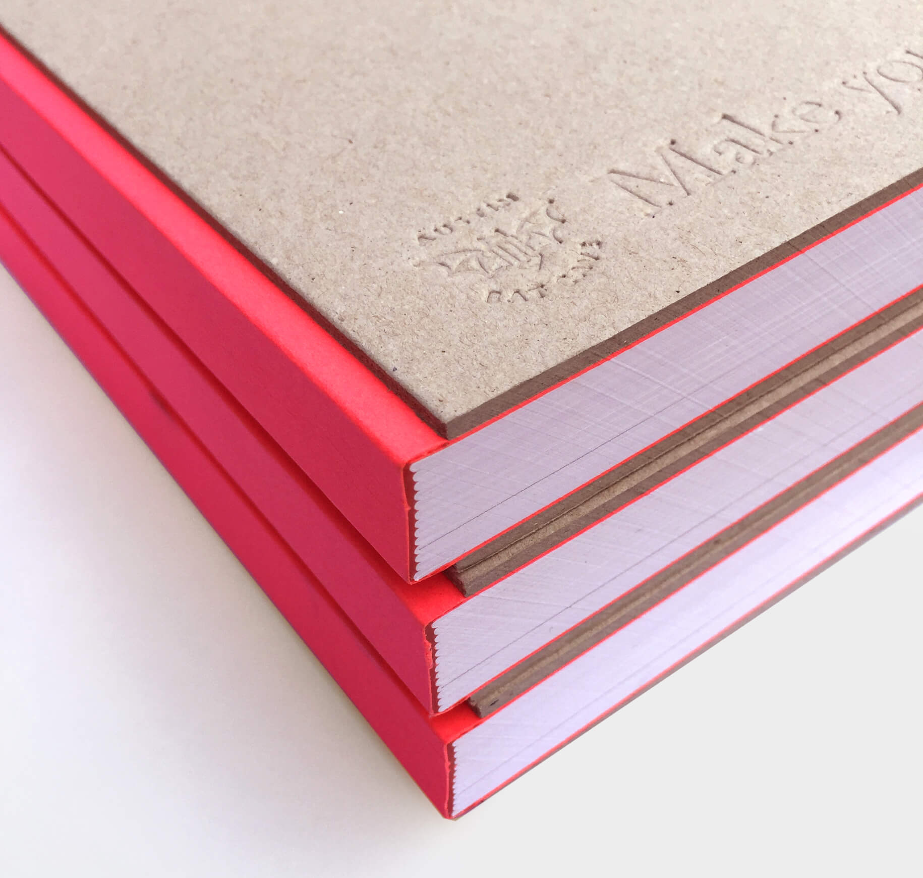
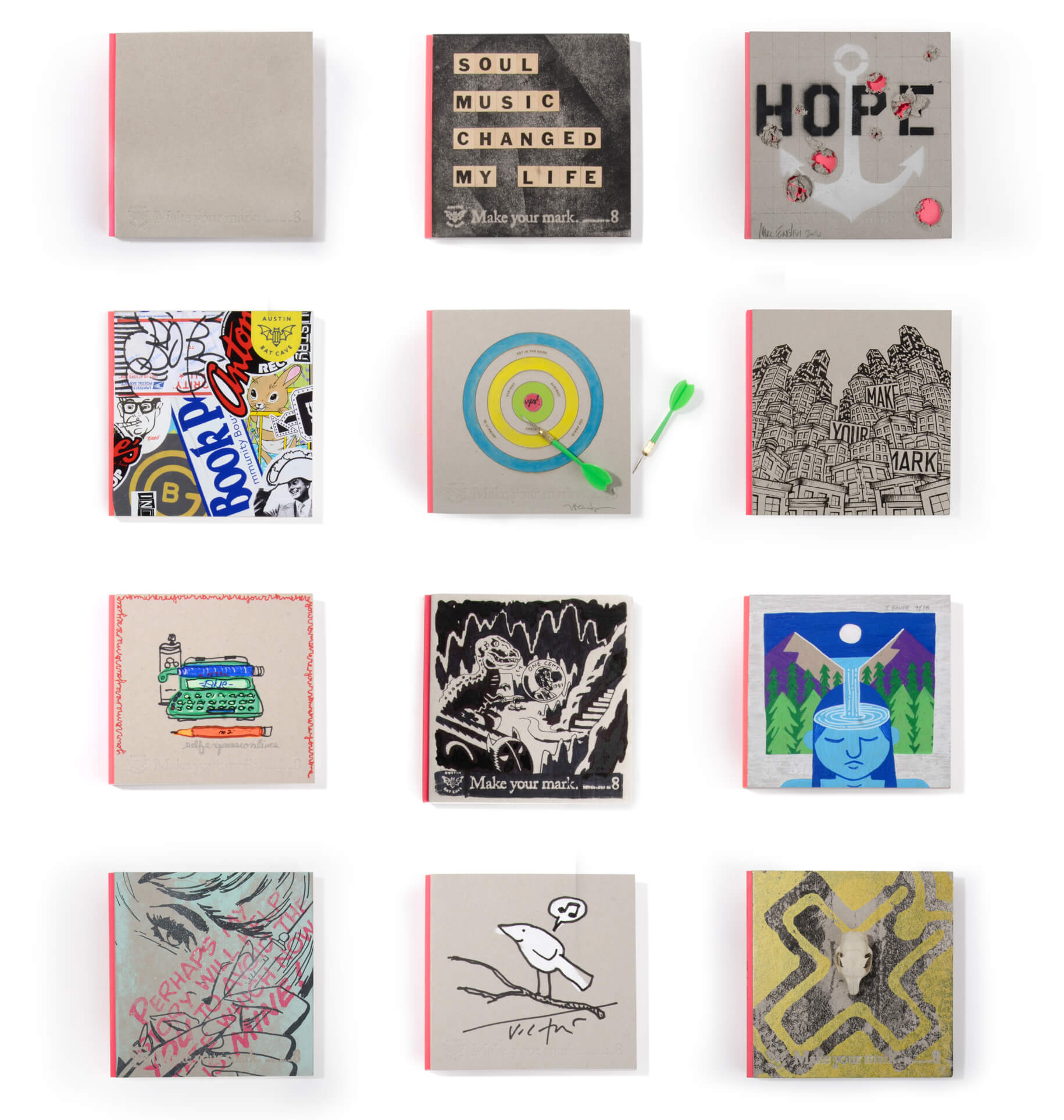
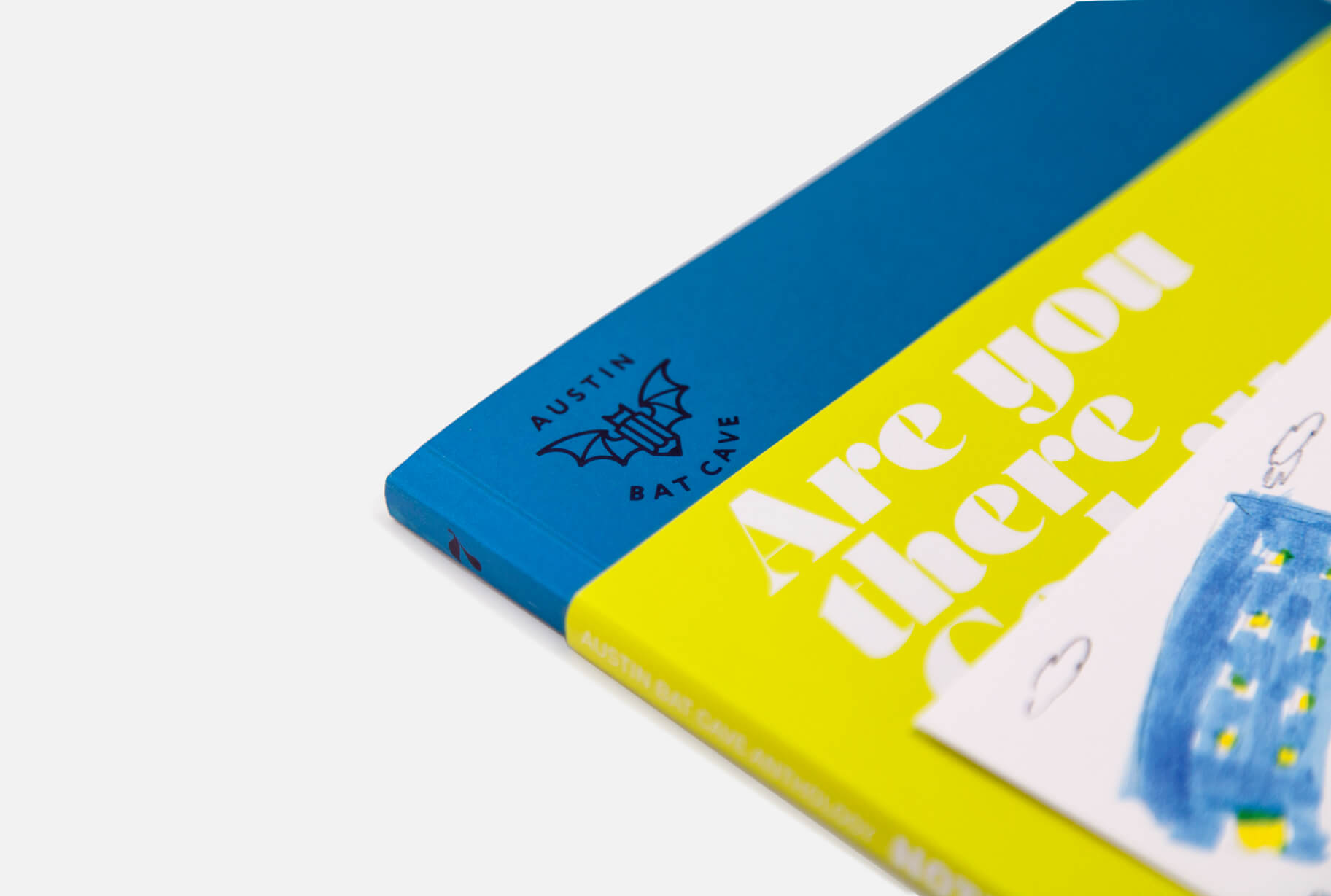
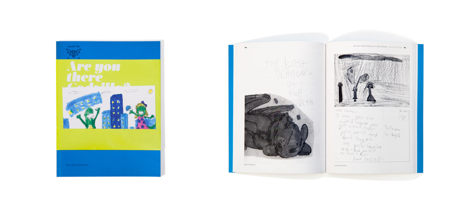
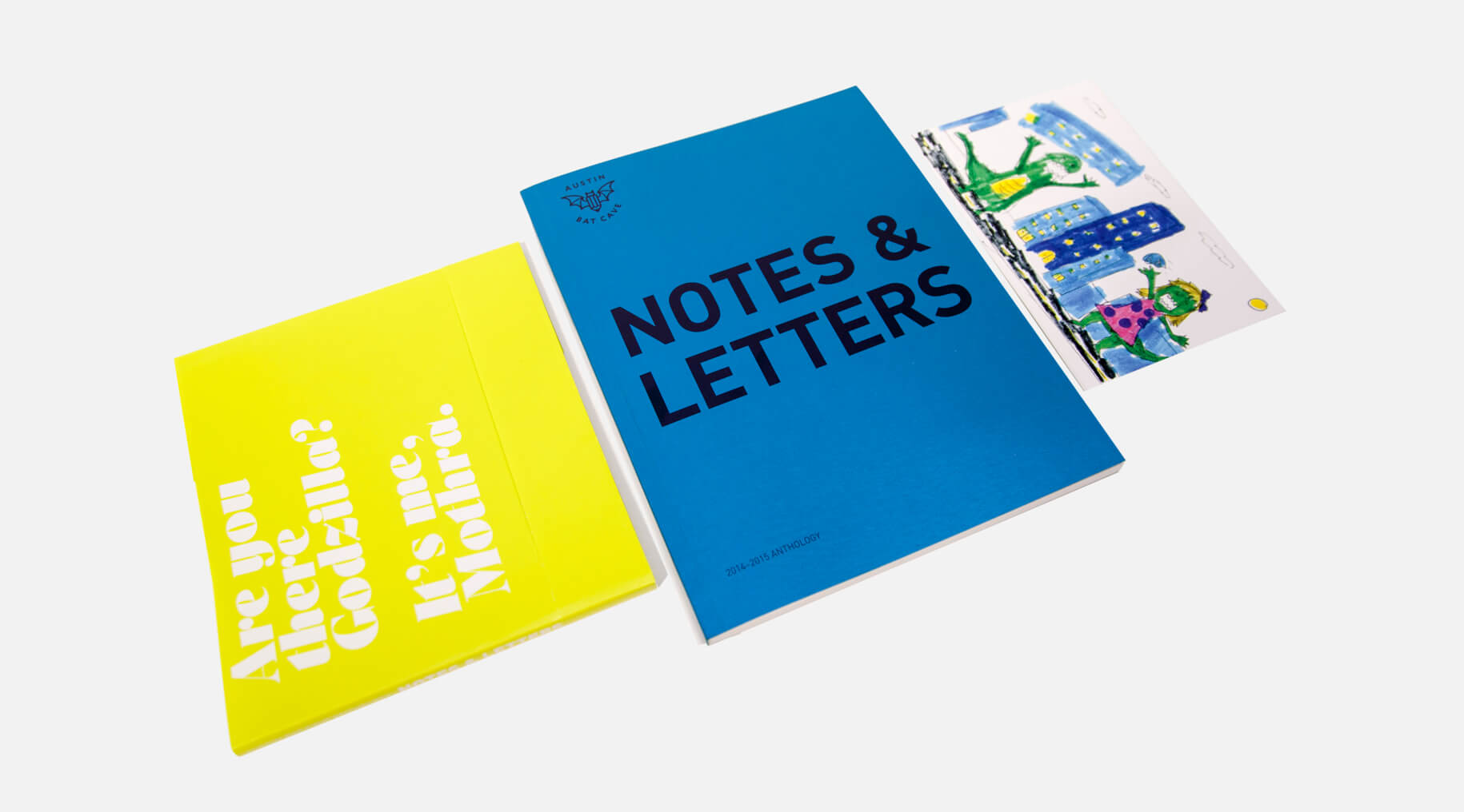
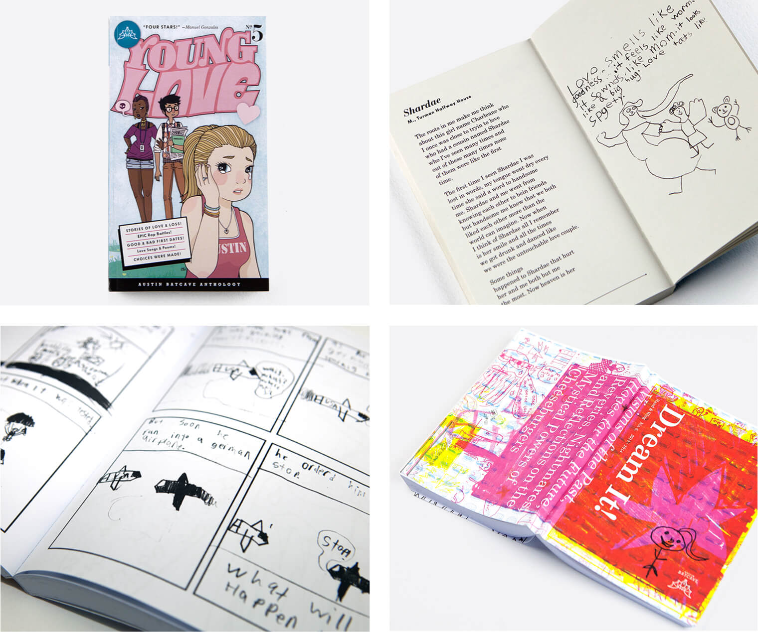
Putting bats back in the alphabet since 2007. Austin Bat Cave is a super-fun non-profit that connects local students with fiction writers (like Rick Moody!), playwrights, poets, musicians (like Bill Callahan!), local non-profits and other volunteers for writing workshops and tutoring. Lewis Carnegie offers our studio space and poster design for their various great events, as well as the layout and design of their annual anthology of student work.
Identity, Web Design, Print, Illustration
Olmsted-Kirk Paper
Identity, Web Design, Print, Illustration
Olmsted-Kirk Paper
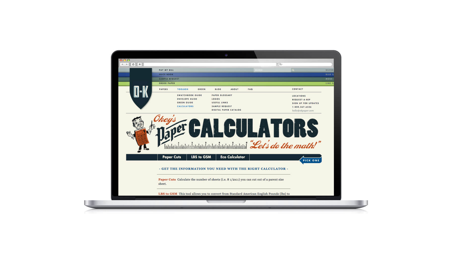
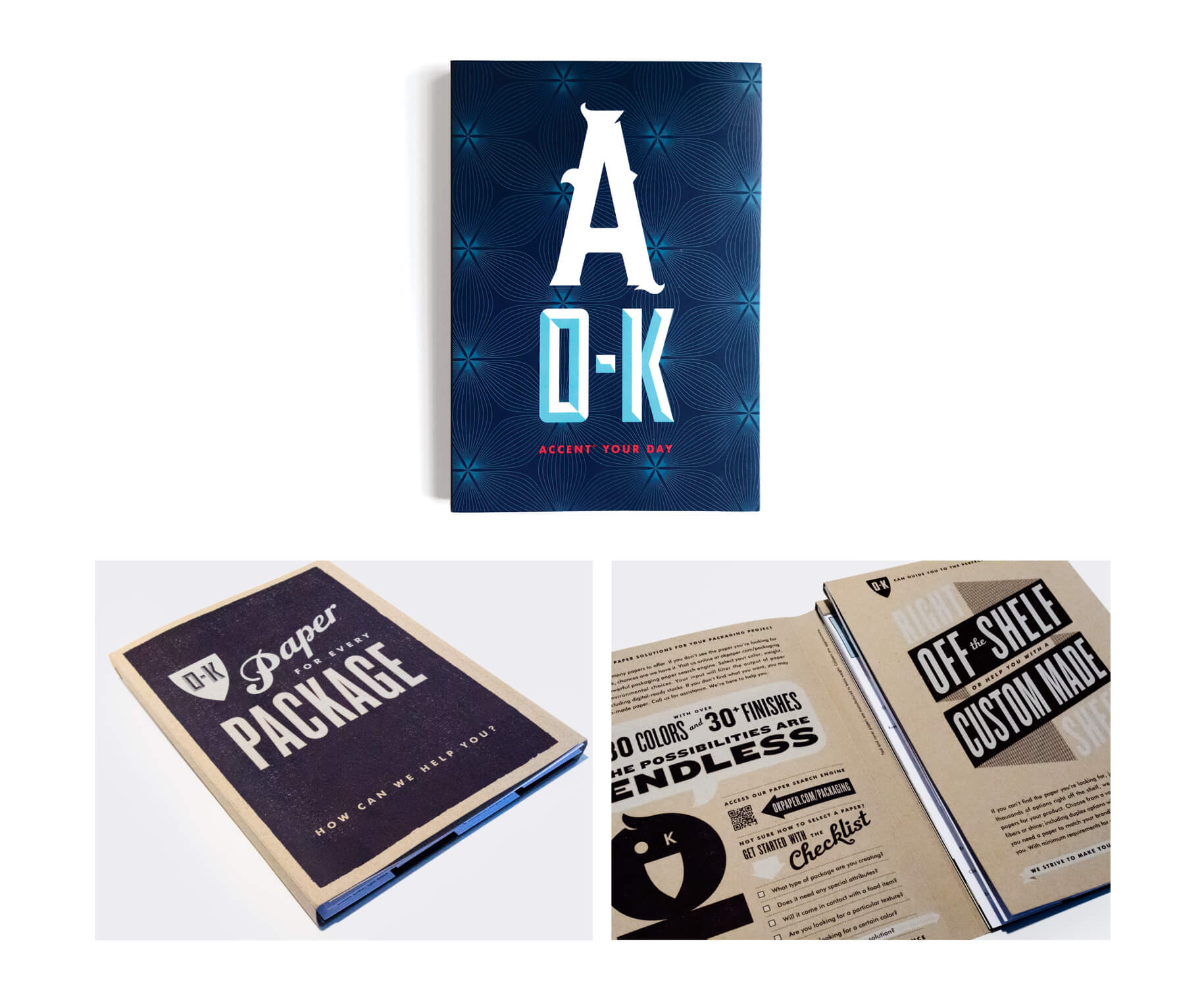
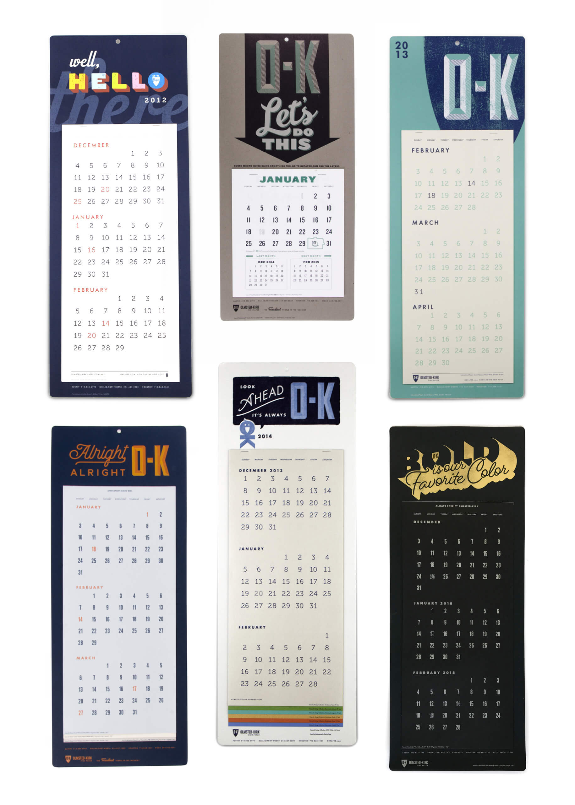
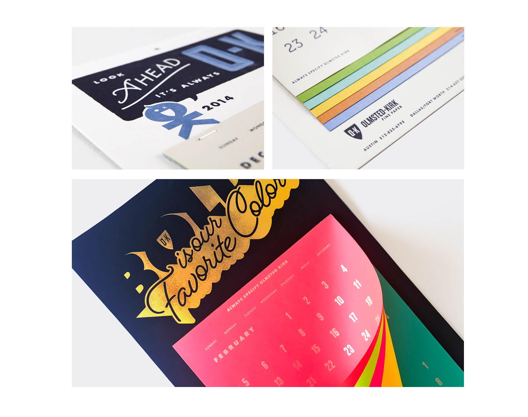
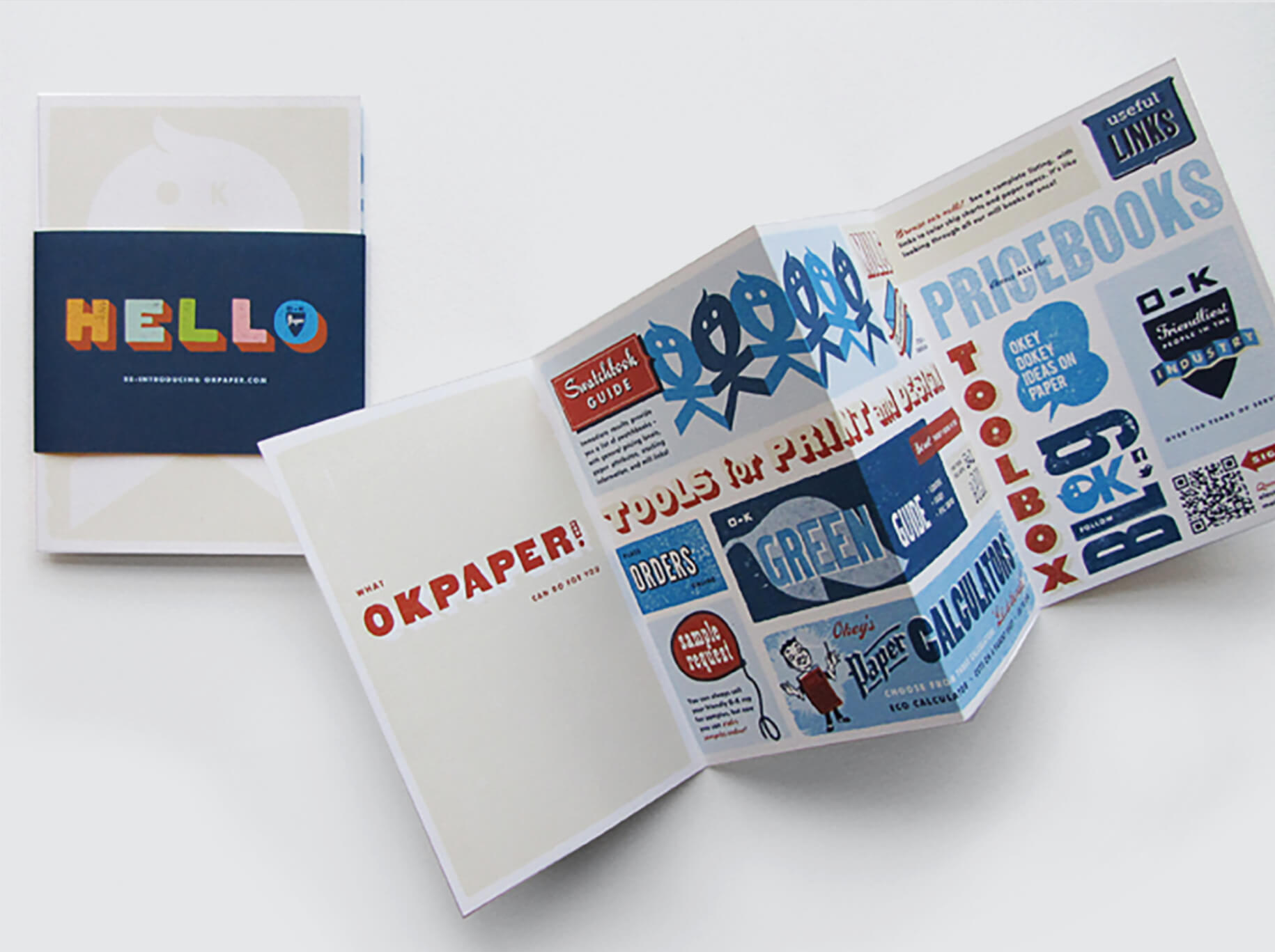
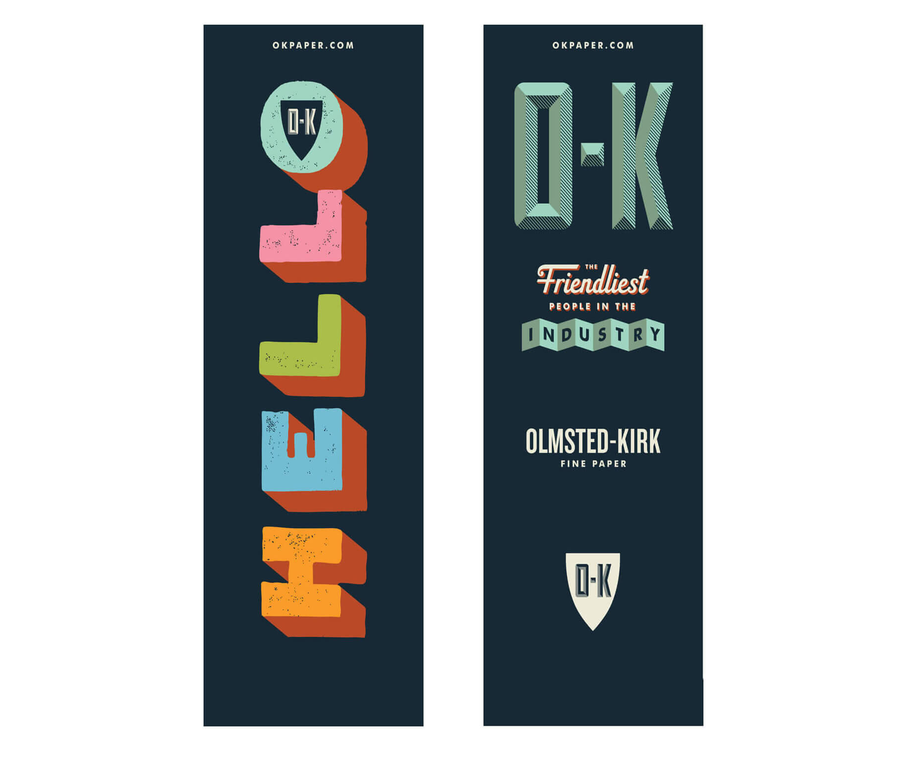
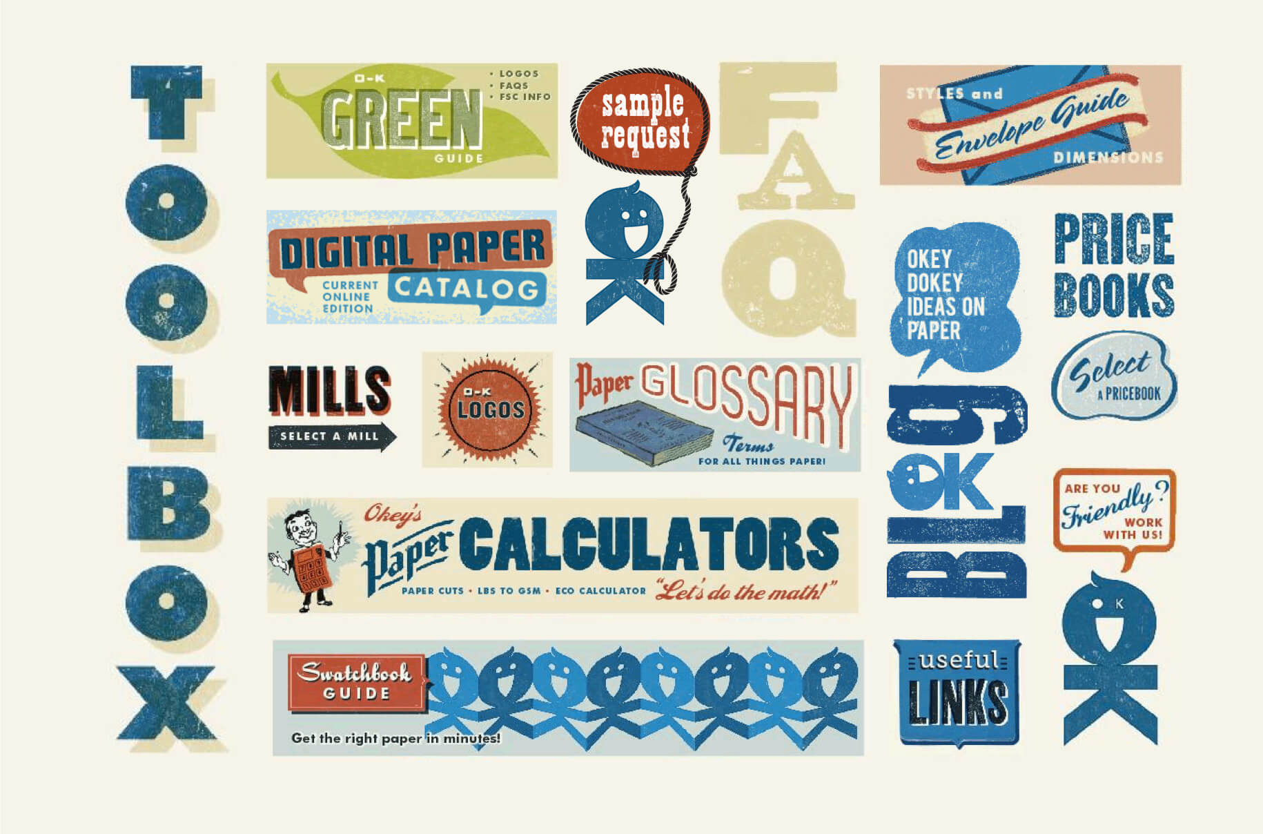
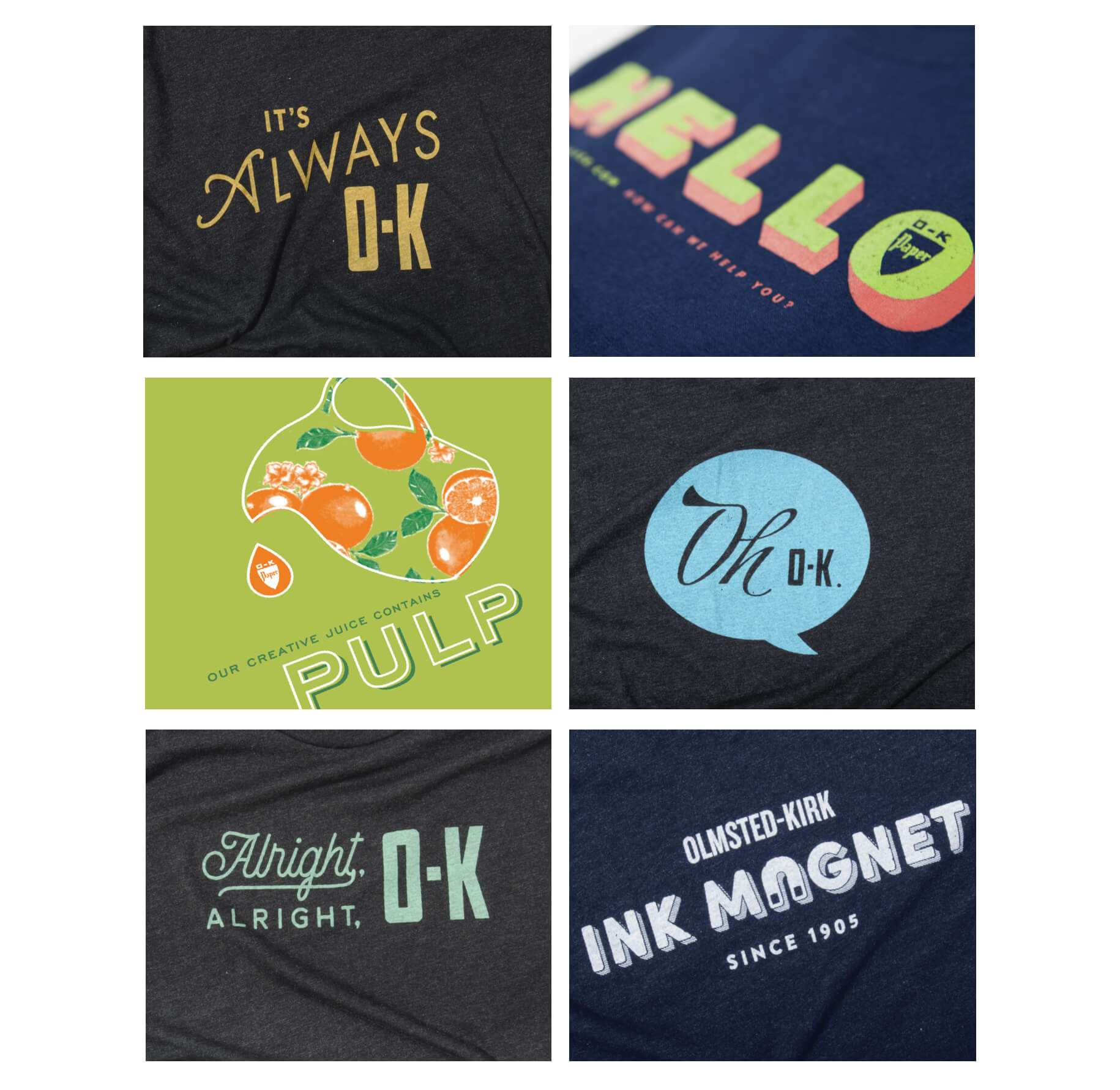
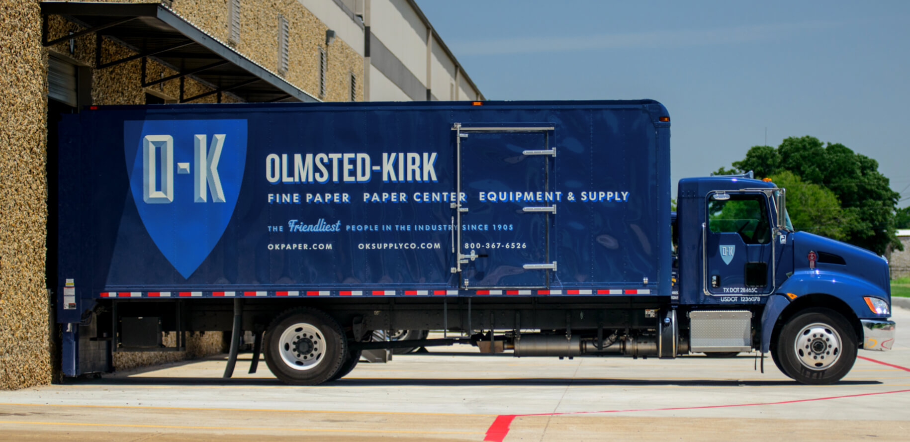
O-K Paper Company is over a hundred years strong. Over time the company divided by industry, with completely different branding for each industry. It was time to bring the family back together. Inspired by their long-time mantra “the Friendliest People in the Industry” – we built a universal brand to tie all the companies together using the shield, a lively color palette and playful typography. We designed a new website to showcase O-K’s custom tools and easy-to-access paper resources for both designers and printers. The navigation incorporates a waterfall of colored paper, allowing O-K to feature different paper lines and swap them out easily. With a cheerful brand comes non-stop opportunities to play with the name and definition of O-K, and apply them to any form of giveaways from t-shirts to patches, swatch books to calendars – it’s always O-K. Get it? We made O-K great again. Alright, Alright, O-K…. that’s enough.


Web Design, Print
Signature Course Stories
Web Design, Print
Signature Course Stories
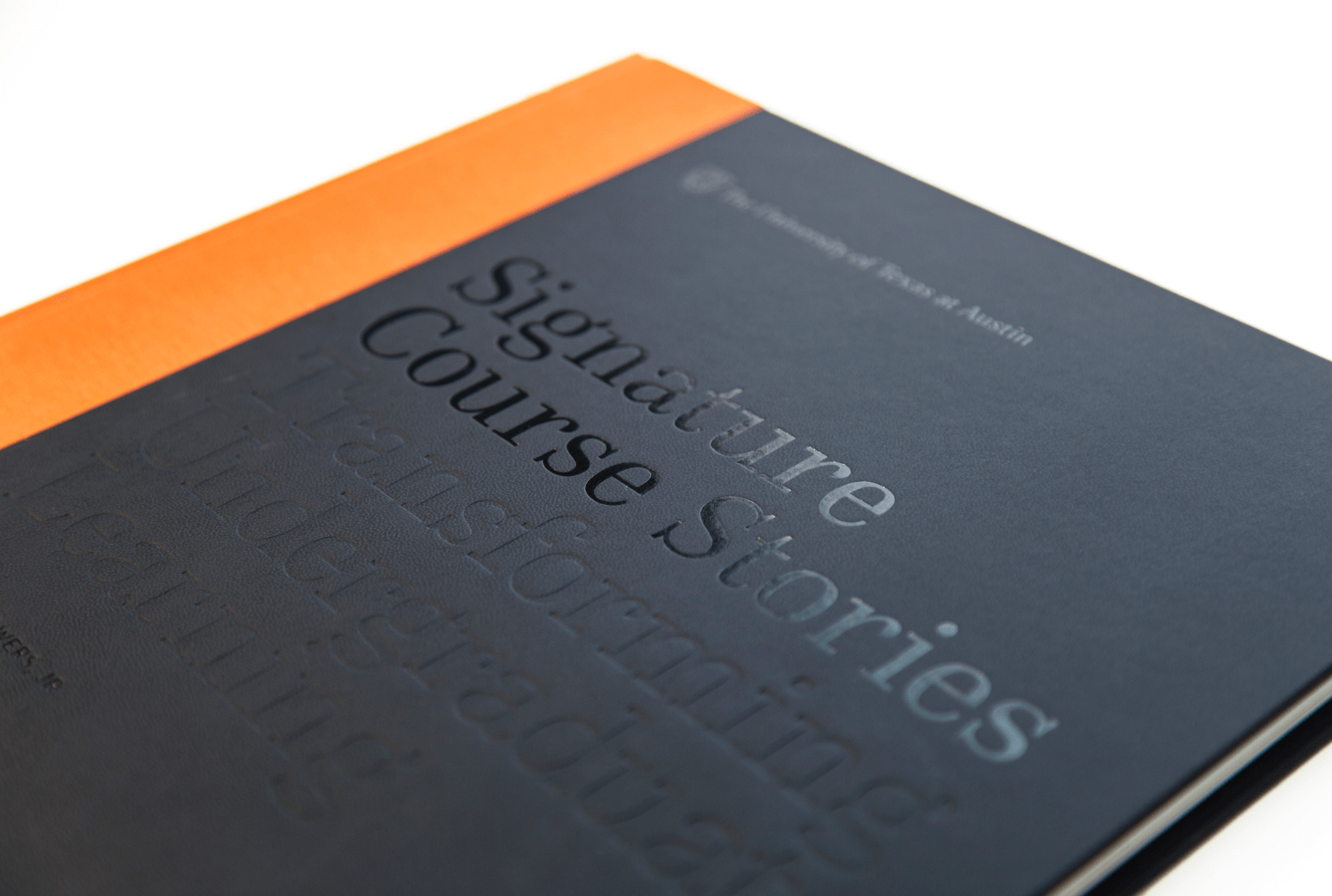
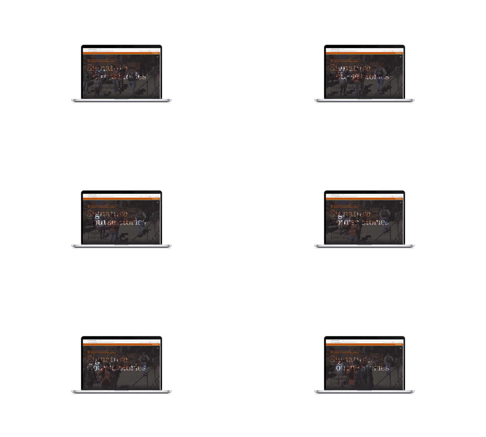
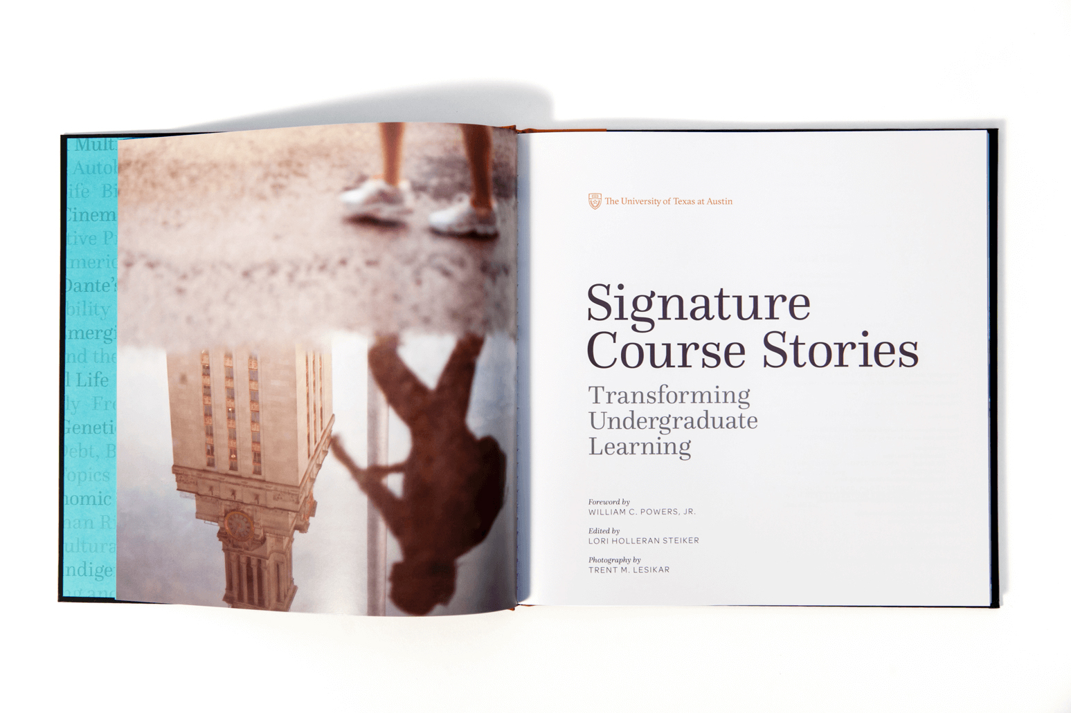
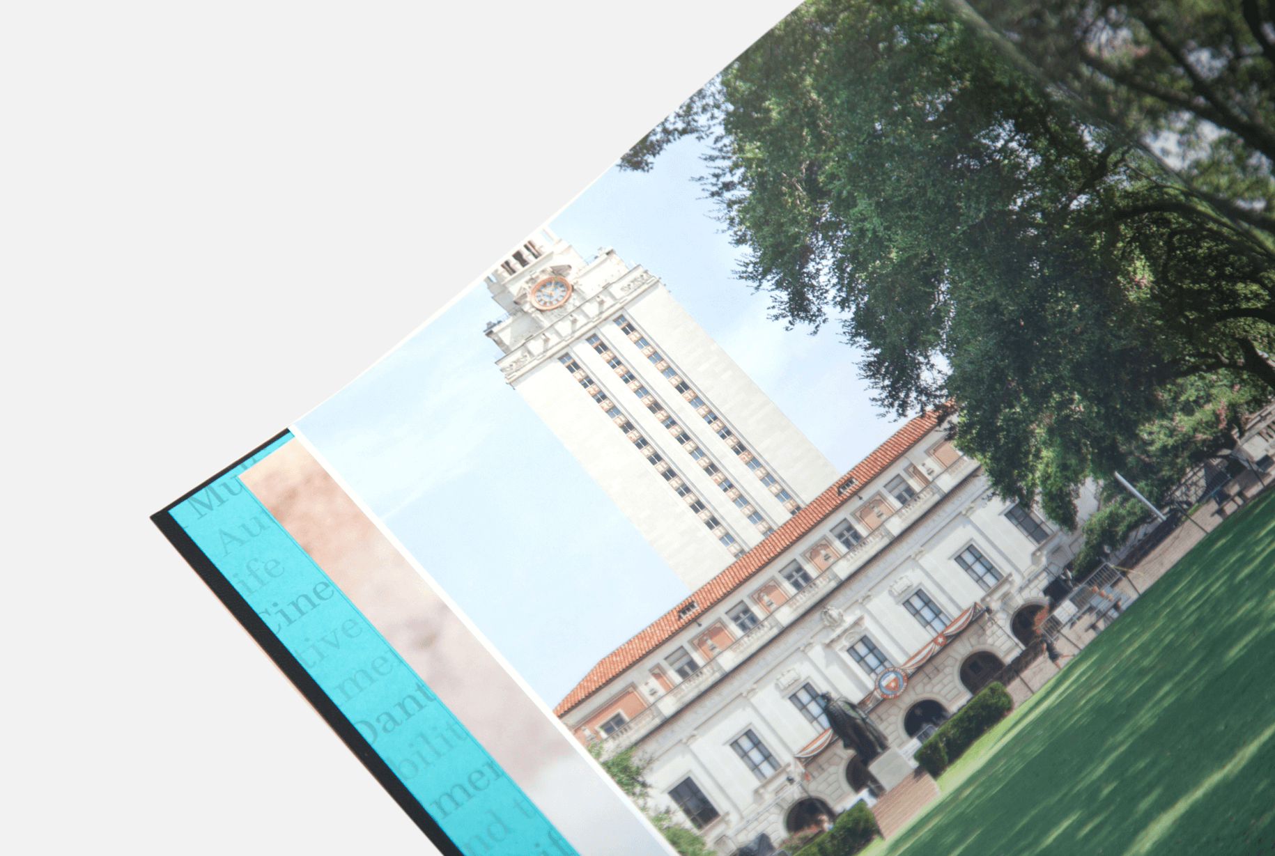
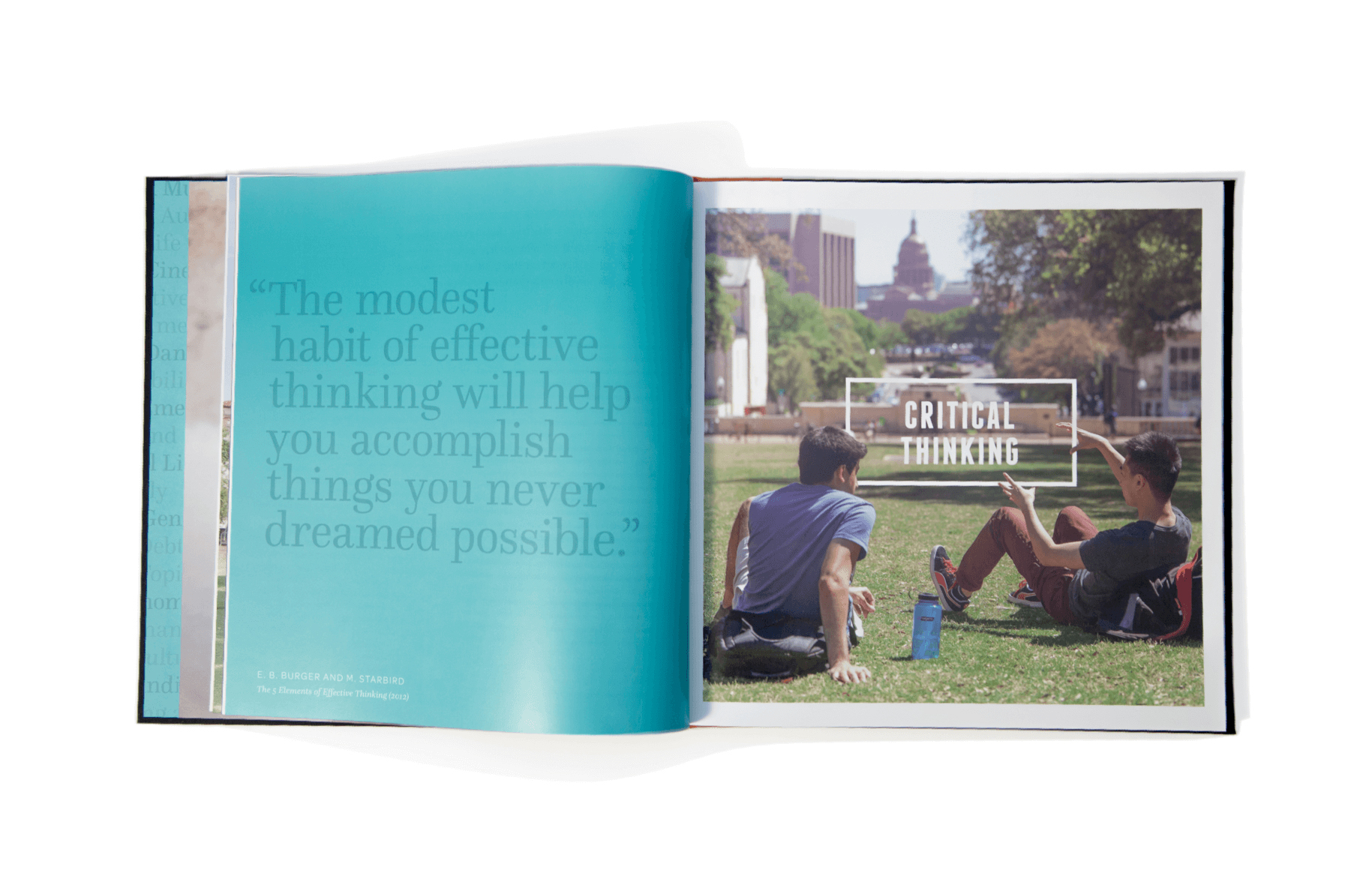
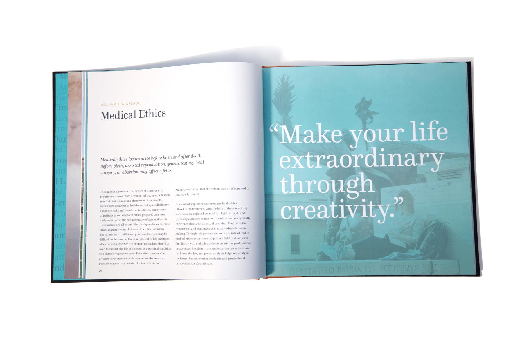
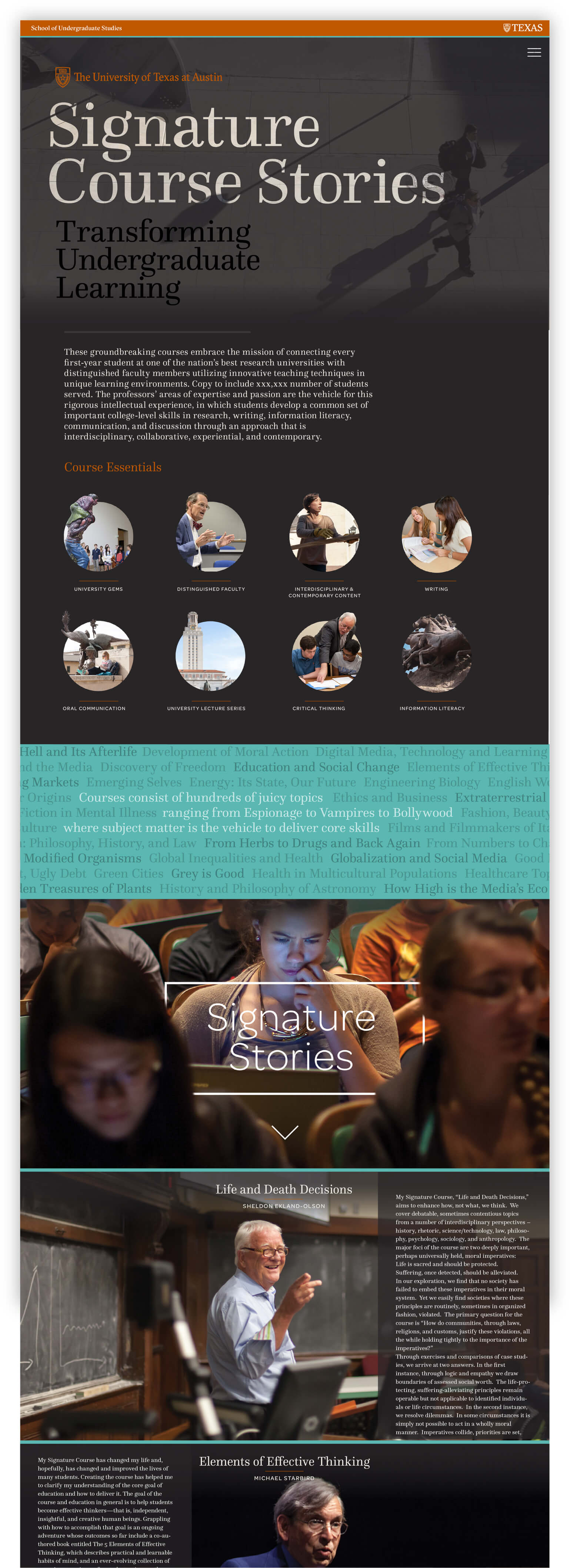
The required Signature Courses at the University of Texas provide freshman the basics to become better students. Professors’ personal interest in a range of subjects – from espionage to vampires to Bollywood – are the vehicle for teaching important college-level skills. As the groundbreaking approach proved successful, the School of Undergraduate Studies needed vehicles to explain Signature Stories abroad – resulting 150-page coffee table book and interactive one-page website. https://ugs.utexas.edu/signature-stories
Web Design, Print, Packaging
Epicured
Web Design, Print, Packaging
Epicured
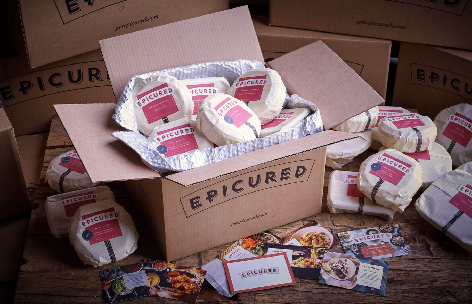
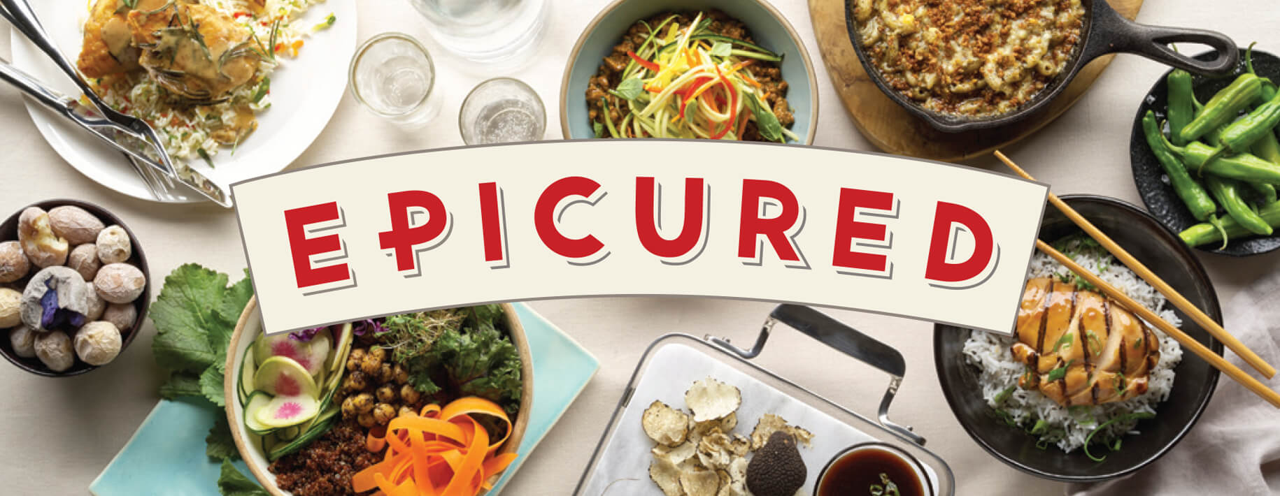
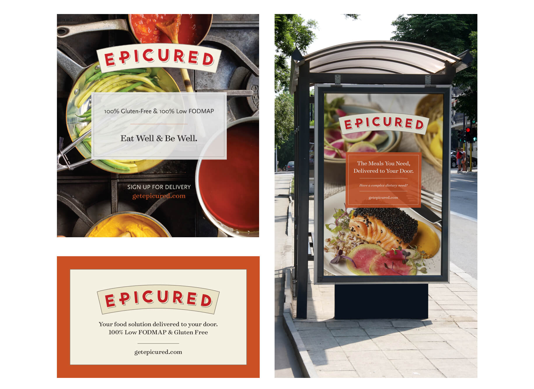
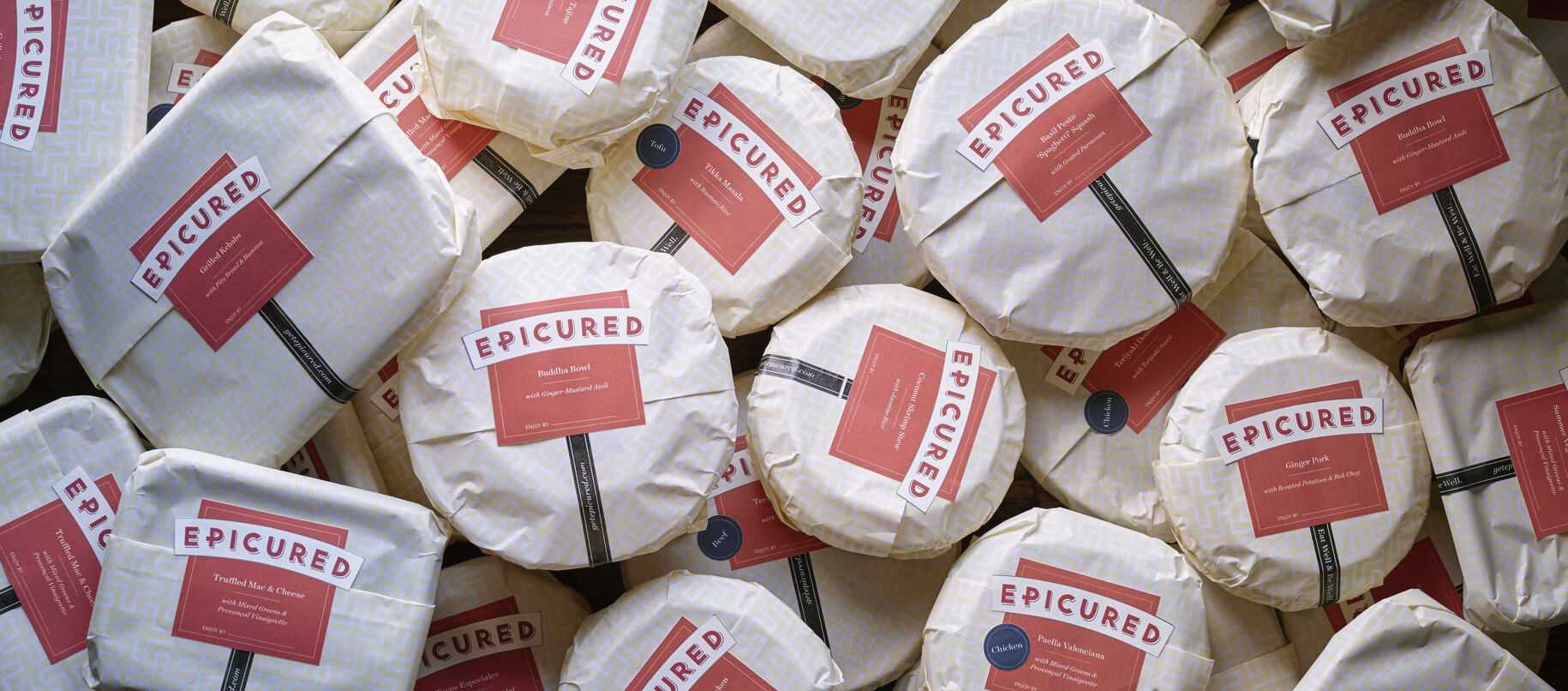
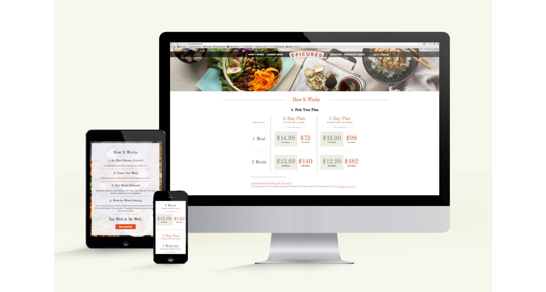
As the first 100% Low FODMAP and gluten-free food company, Epicured offers a healthy, unique and digestion-friendly menu. Lewis Carnegie worked with the founding members to create and produce all the required collateral for their product launch – including product announcement collateral, recipe cards, labels, meal packaging, labels, tissue, boxes, tape, and the entire user receiving experience. We also worked with the web team to improve site architecture, the user ordering experience and provide visual design guidelines.


Environmental, Identity
Overture Center for the Arts
Environmental, Identity
Overture Center for the Arts
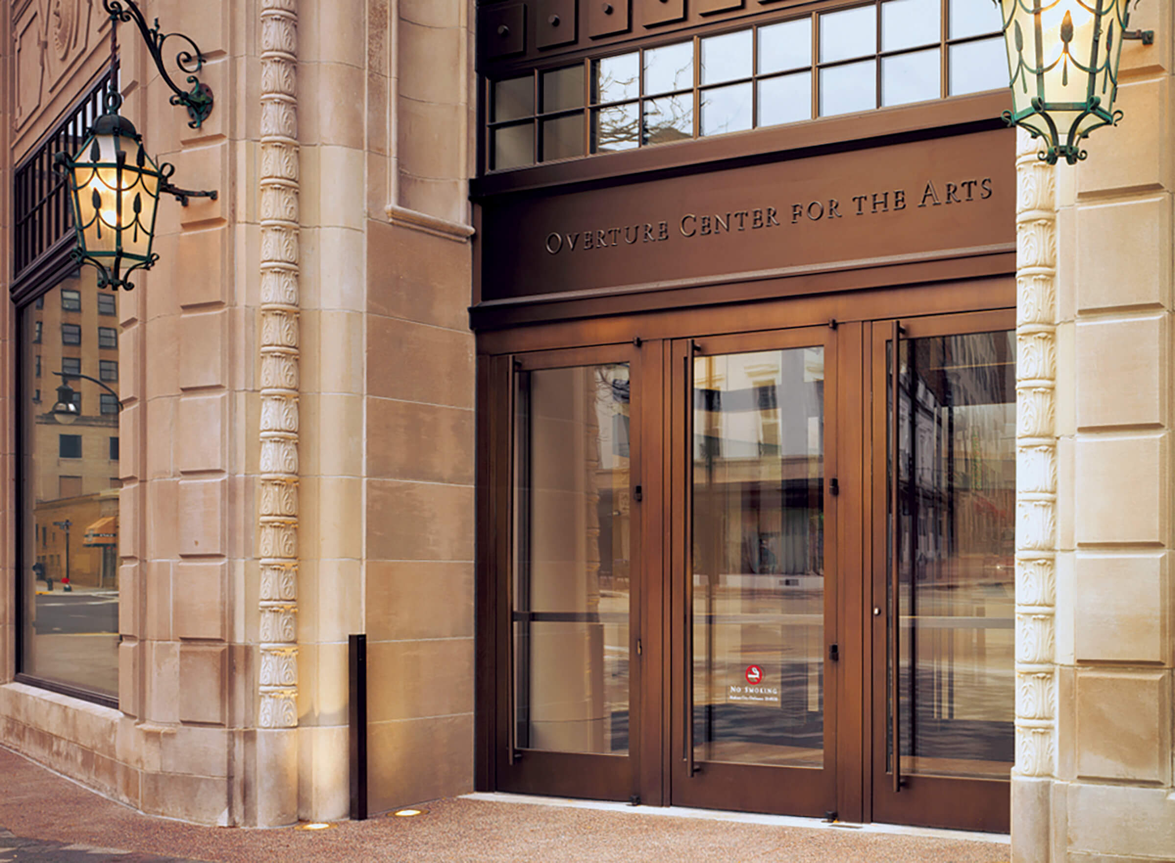
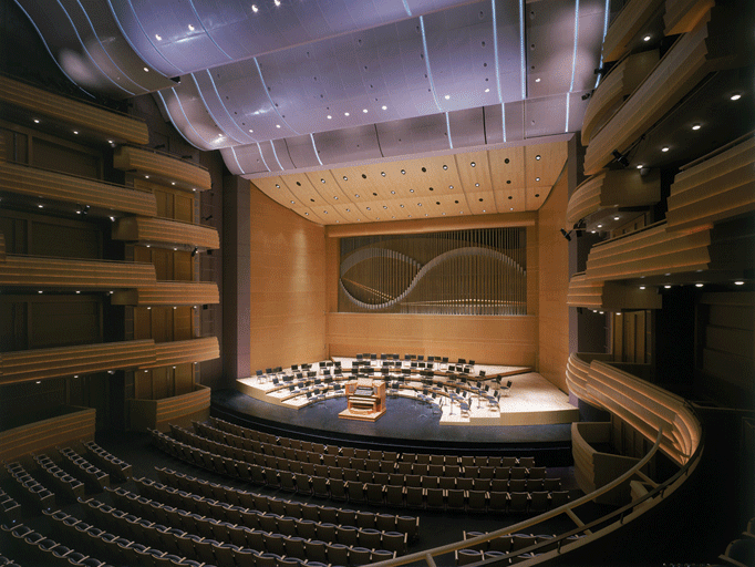
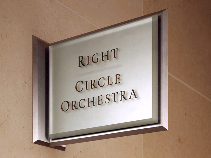
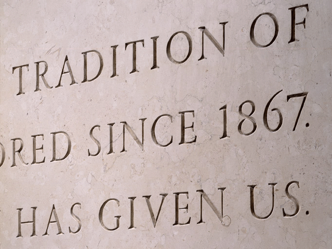
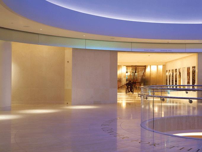
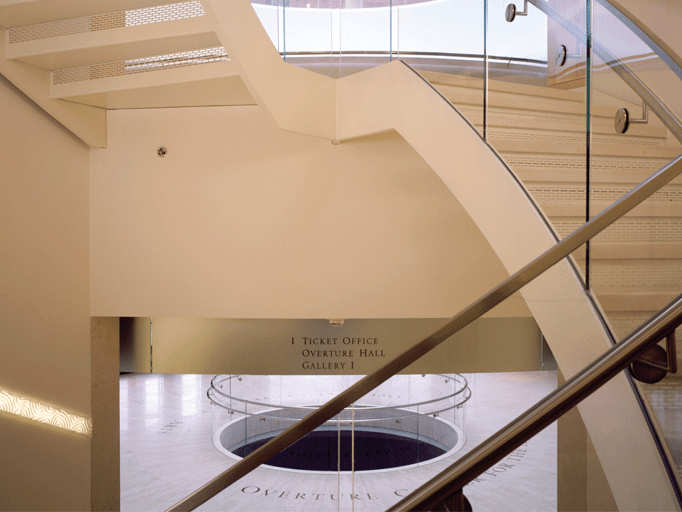
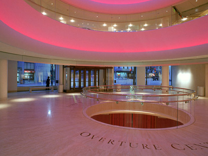
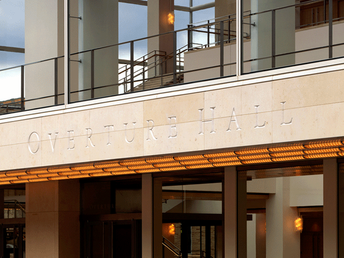
When a single donor offered the city of Madison a revitalized home for the arts, he looked back to the golden age of philanthropy and spared no expense. The resulting complex – a multi-block performing arts facility and museum designed by Pelli Clark Pelli – is a sumptuous gift. We created the identity, signage, and wayfinding system; including designing a custom font that reflected the stately combination of historic and contemporary architecture. Created with Pentagram Austin & Pelli Clark Pelli Services include Identity, Signage, and Wayfinding
Identity, Web Design, Print, Illustration
McCombs School of Business
Identity, Web Design, Print, Illustration
McCombs School of Business
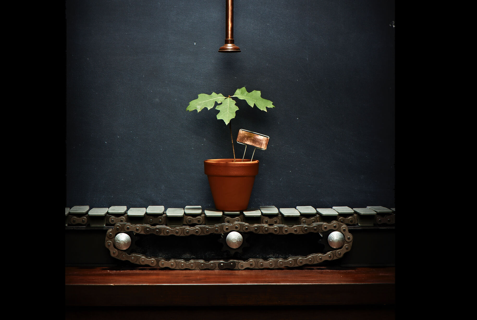
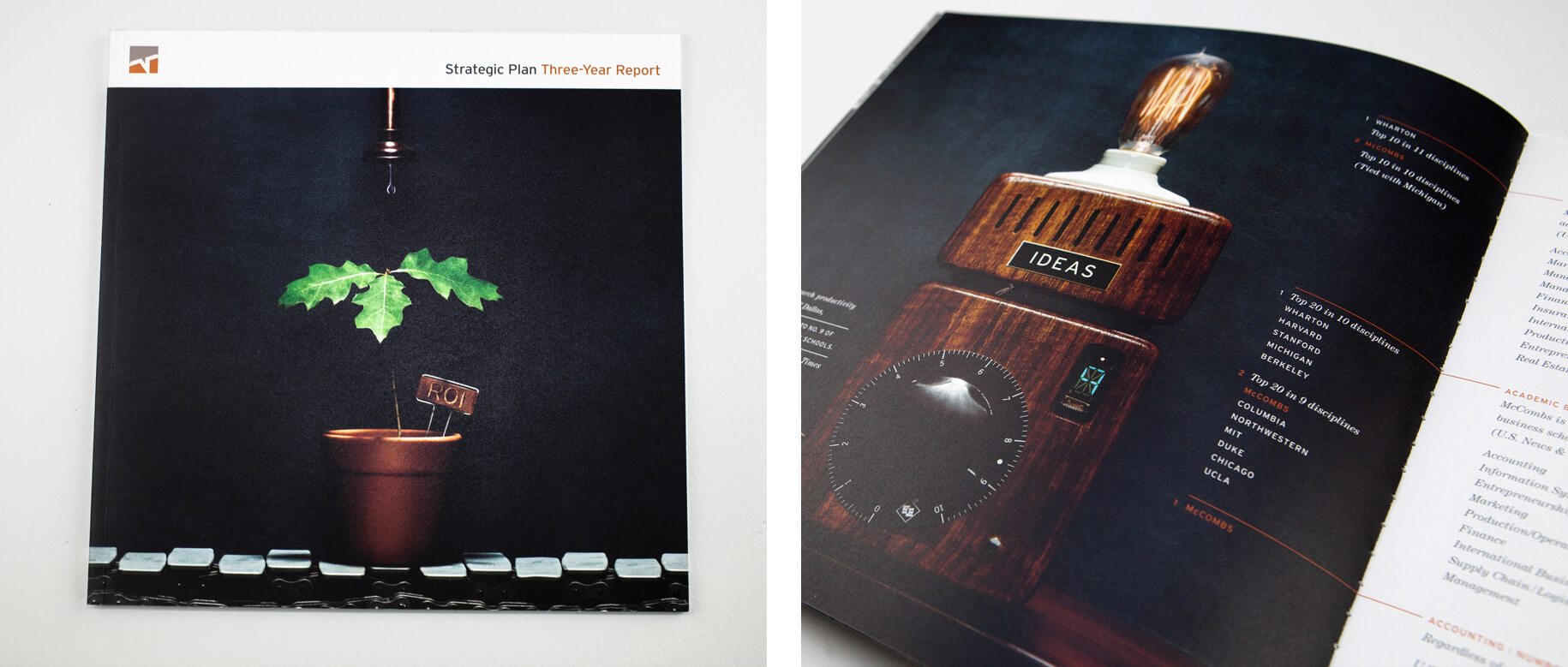
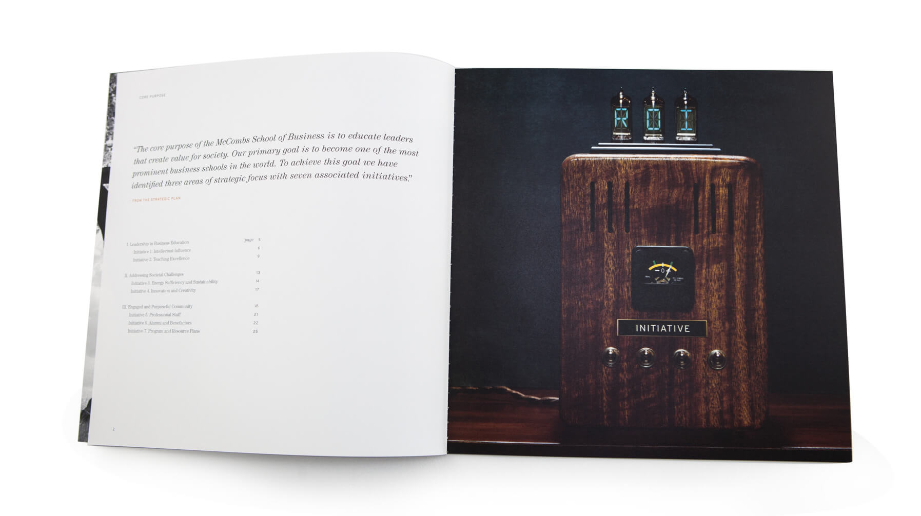
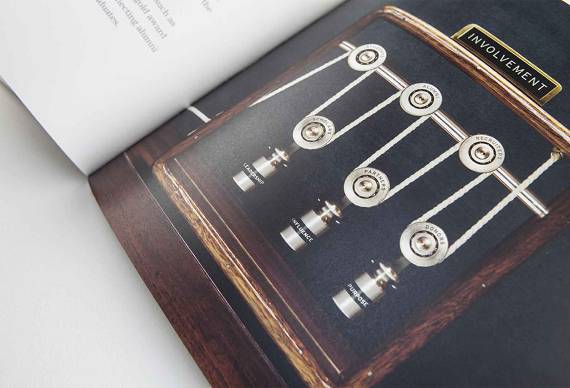
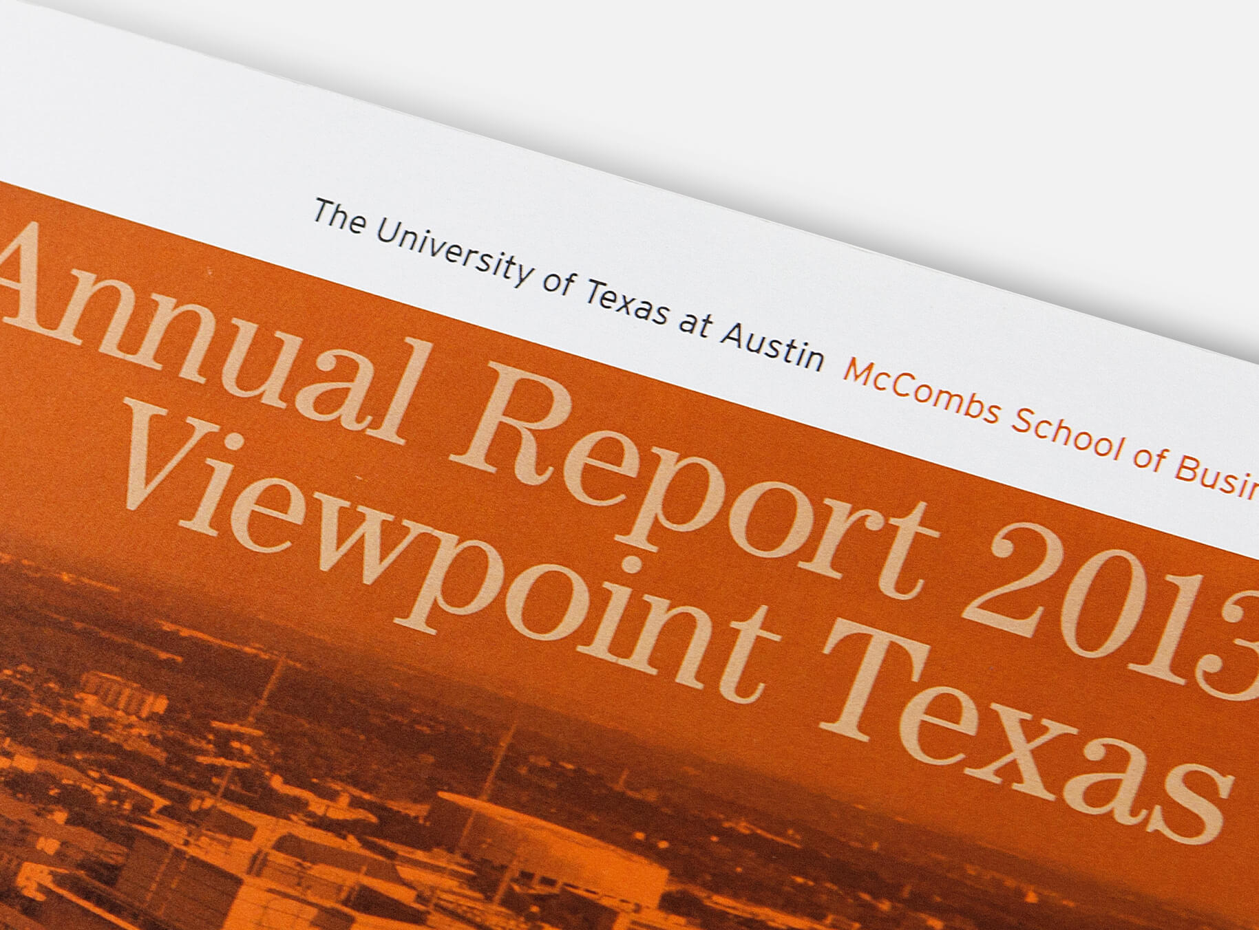
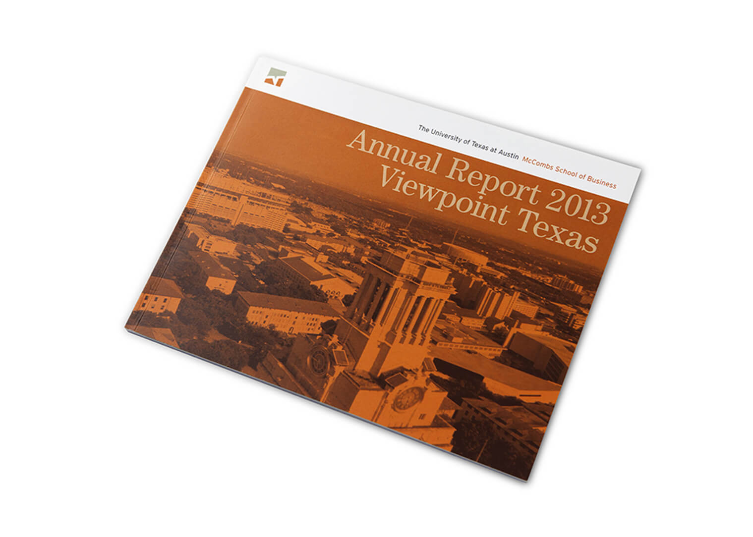
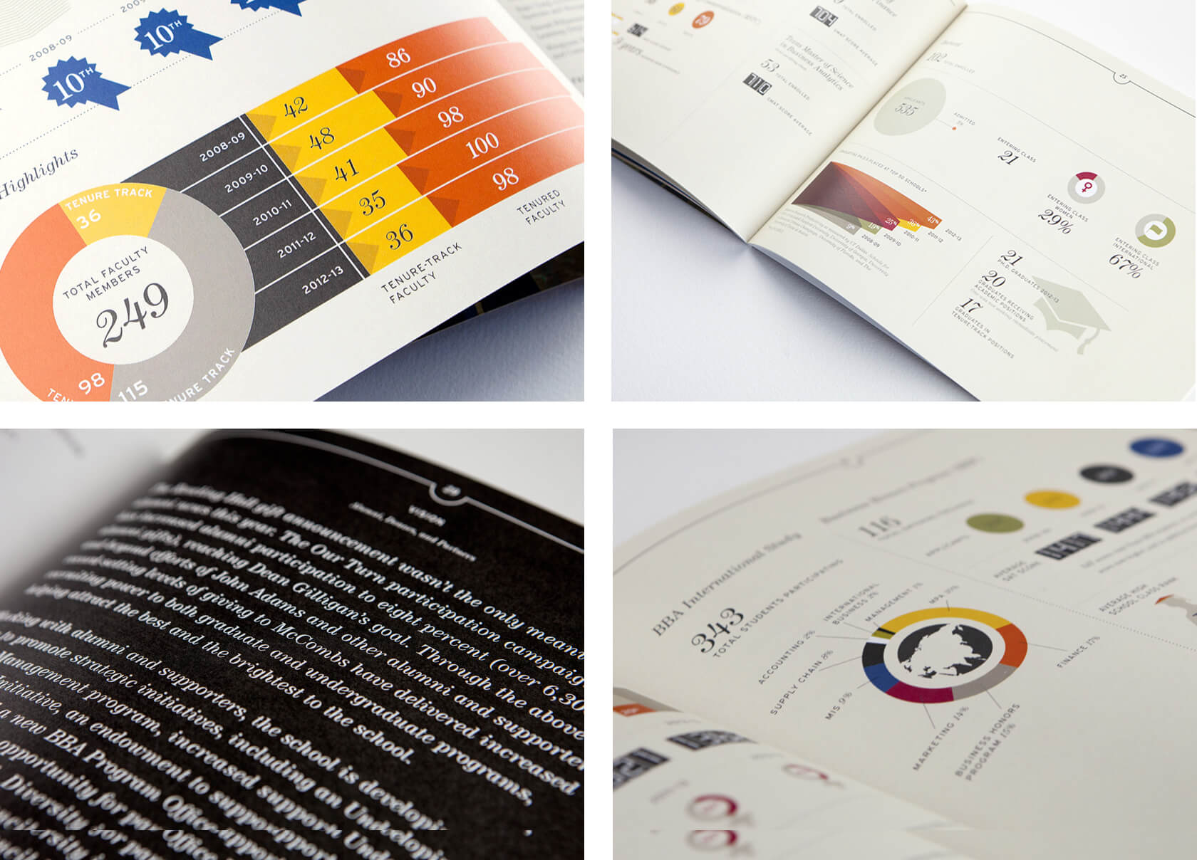
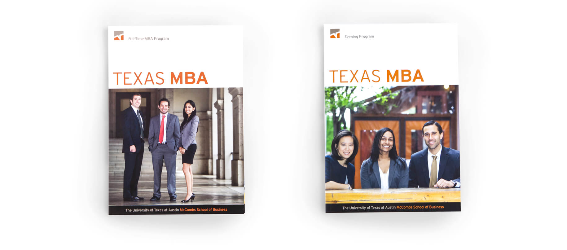
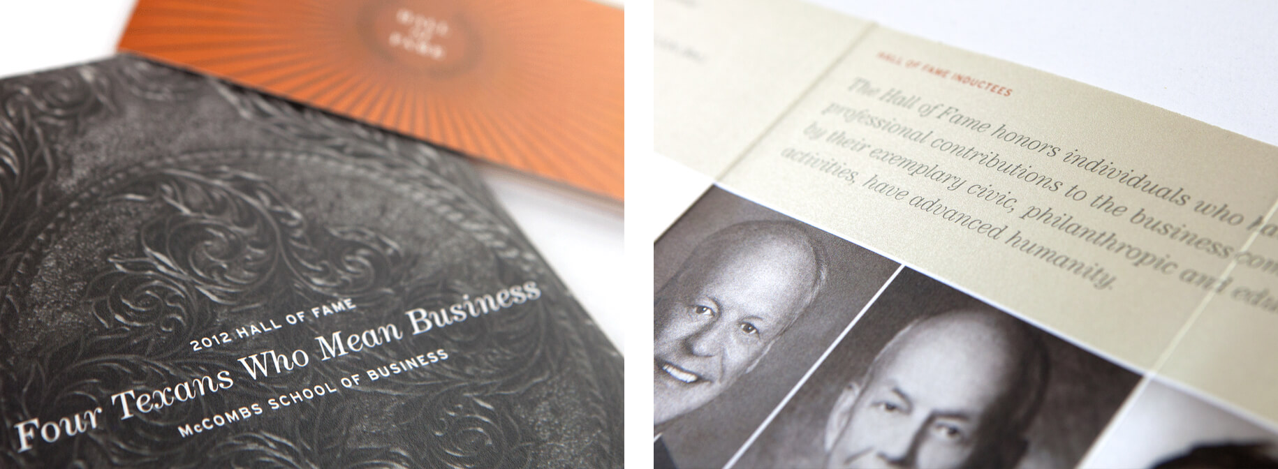
The McCombs School of Business at the University of Texas at Austin is one of the largest and most distinguished business schools in the country, and it requires impactful design and messaging to reflect its prominence. We continue to work with McCombs on a variety of projects including: Three-Year Report using the concept of Return on Investment with different kinds of custom investment contraptions built and photographed by Matt Wright-Steel. A latter Triennial Report played with Leadership times three featuring illustrations by Lin Zagorski. In the off years, Viewpoint; Annual Report used infographics bringing life to the data behind the McCombs School of Business. The Hall of Fame Invitation, for the Texans Who Mean Business awards featuring a commissioned silver engraving by Larry Nye. And finally, several MBA Viewbooks to help prospective students understand individual degree programs.

Web Design, Print, Illustration
MetCenter
Web Design, Print, Illustration
MetCenter
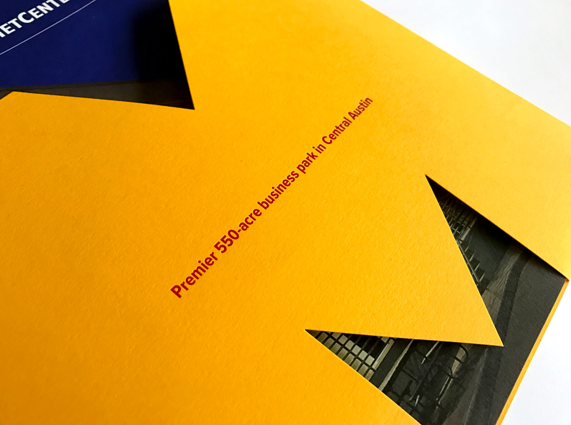
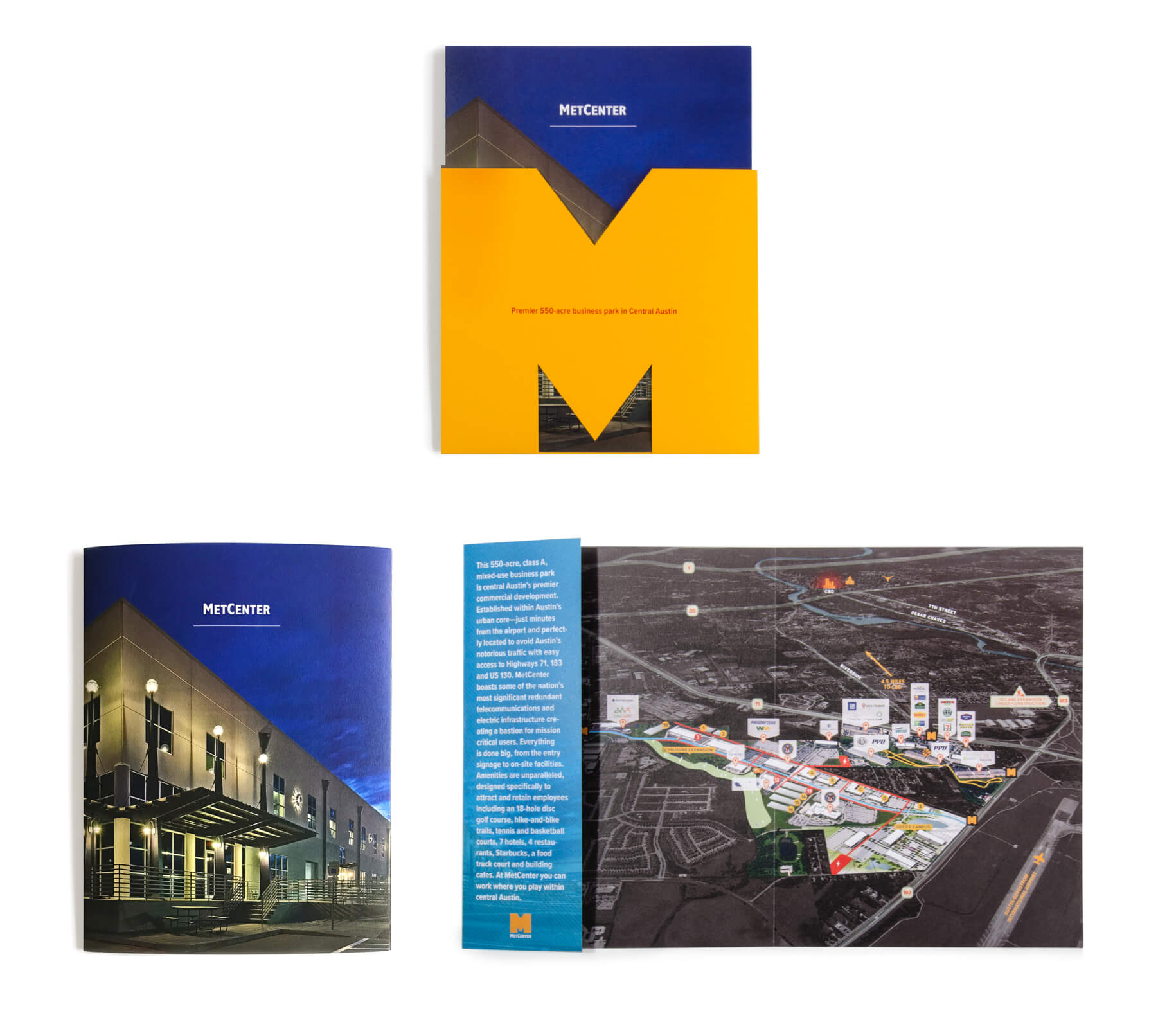
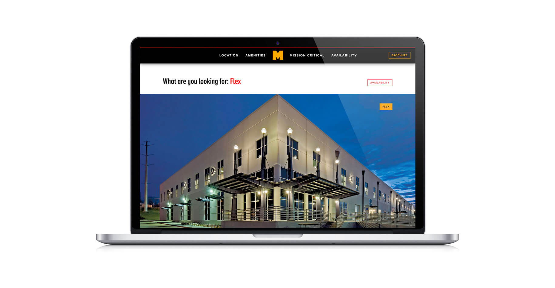
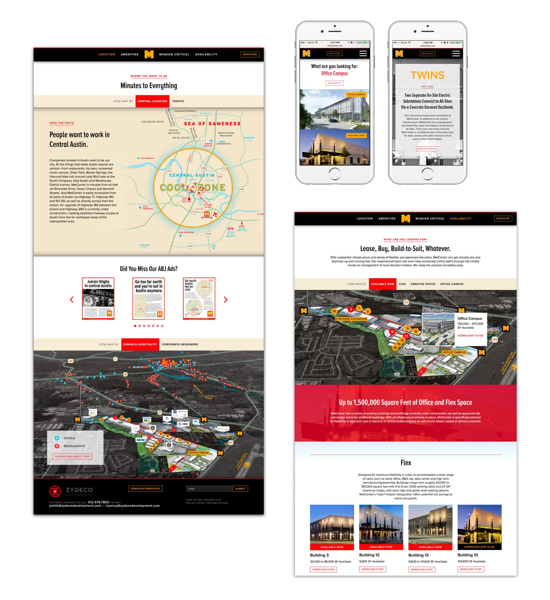
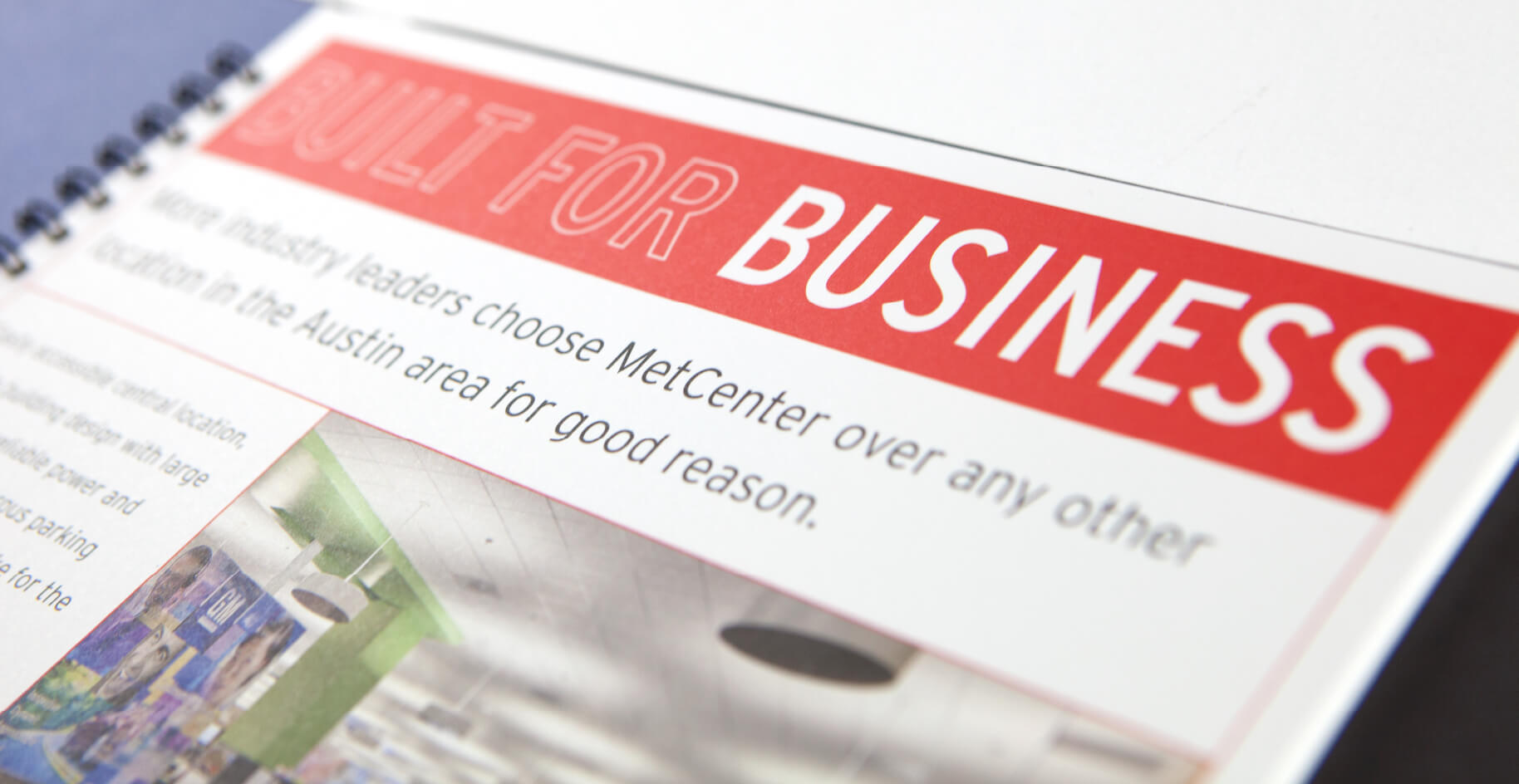
MetCenter is a 550-acre premier business park centrally located in central Austin. The client-friendly, Texas-style attitude is reflected in the website, which includes an interactive map that shows availability and amenities within the context of the central business district – all the information prospective buyers need in Austin’s competitive market. www.metcenter.com


Web Design, Print, Illustration
Artcobell
Web Design, Print, Illustration
Artcobell
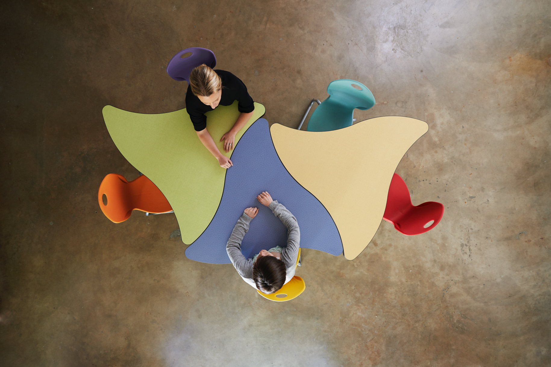
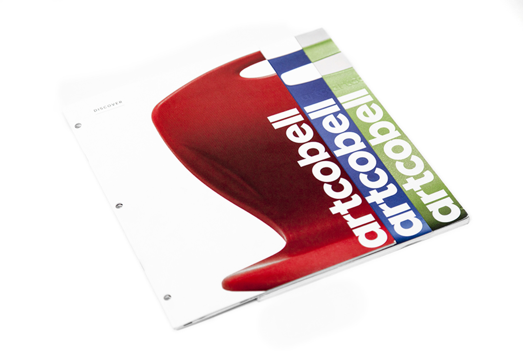
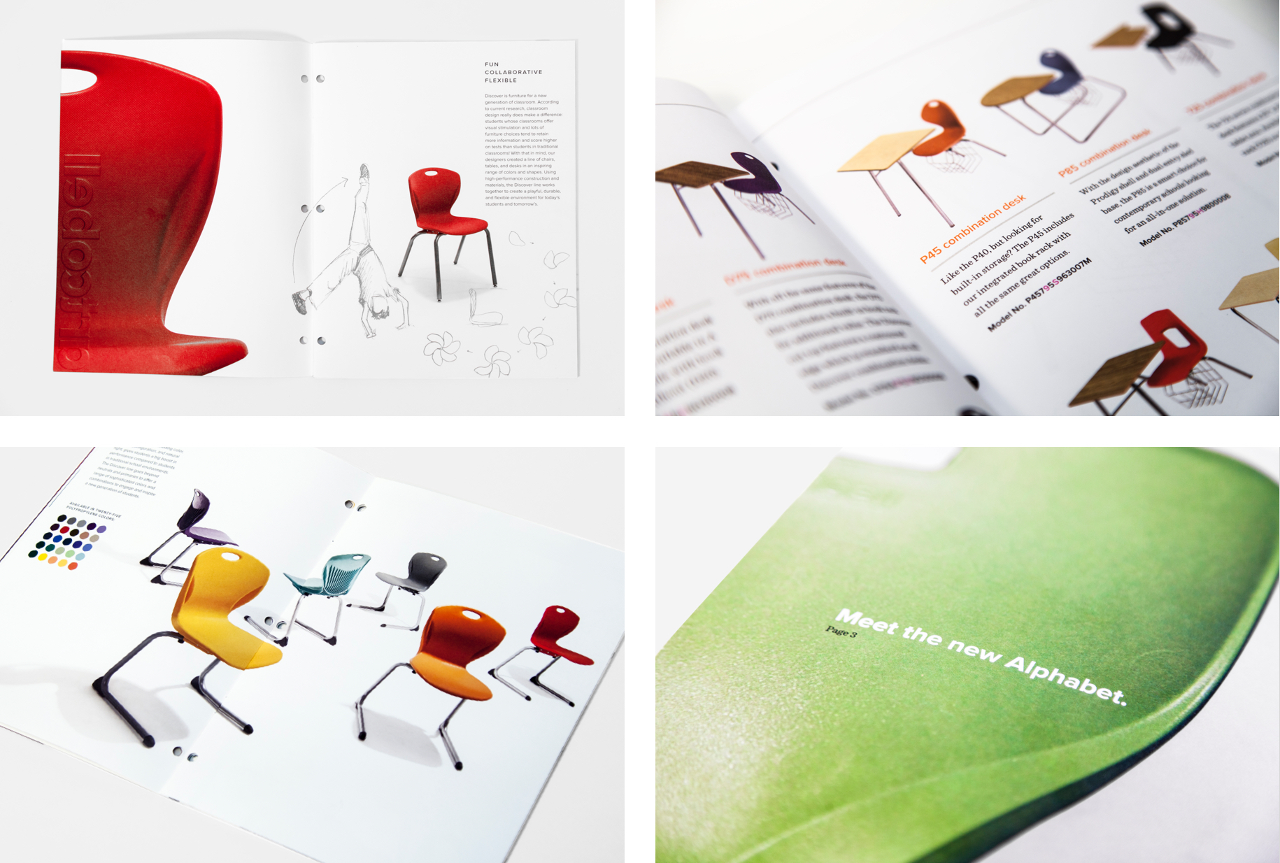
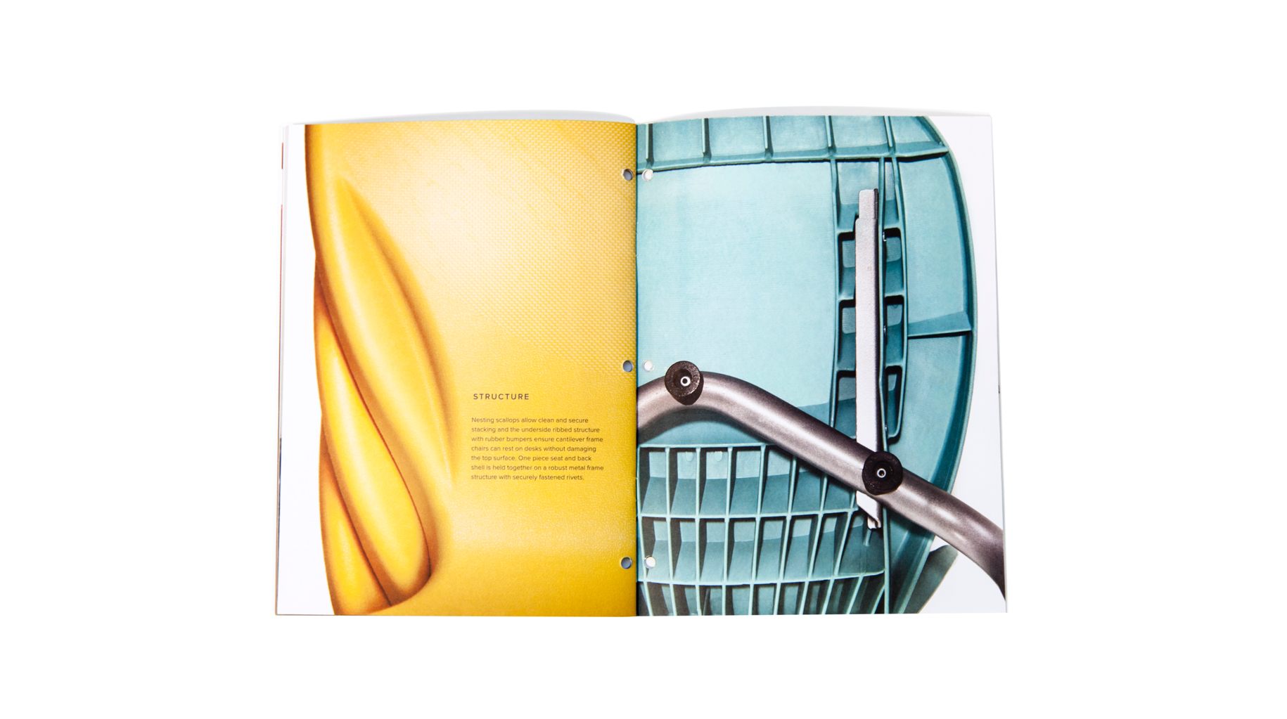
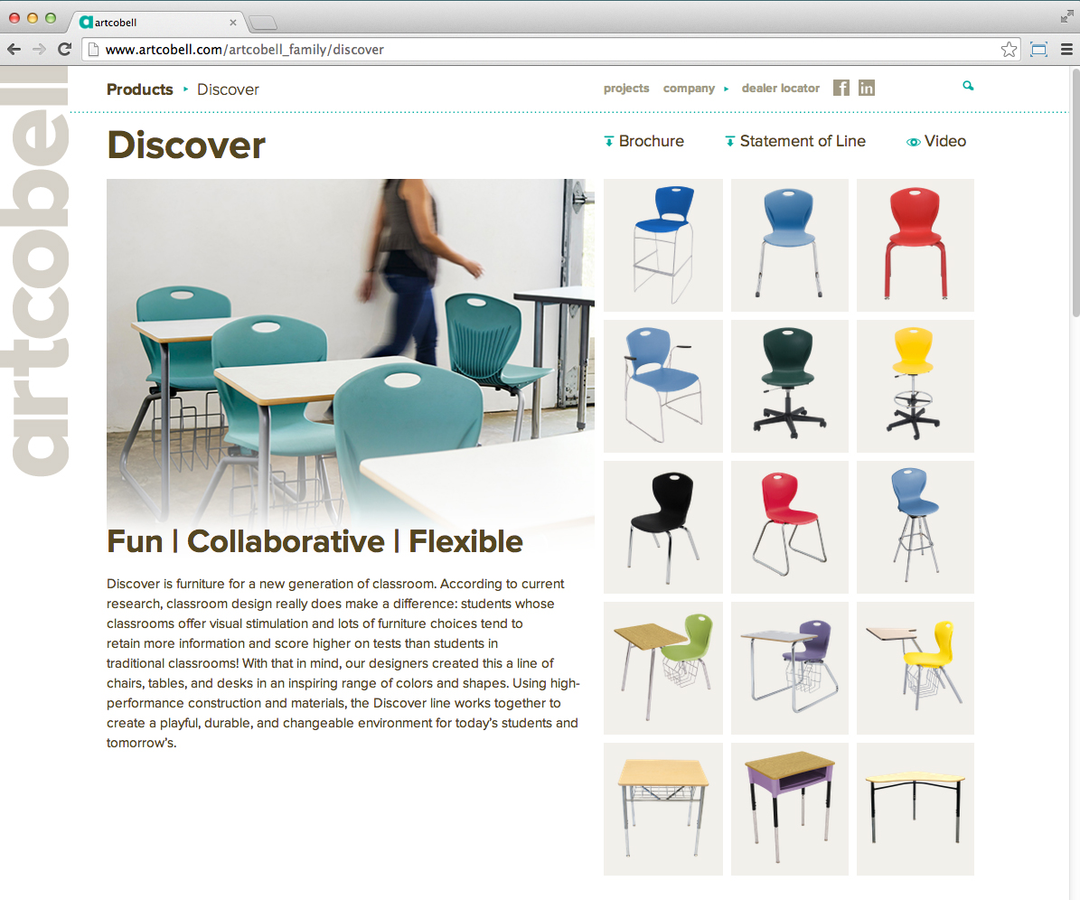
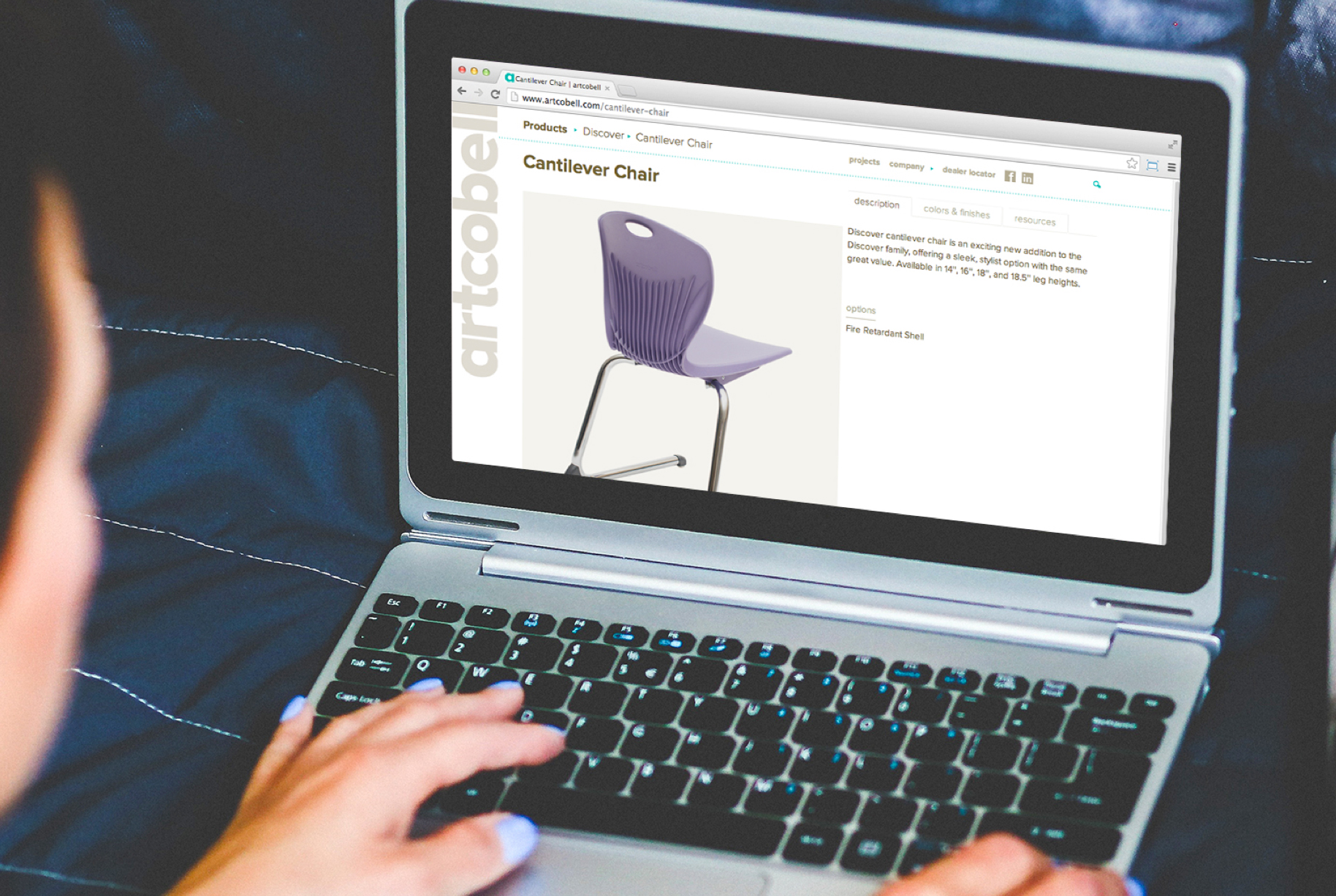
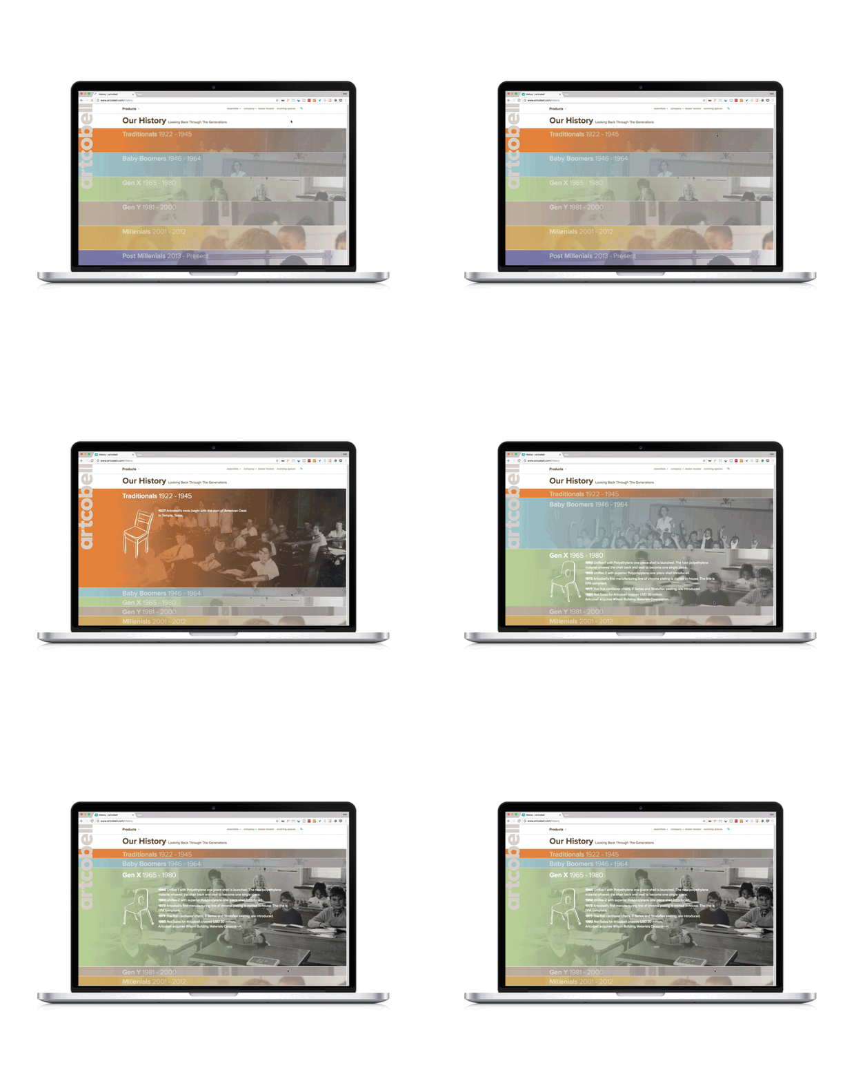
Artcobell is one of the oldest school furniture manufacturer’s in the country. Built from classic design and forward thinking, Artcobell brings the classroom into the 21st century. Their website is built using a custom Drupal template to reflect their forward thinking ideas on the classroom and showcase their products. We incorporated motion in the web design to introduce architects, designers, and teacher to breathe life into their products, showing how they can be used within the classroom.


Web Design, Motion Graphics
Verb Products
Web Design, Motion Graphics
Verb Products
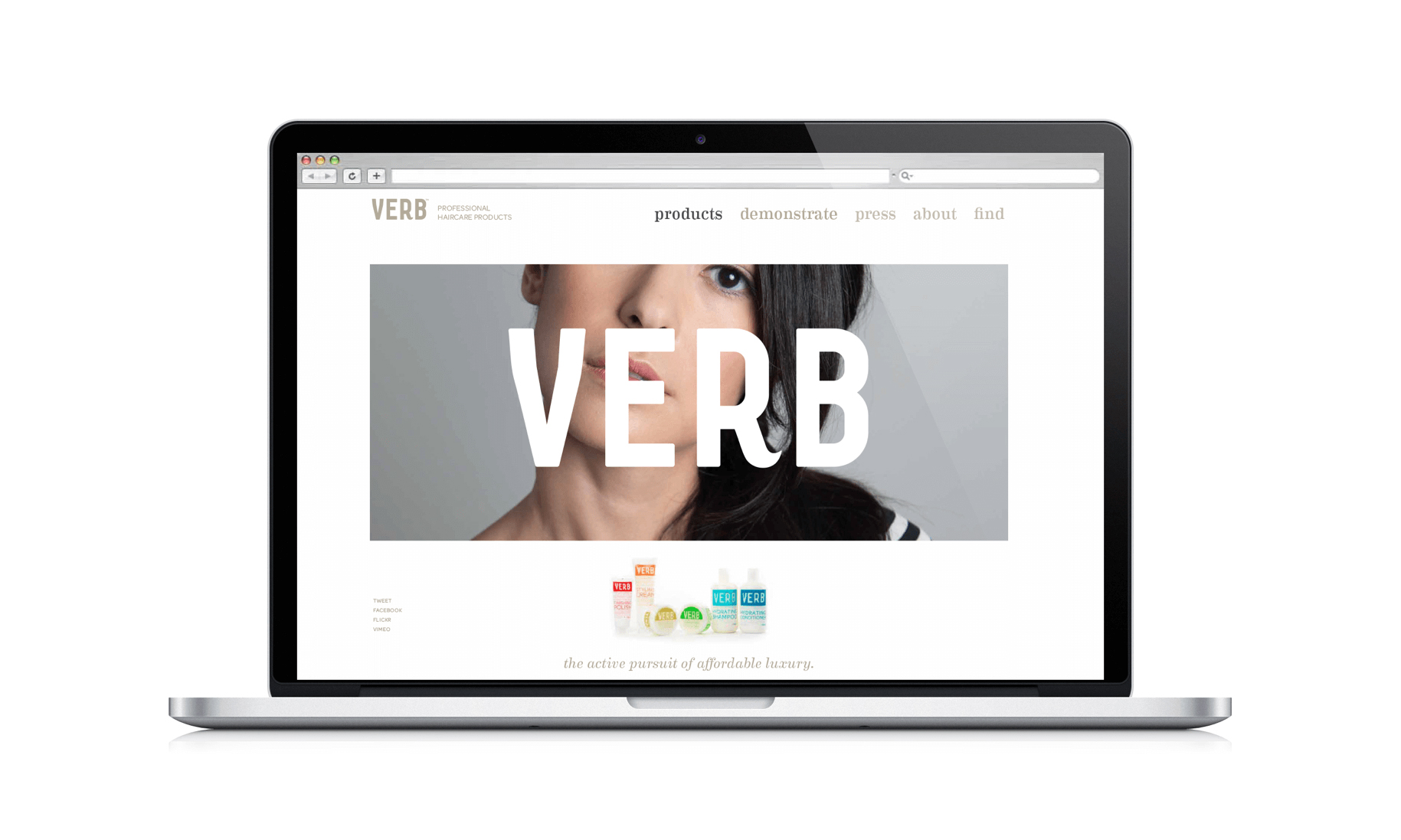
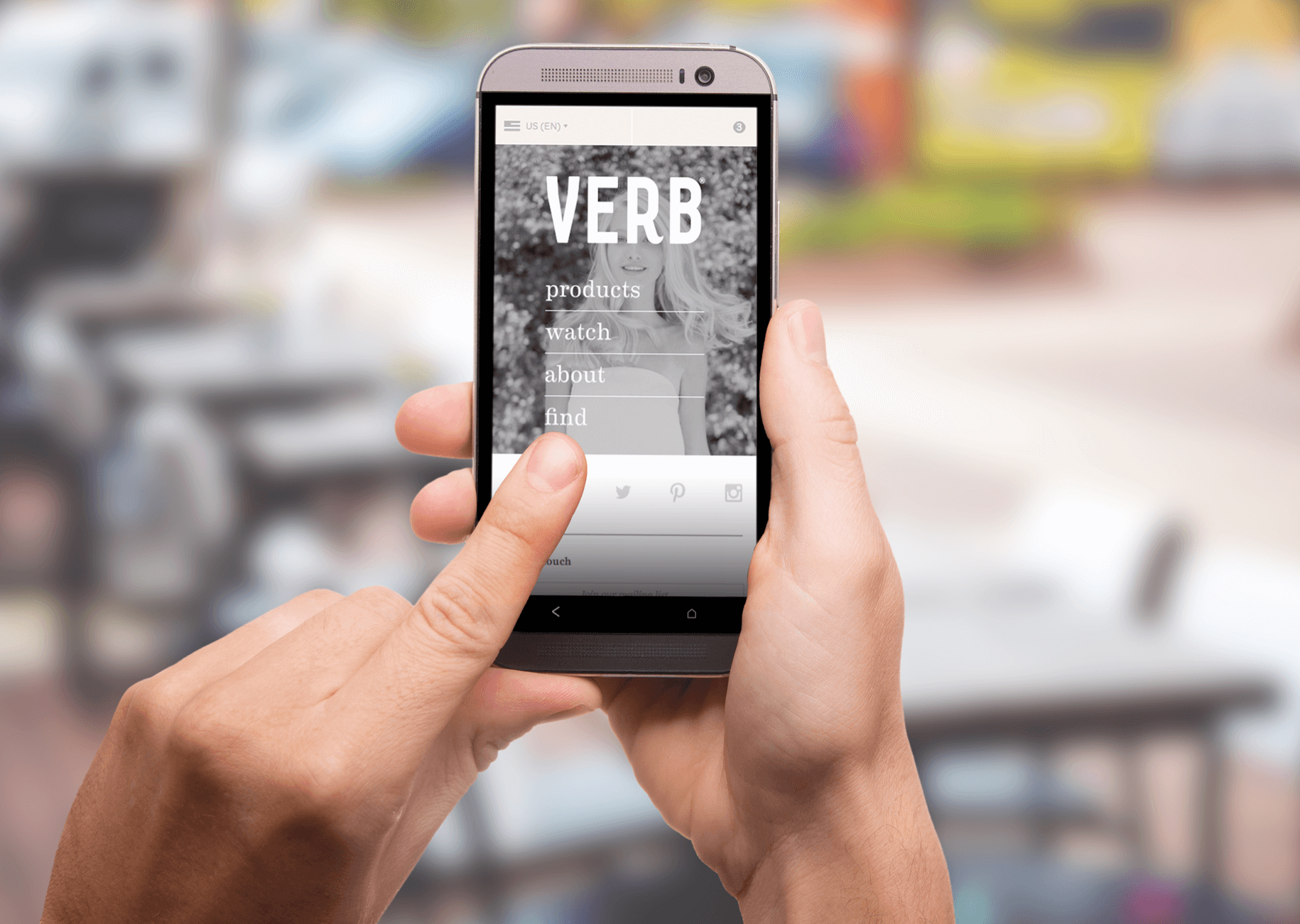
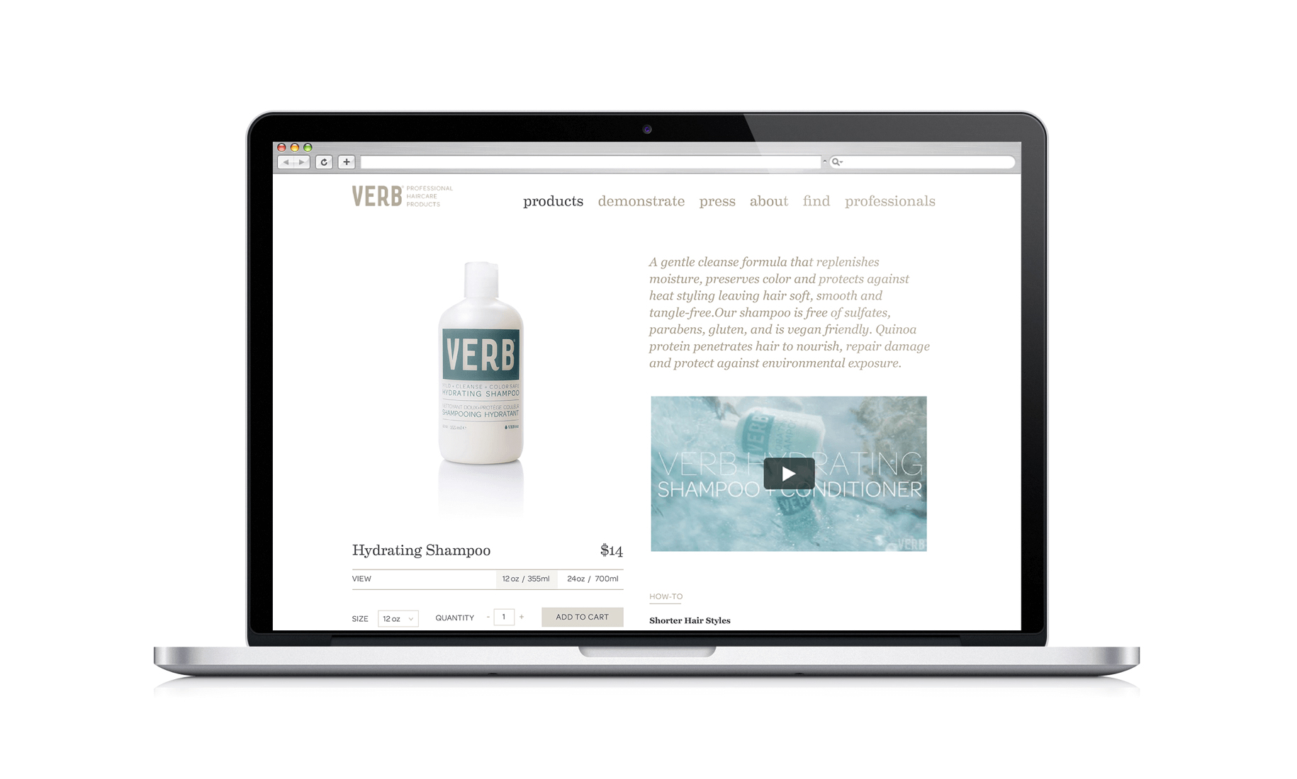
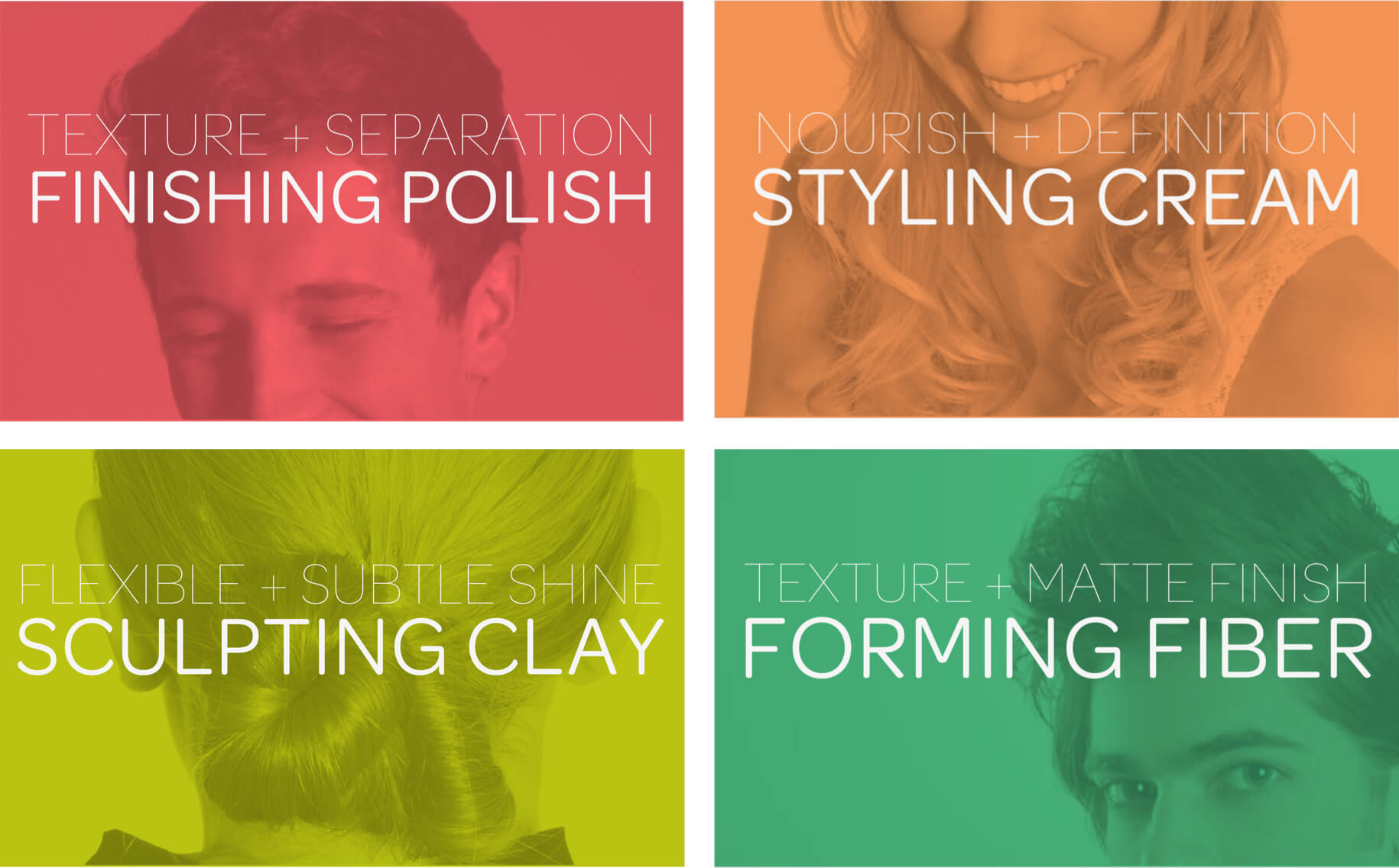
Verb is hair product line that got its start at Bird’s, Austin's beloved rocker barber shop where you get a Lone Star with your haircut. Like its name suggests, we designed an active site with a video on the front page, and a clean showcase of its products.
Environmental
ZACH Topfer Theater
Environmental
ZACH Topfer Theater
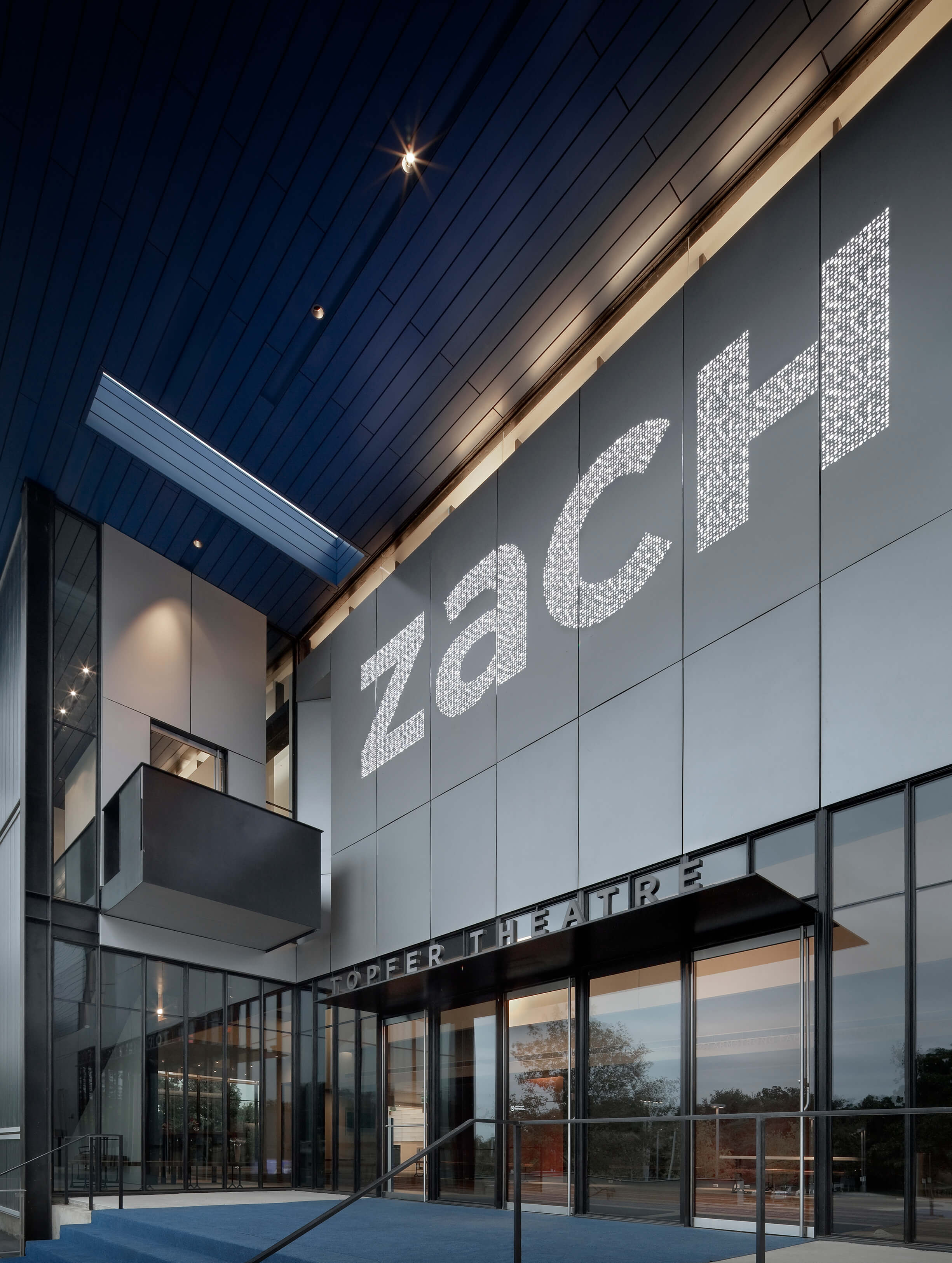
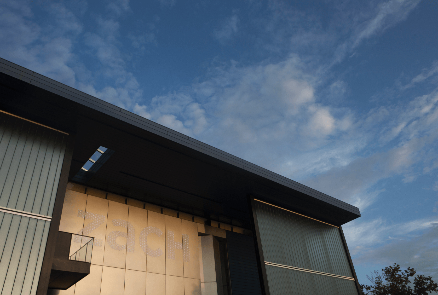
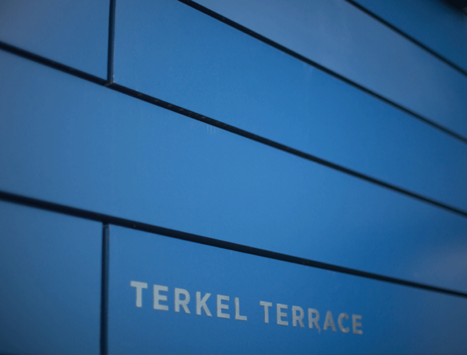
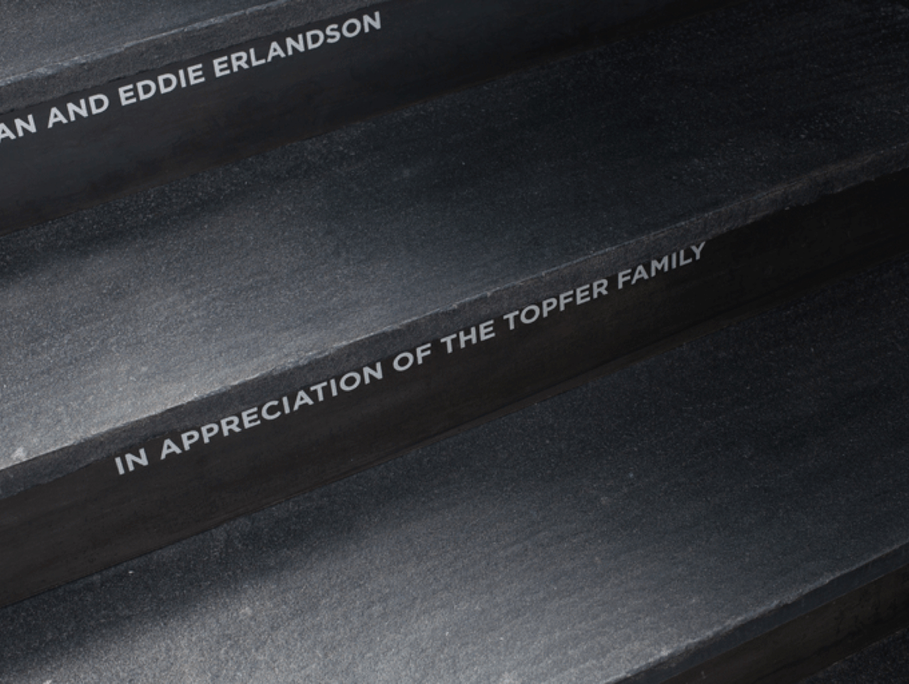
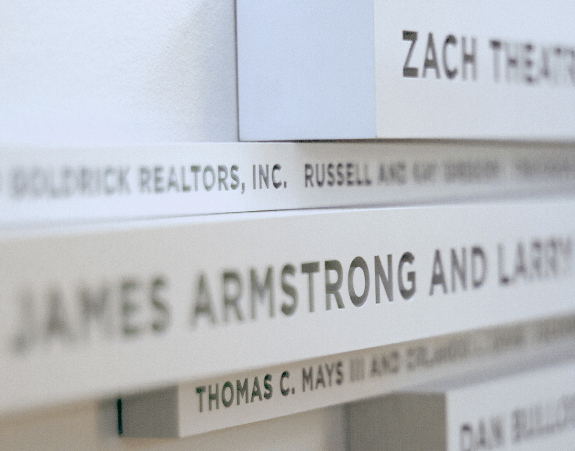
ZACH’s been putting on a show for Austin since 1933, and the new theatre designed by Andersson-Wise Architects pulls out the stops. The new building anchors the burgeoning arts district on Lamar Avenue and adds a little bling to the south Austin skyline. A spangled sign directs theatre-goers to the main entrance, while other signage provides guidance through the campus and connects old buildings to new. Thank-you’s to the donors who made the new theatre possible are thoughtfully incorporated into the architectural design. Services include Signage & Wayfinding. Created with Andersson-Wise Architects & JE Dunn Construction
Marc Burckhardt
Marc Burckhardt
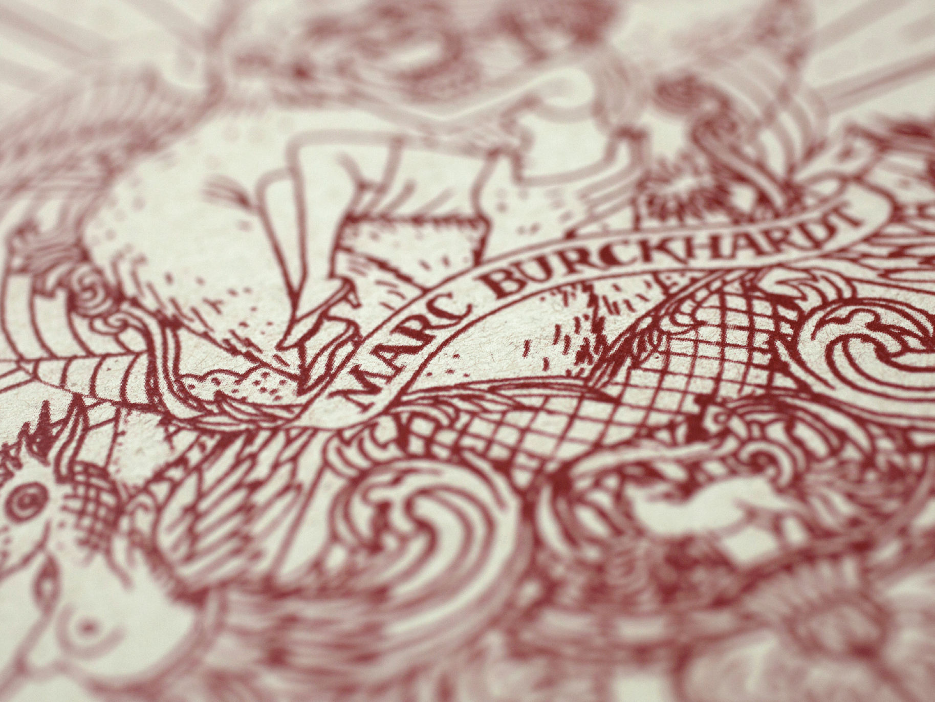
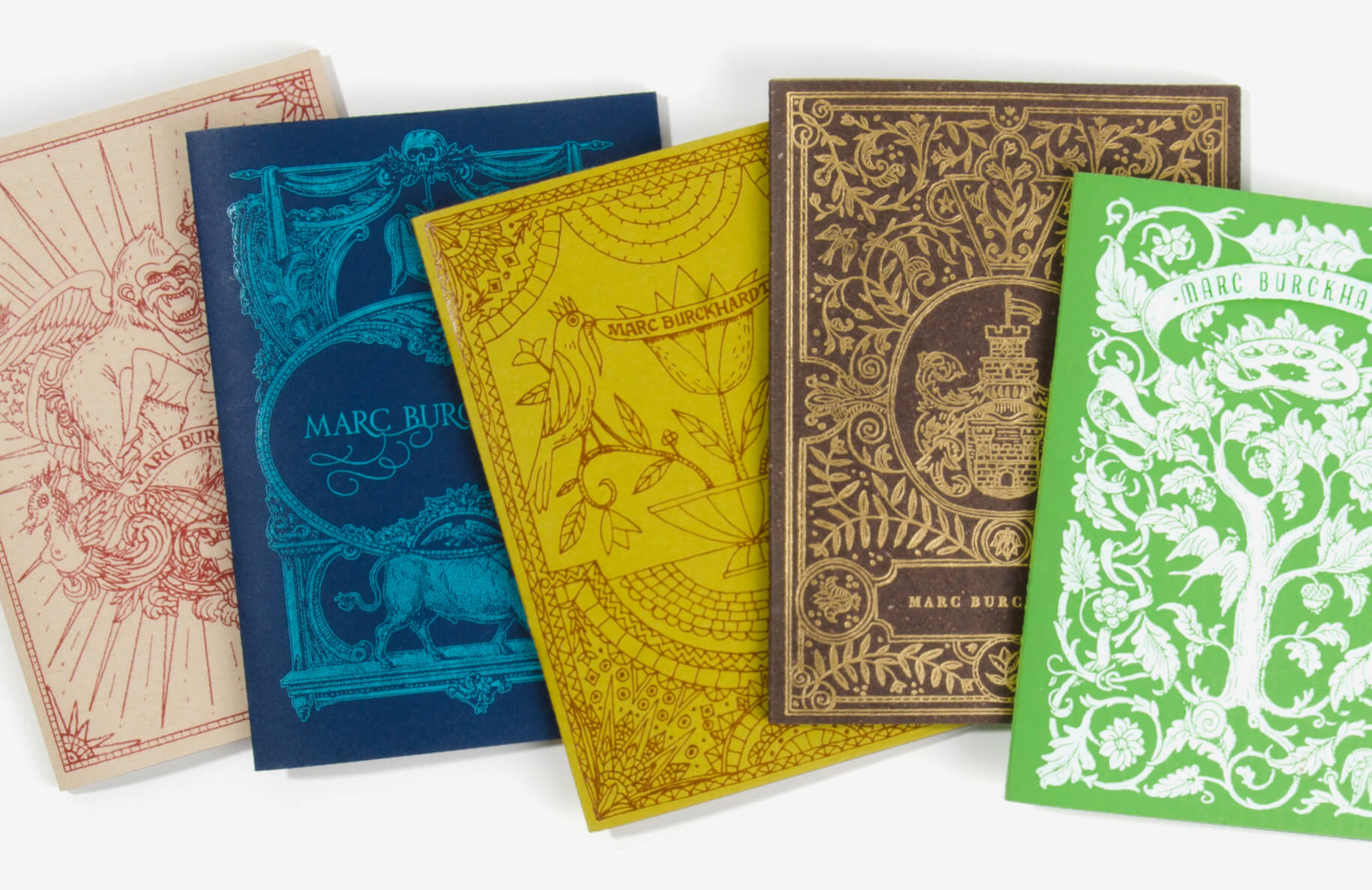
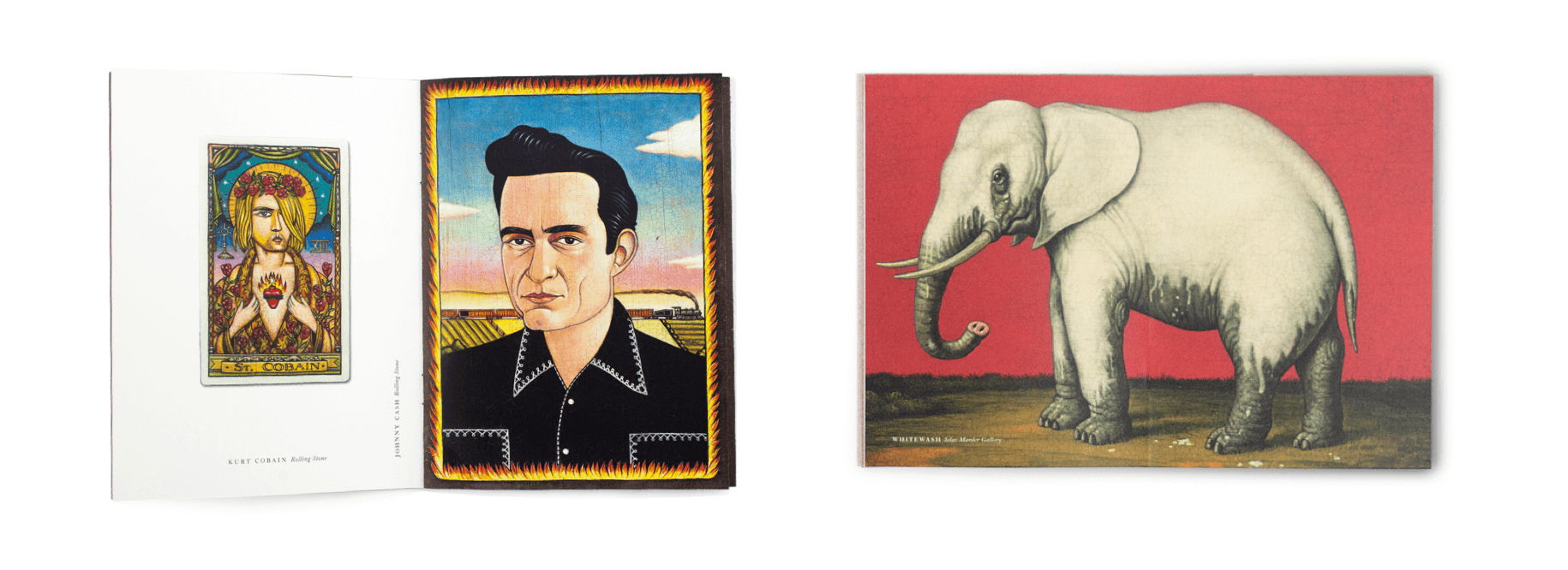
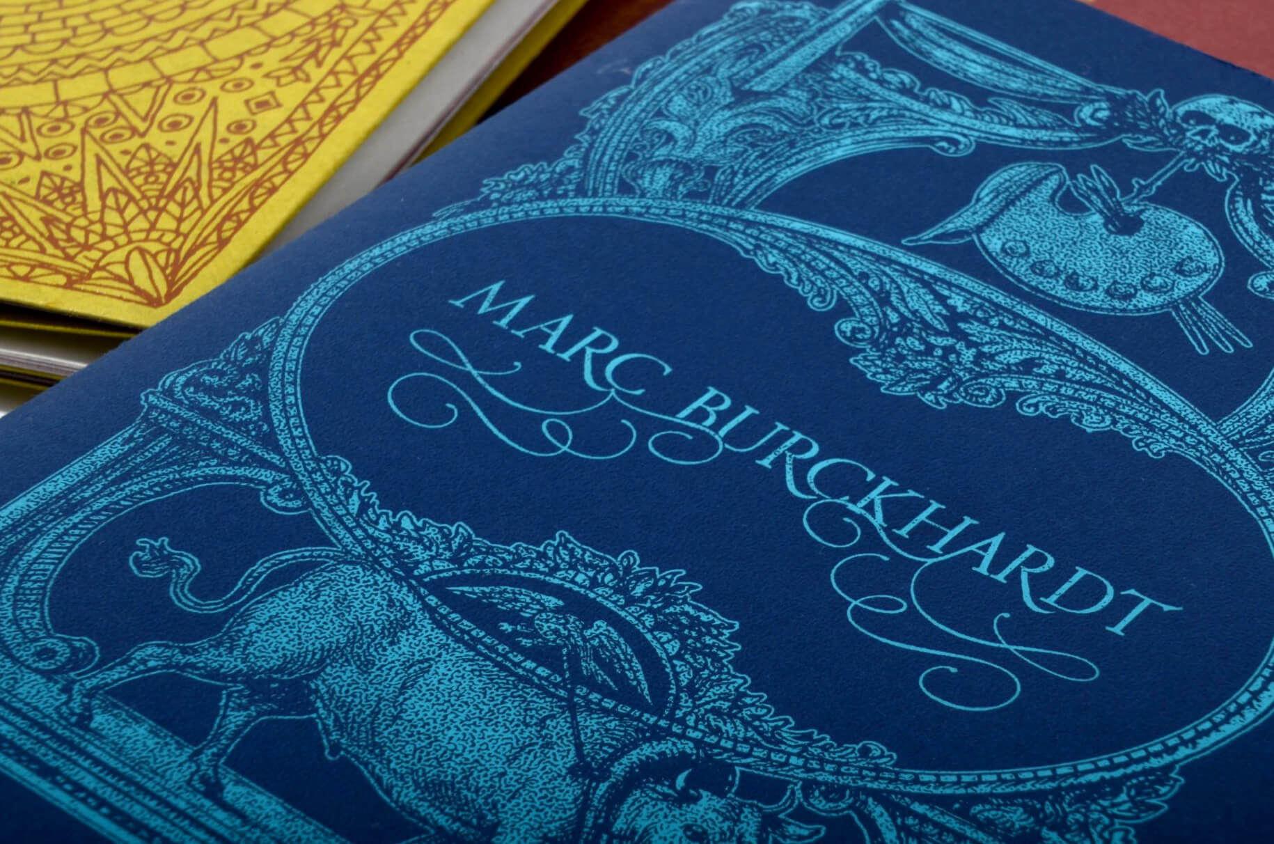
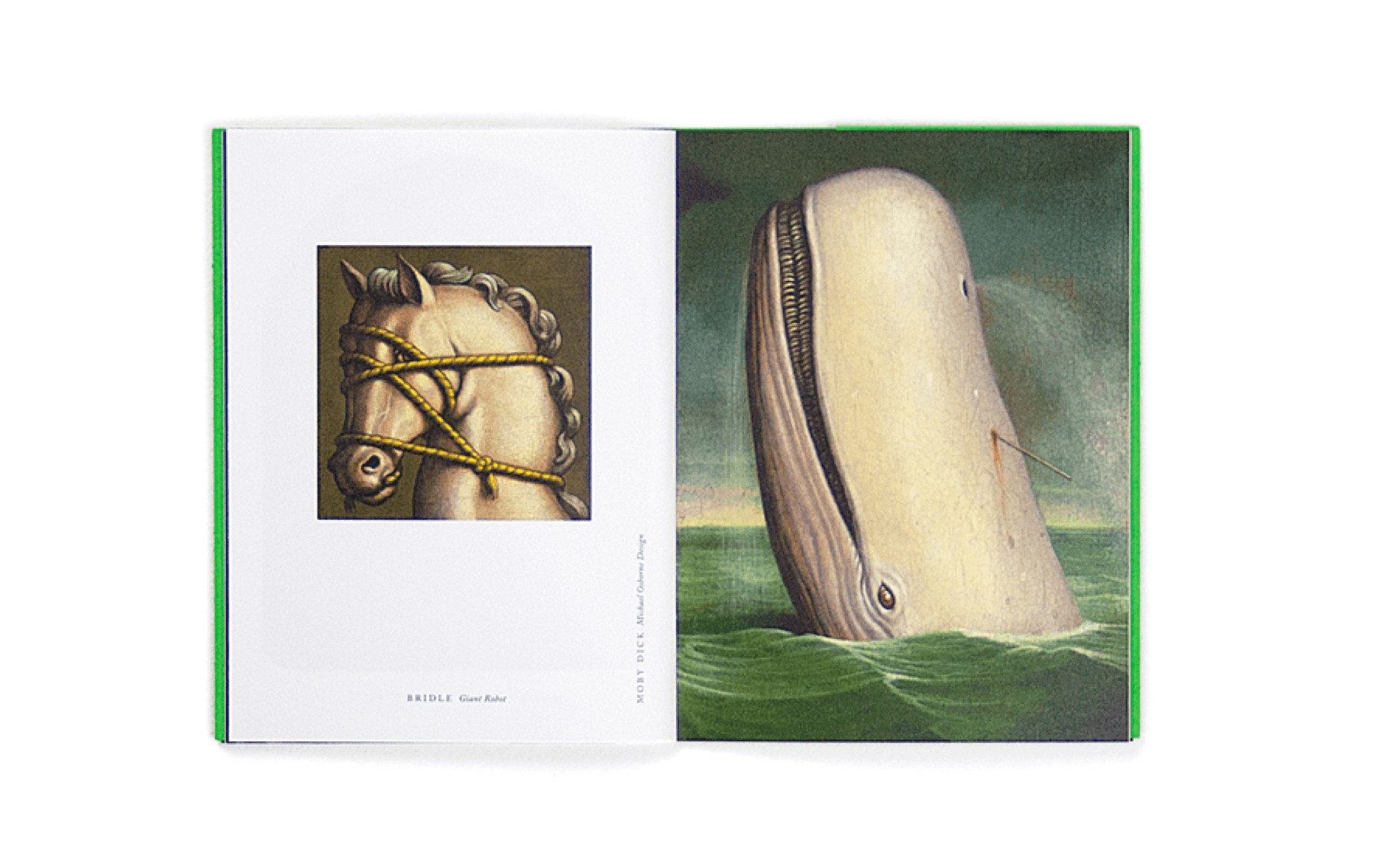
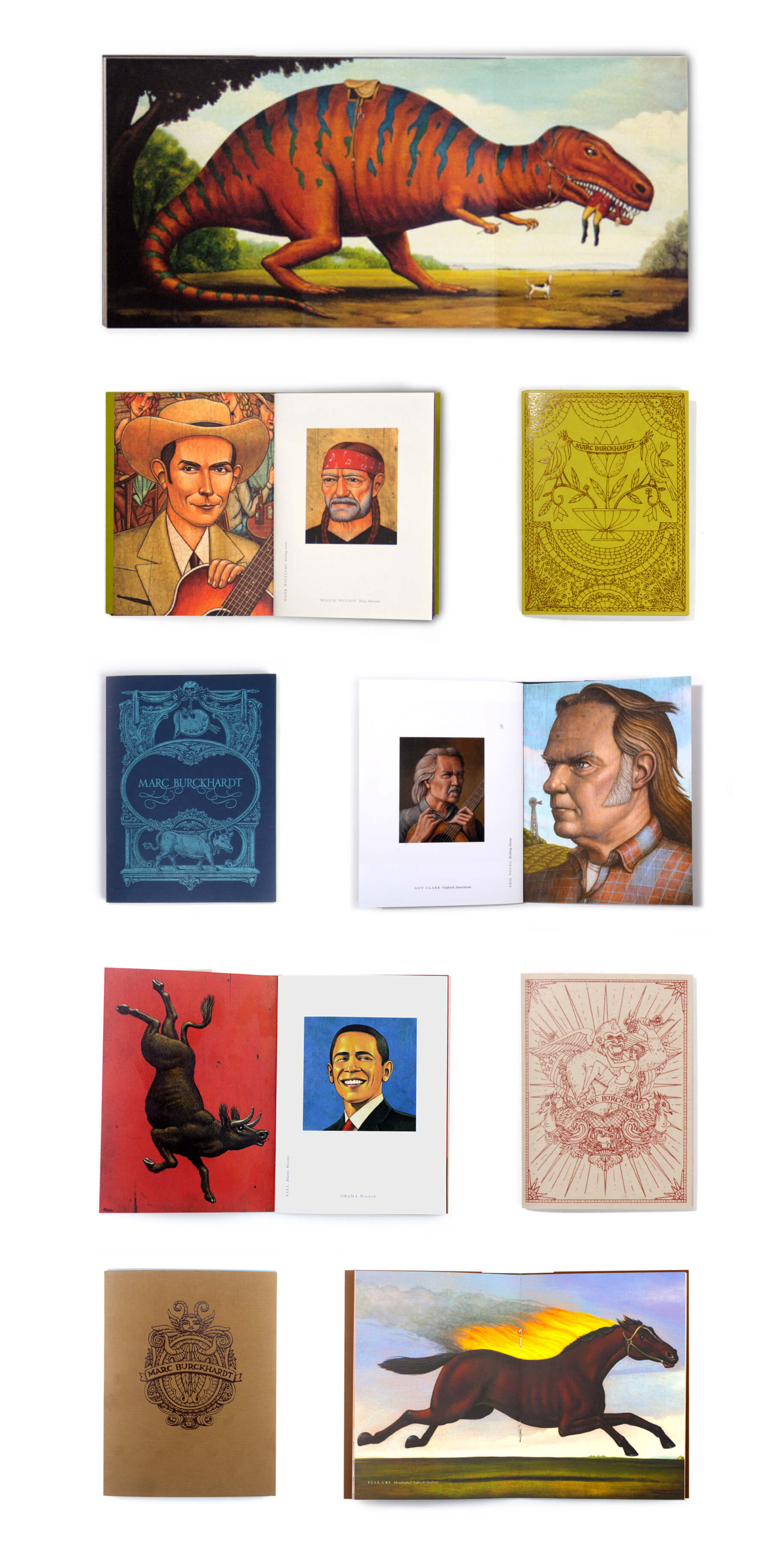
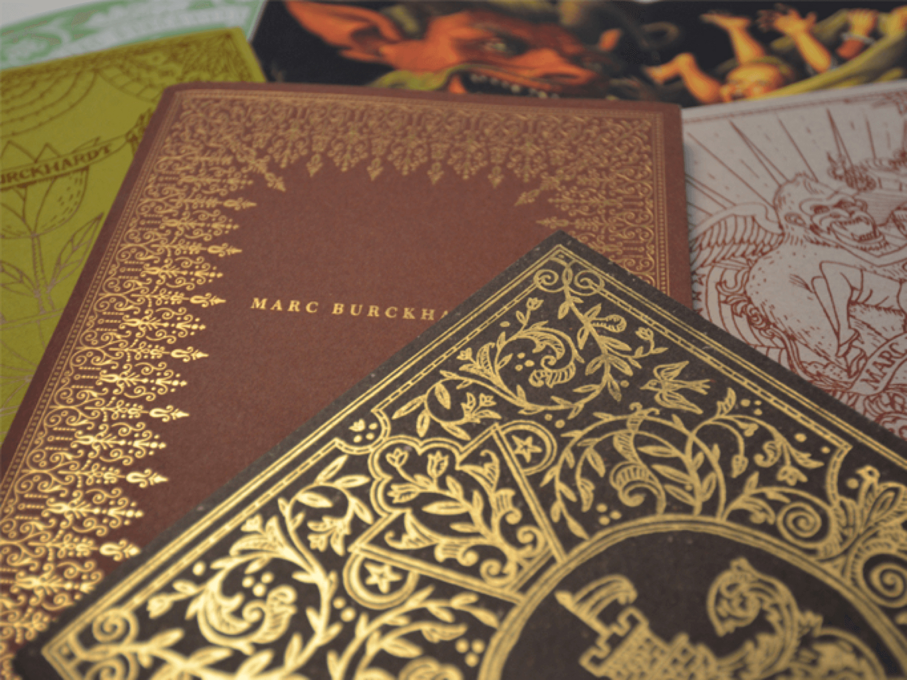
Before Marc’s work adorned the pages of newsworthy magazines and the walls of art collectors, he faced every illustrators challenge – how to stay fresh on art director’s minds. After studying self promotion that landed in the trash against the few we hung onto, we recognized a need for something personal and collectable to make that lasting impression. A series of small printed art books featuring Marc’s unique illustrative style met the challenge. Each book cover showcases a different printing technique on premium papers, sometimes inspiring art directors with new projects Marc has taken on over the years.
Environmental
Rice University
Environmental
Rice University
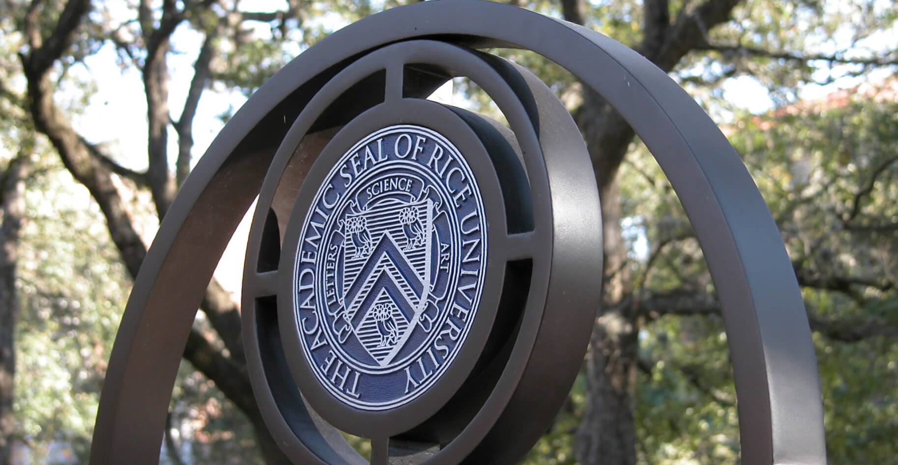
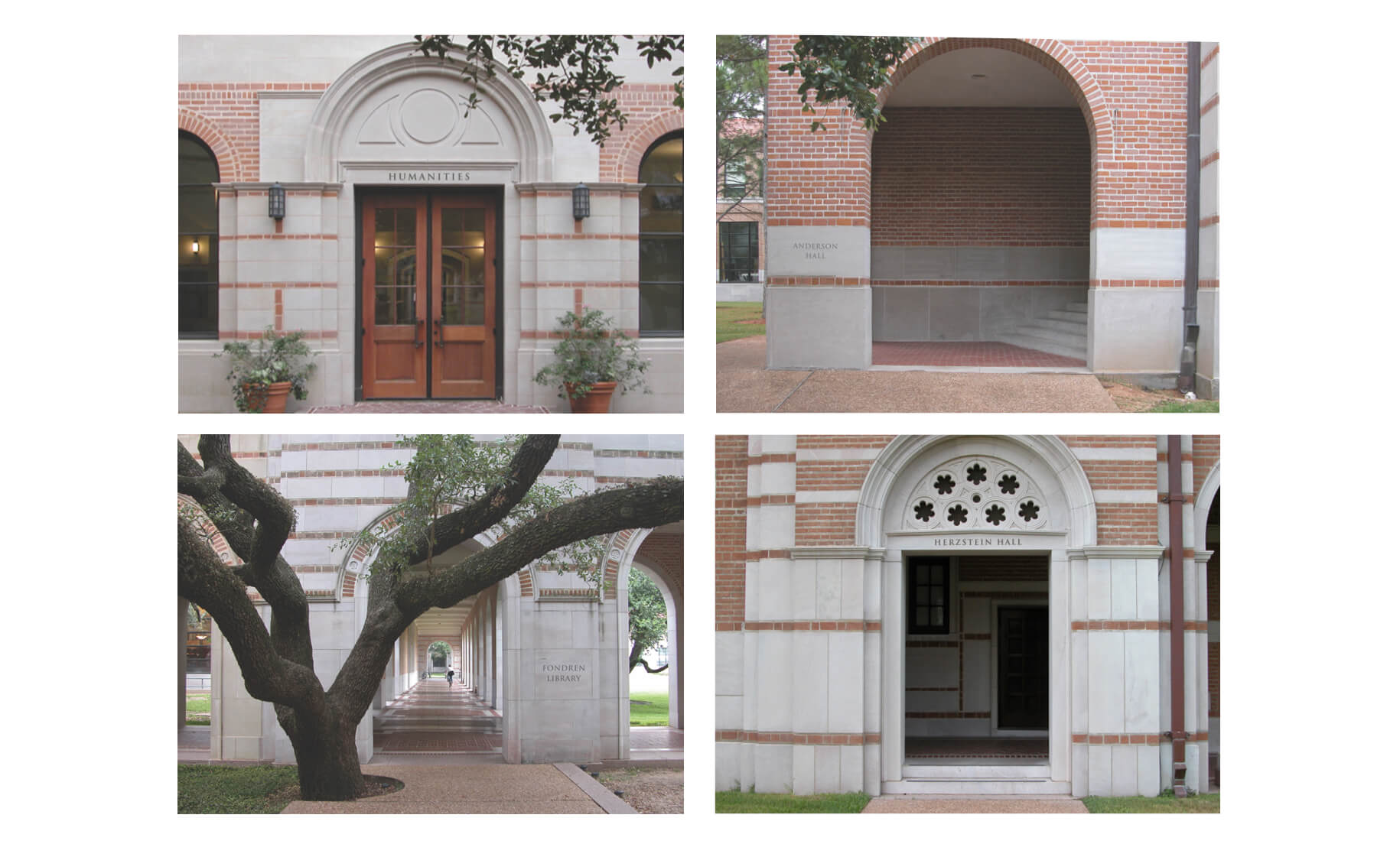
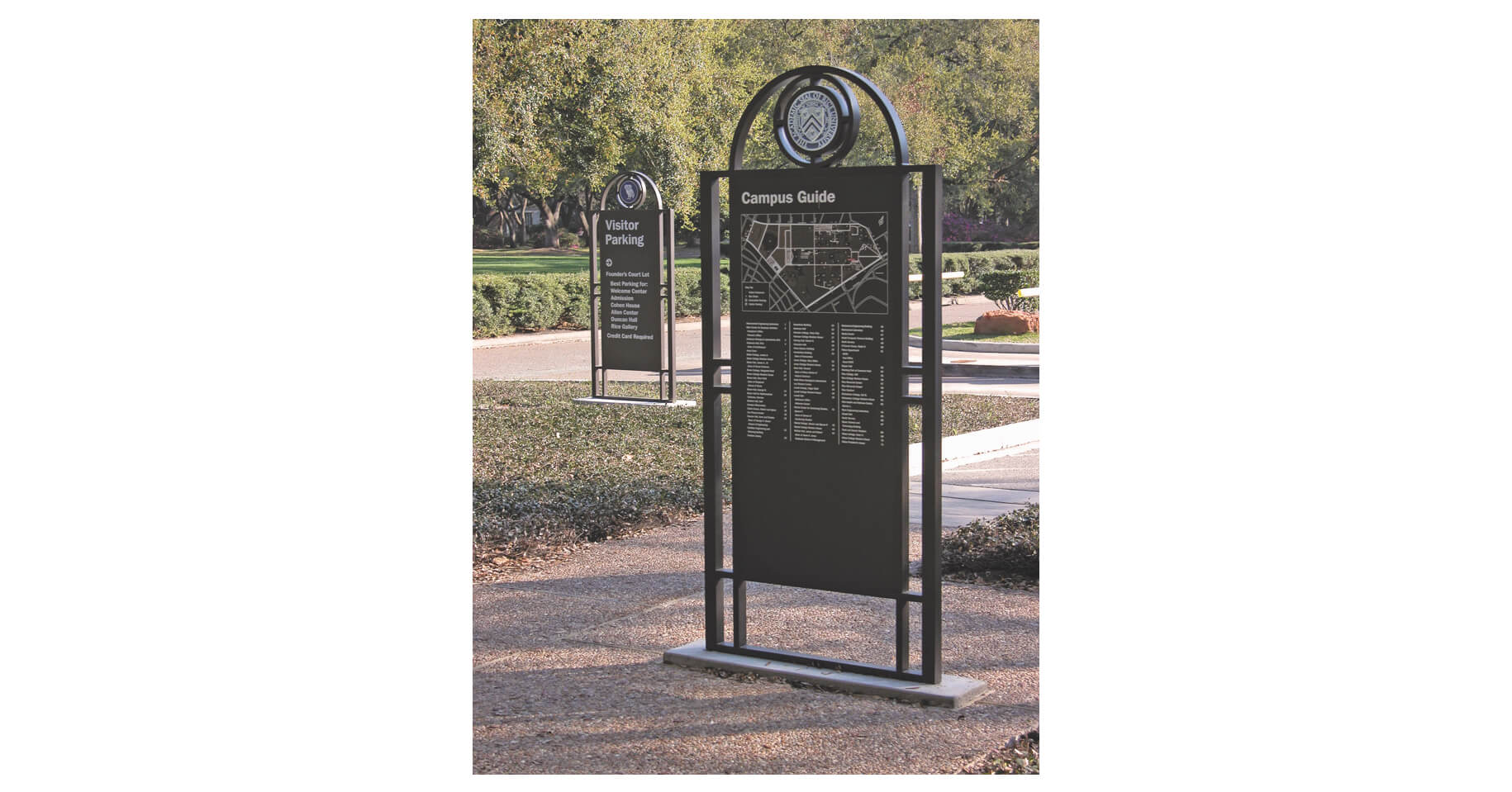
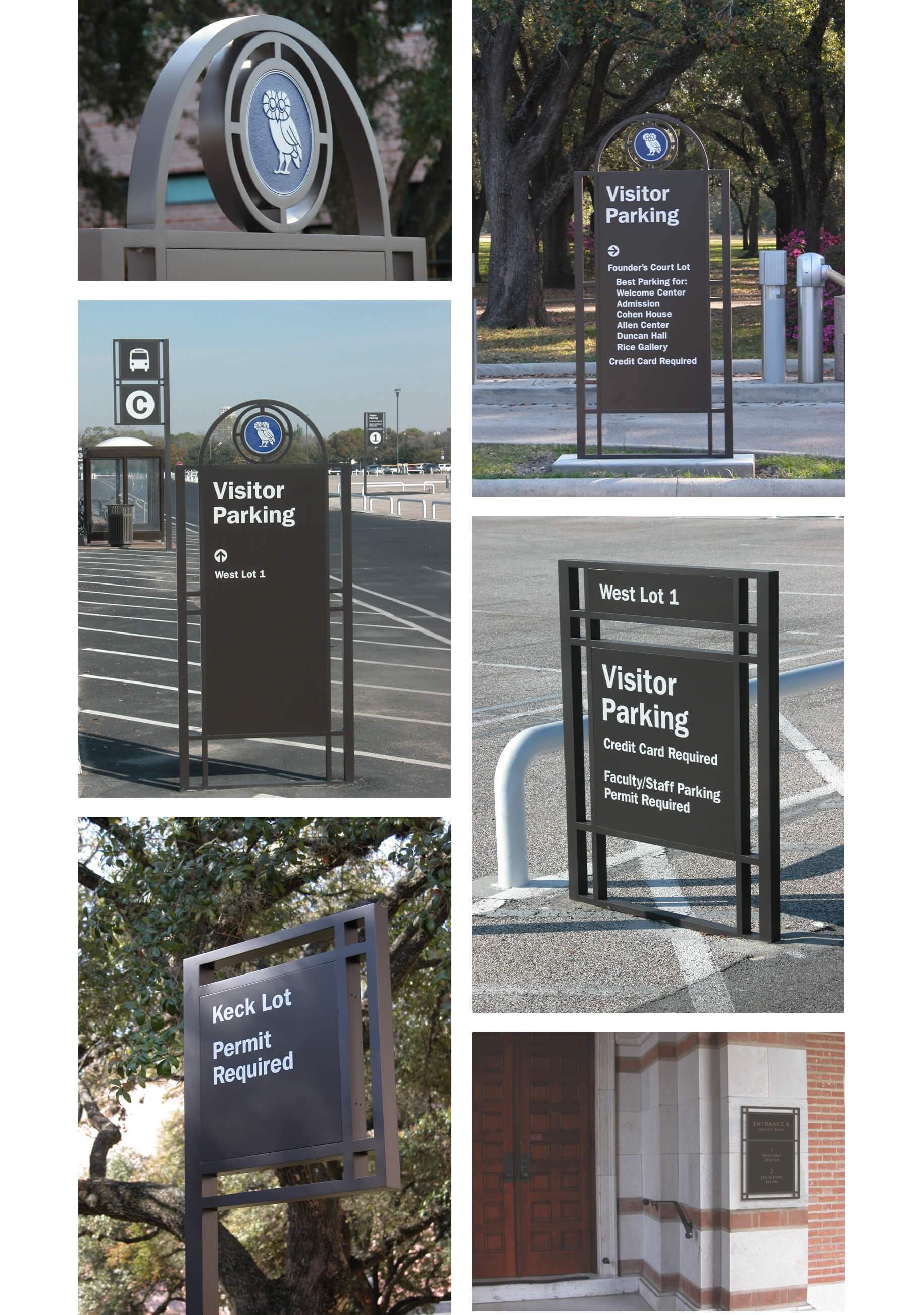
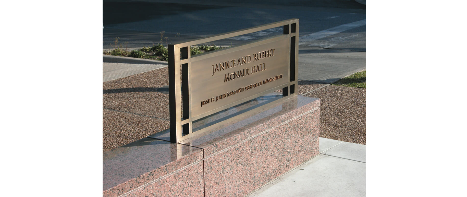
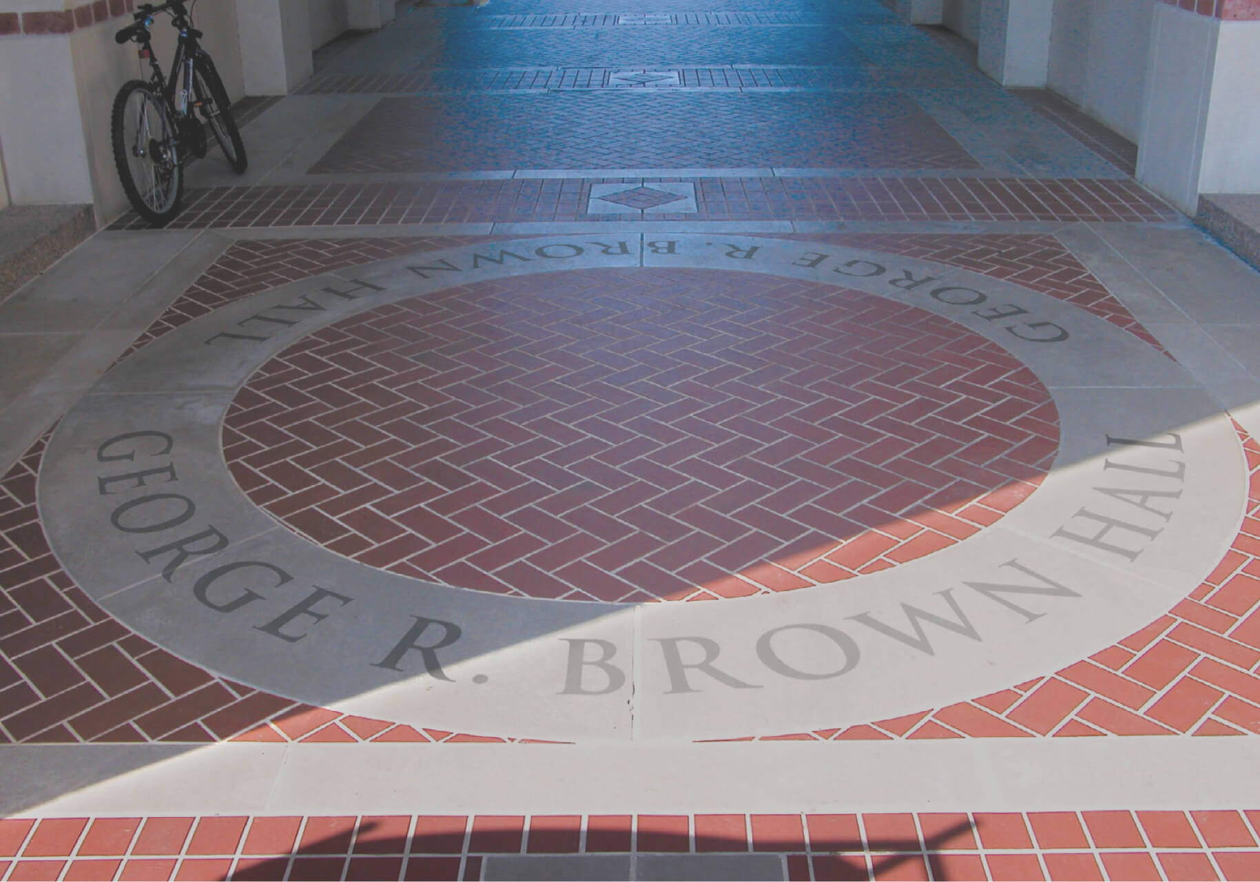
The campus of Rice University is a hidden gem in Houston’s museum district. We helped people find their way in. Though beautifully situated, the Rice University campus had no central entrance and no clear wayfinding strategy. We created a master plan for wayfinding and signage that included a naming and numbering system for campus entrances, markers at each point of entry, a sign system with replaceable panels, and a unified visual language for campus signage and building identification. Project created with Pentagram.
Environmental
Harry Ransom Center
Environmental
Harry Ransom Center
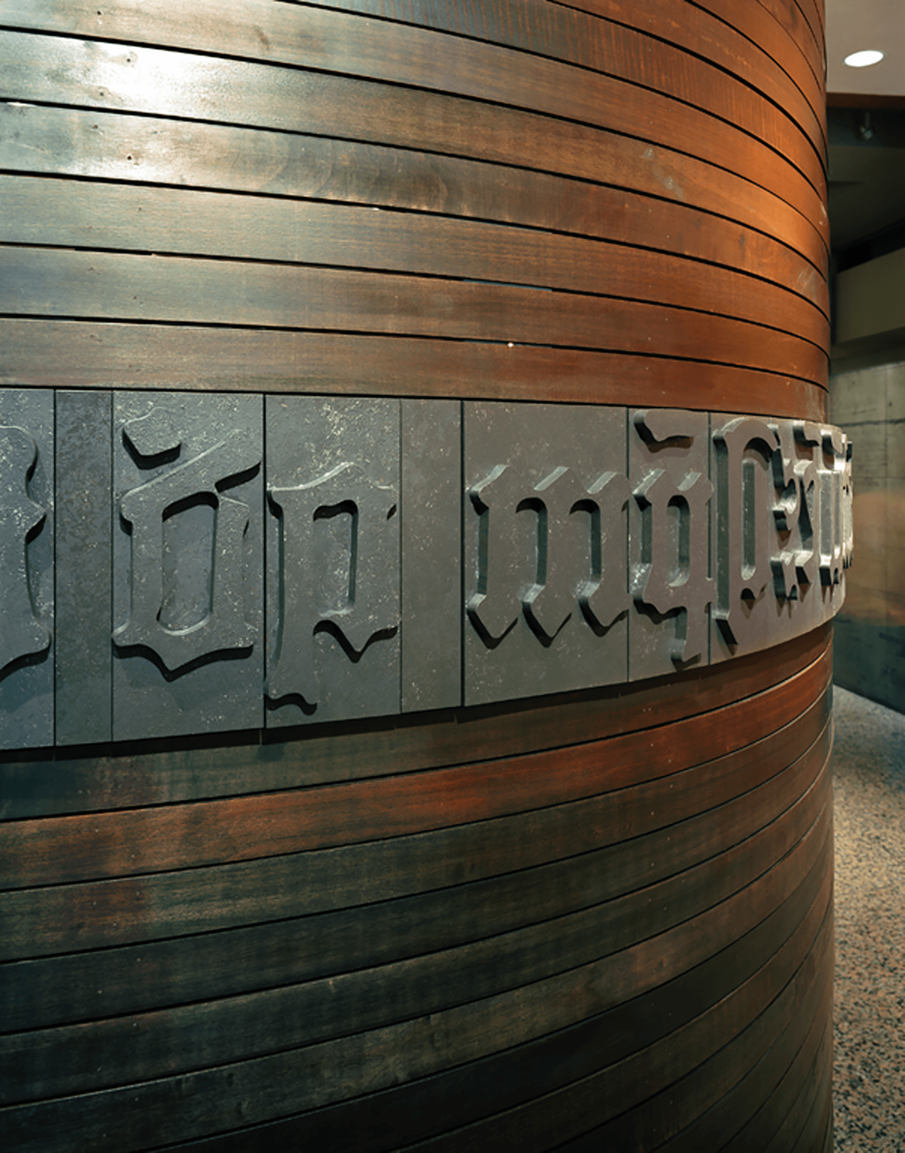
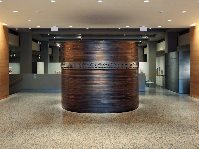
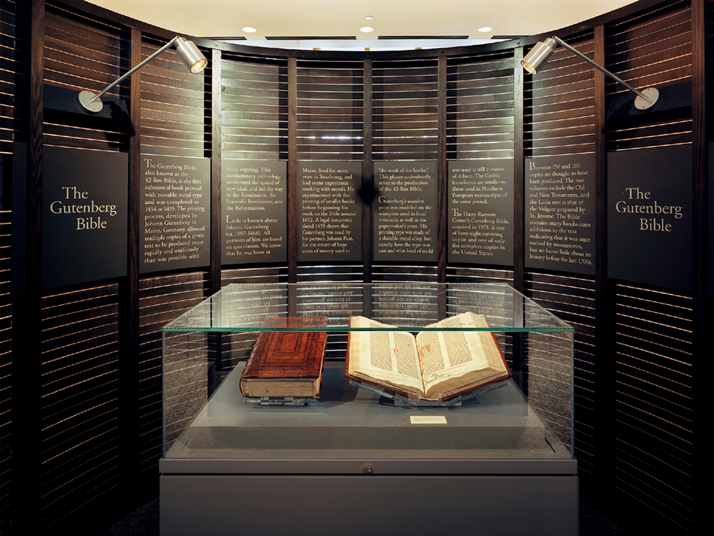
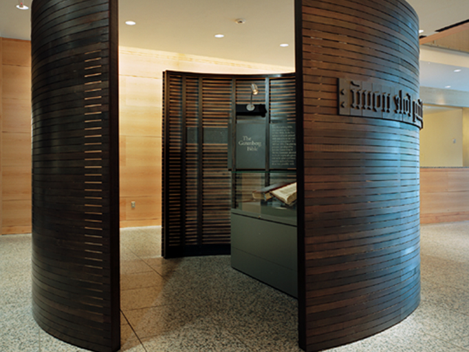
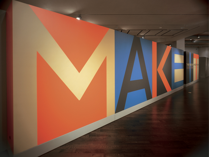
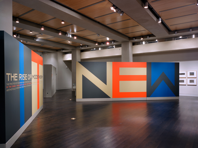
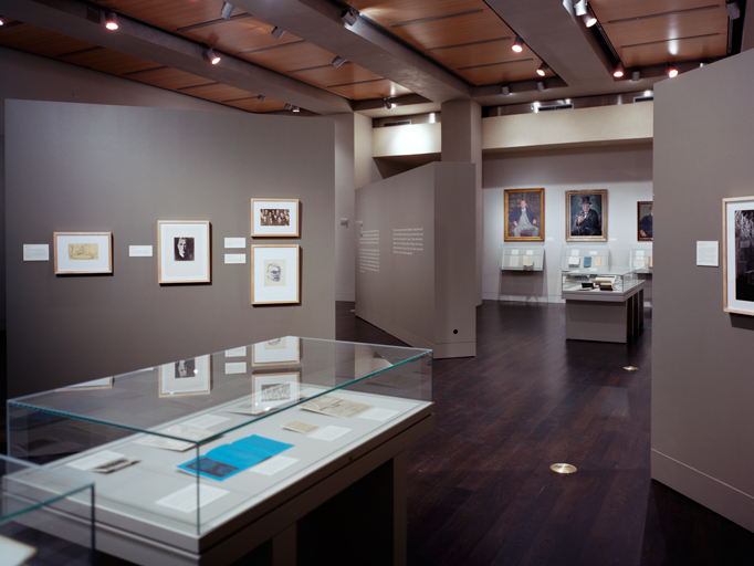
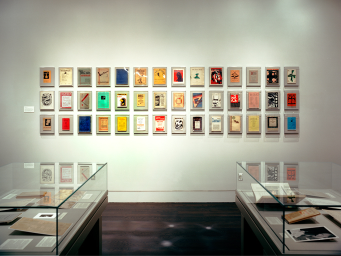
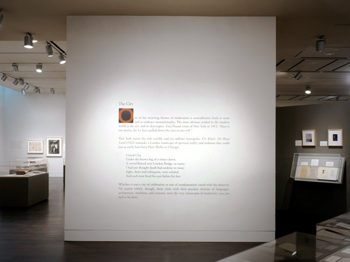
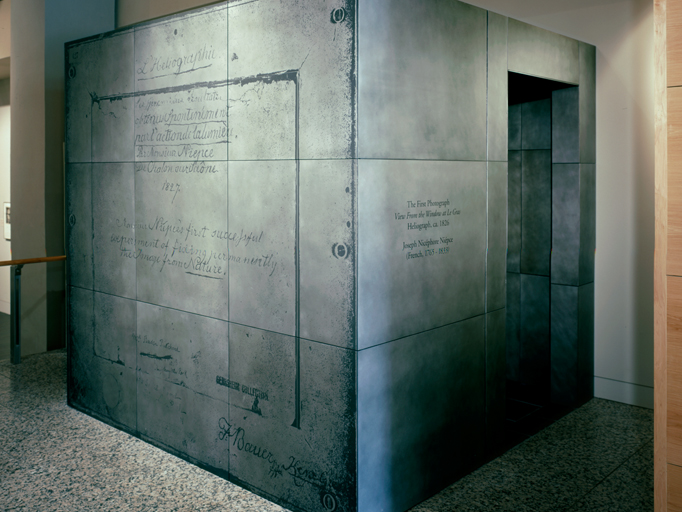
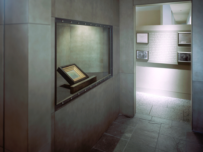
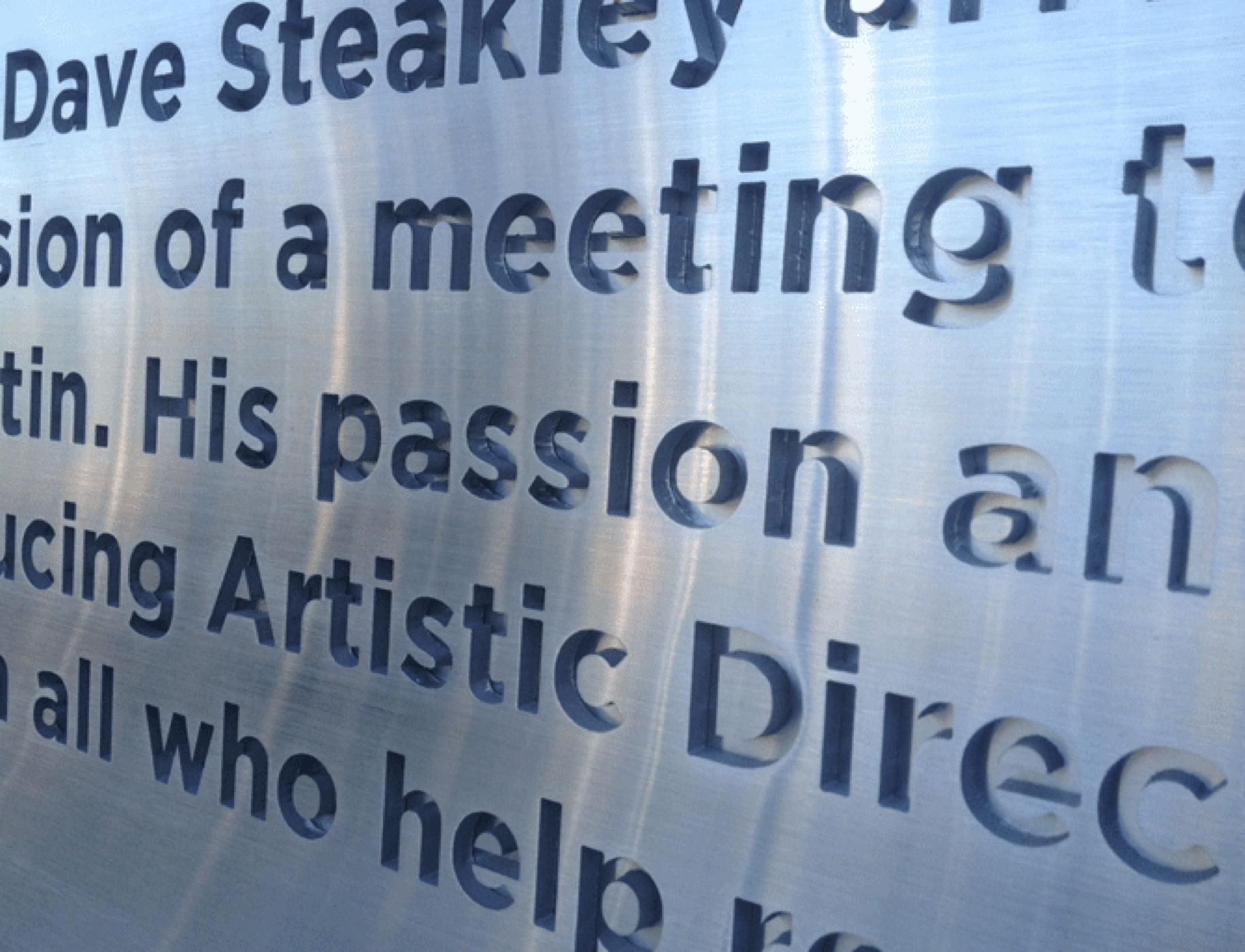
The University of Texas's Harry Ransom Center is the owner of several impressive firsts – including the first photograph and a rare copy of the Gutenberg Bible, the first substantial book printed from movable type on a printing press. As distinguished pieces in their permanent collection, they are prominently displayed in the lobby and are SEGD award-winning exhibits. The Gutenberg Bible features a build out that plays off the printing process type blocks. For the first photograph, we turned the picture over and blew it up. Visitors approach the photograph through an exterior shell that replicates the photographer’s notes on the back in etched metal. For the first few rotating exhibits, Make It New and In a New Light, we designed everything from the cases and display layouts to wall graphics and exhibit layout. Created with Pentagram Austin, Lowell Williams Lake | Flato Architects Services include Exhibition Design, Branding, Fabrication and Installation
